The last days of summer in the Northern hemisphere are almost gone and the first signs of autumn have already appeared: the days are shorter and the nights longer, the temperature has become bearable (this is valid for my country, Romania). A web designer, a creative soul, surely is influenced by these changes and nature has always been a good source of inspiration.
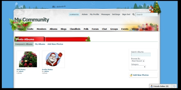
On the other hand, the cold temperatures remind us that sooner or later winter will come together with Santa Clause, snow and the holy Christmas; clearly, all these are good reasons to party and have fun. The online medium can’t ignore these and the majority of the websites present signs that they are prepared for the joy of the warm days. Personally, I am very happy in the winter and I strongly appreciate any “snowy icon or logo” that lets visitors know that Santa Clause is coming soon. It may be considered as a sign of professionalism to be up-to-date with the upcoming season.
A wise designer prepares ahead the files for upload in winter and I believe that this post is a good refresher for everyone. The overall success of a website is related to the consistency offered hence a major mistake is to drastically change a layout for the months of winter. The ideal situation is only to show that there are some “preparations” for the cold season but the base of the layout must remain unchanged. An in-depth analysis is more than necessary and I decided that breaking down a layout into components is the best solution.
The Background
Usually, it’s the biggest area of a layout so there must be enough potential to show visitors that winter is here. The key of success is to keep everything balanced; all the designers must be aware that their primordial job is to make the access to information easier and not to create huge headers (don’t get me wrong, it is awesome to have a cool design, but it is vital to part what is capital, the information, and what is attractive, the design). Here are the most common ideas to apply on your background:
- Upload a background using colors common to winter (white, variations from white, red);
- Insert pictures of Santa Clause, sleighs with reindeers, bells, snowy roofs etc;
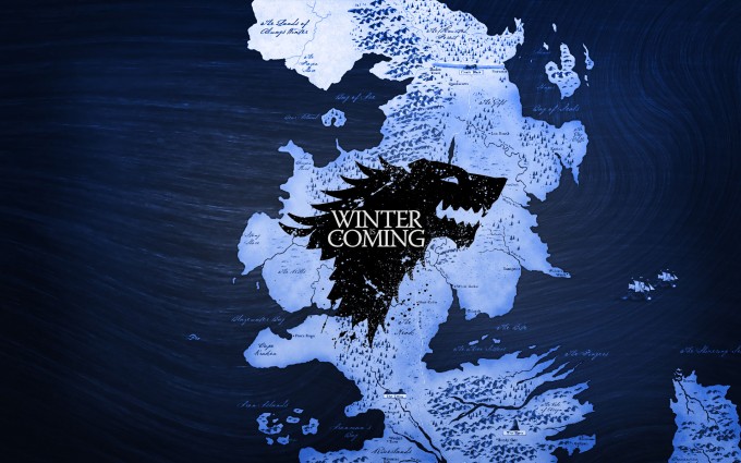
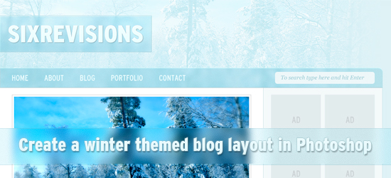
- Create a huge background using a quality photo taken in snowy conditions;
- Adding few snowflakes, static or in addition to a script that allow the effect of a never ending snowfall;
- A “portrait” of a snowman is always a good solution.
To resume, when a substantial modification is required to highlight the coming of winter, the background is a very interesting opportunity.
The Logo

A logo condenses the identity of an online presence and the biggest mistake is to redesign it to match the specificity of the seasons. There must be only slight variations, less is better. One of the best solutions, if not the only, is to add some “snow” at the bottom of the logo. In any cases, the logo shouldn’t suffer important modifications.
It is not a mistake to add “winter files” to multiple parts of the website; if you consider that the five snowflakes on the logo aren’t enough, undoubtedly, you can attack the navigational menu. The idea is that the new design should be a seasonal transformation and not a complete redesign.
The Navigational Menu

Even the most dreamer visitor will notice that a website is adjusted for the winter when the navigational menu is customized, because it is impossible to navigate without clicking on it. I consider that there no major modifications should be made; it’s too risky not to affect the usability and the accessibility of the website. Try to imagine a menu, full of snow or simulating snowy conditions, how will you determine where to click? A web designer should pay attention to this area, but when it is done properly, the results are awesome.
The Header
This area allows any modifications and it is frequent used in these kinds of changes. First of all, here the eyes of the reader are driven hence the visual impact is powerful. Second, there isn’t information that is too important, therefore the limitations are absent. The imagination of the designers has lead to awesome works and I am waiting for the novelties of this year.
On the other hand, many designers haven’t the courage to be more creative and I discover that there are some repetitive solutions as: a sleigh of Santa Clause, the eternal snowflakes and bells. Yes, these are the symbols of the winter but it’s time to be more innovating.
The Footer
Because it is noticed in the end, its importance in making your website “winter-friendly” is reduced. In spite of that, it’s not wrong to put some snow at the bottom, try to make a cool last impression on your visitors.
I feel that I must repeat, the classification I just made isn’t a strict one, it is made only to understand my point of view easily. A very cool idea that isn’t mentioned in the anterior paragraphs is to use icons that are designed only for wintry situations, I love them and the aspect created is astonishing, please pay attention to them.
Do you have any other ideas? Please share your interesting thought with us, let’s make together this online winter more appealing!
need more resources and inspiration? look no further


