CSS3 is the latest offering that can generate a great amount of details without using images. With the evolution of CSS3, web designing also were elevated to greater levels. CSS3 is based on motion techniques and can easily recreate effects which were before far too complex to achieve without images. CSS3 has gained several advanced features such as box-sizing, border-image, border-radius, text-shadow, multiple backgrounds etc. Though CSS3 has the potential to produce splendid design effects it is not supported by some of the browsers (still). This article presents you the effects that CSS3 is capable of generating without the use of jQuery techniques.
Border Radius
Border Radius: Part 1 – Video Tutorial From treehouse
The border radius option gives you the chance to personalize the border the way you want. The border radius option in CSS3 enables the user to provide rounded corners, or borders, to an html element via the style declaration. This option also includes several customization features like color and size of the border. The user can set the radius of the curve at the corner and even provide color for the border. The user also has the choice of customizing each of the corners individually rather than setting a single parameter value for all the corners.
The other customization options are: setting the width of the border, providing inside and outside colors for the element. Browsers like Mozilla and Safari support this feature while IE still lacks. But IE users could still use the existing image-based styling method to implement rounded corners. For users unaware of the border-radius codes, there are many code-generator tools that produces codes compatible to each browser called ‘border-radius.com’ or just google ‘css3 border radius’.
Code Example Below: rounded corner button using Border Radius
#button{
    background:#333;
    color:#fefefe;
    -webkit-border-radius: 10px;
    -moz-border-radius: 10px;
    border-radius: 10px;
}
Multiple Backgrounds
Multiple Backgrounds: Part 1 – Video Tutorial From treehouse
This feature of CSS3 is the most efficient time saver and enables the user to establish multiple background images without using nested elements. With the CSS this task involves a lot of codings and nesting of div tags, but using query with the Background Layers plugin one can easily finish the task. This plugin incorporates JavaScript and reduces the amount of XHTML needed thereby decreasing the length of coding. The plugin concept works on the same basis of working with layers in Photoshop.
The earlier versions of CSS involved the task of assigning images for background while CSS3 utilizes the concept of layers for the same. The layers of backgrounds are stacked in order beneath the initial background. Most of the browsers support this feature including IE9 while you need a separate filter to enable this feature for the older IEs. The AlphaImageLoader filter does serve the purpose but with several issues like inability to control placement and image repeat. The browsers that do not support this feature will display only one background.
Code Example Below: Multiple Background Style Syntax
#epicBackground{

   background:

   url(nyanCat.png) 300px 10px no-repeat,
   /* On top,    like z-index: 10; */

   url(bacon.png) 10px 10px no-repeat,
   /* Middle,    like z-index: 5; */

   url(rainbows.png);
   /* On bottom, like z-index: 3; */

}
Box Shadow and Text Shadow

CSS3 Typography: Text Shadows – Video Tutorial From treehouse
This feature enables the user to generate shadows for text and boxes. The text shadow effects include outer-glow, emboss and letterpress looks. The syntaxes for both text and box shadow are identical except for the fact that the value inset is not applicable for text shadow. Both the features are supported by most of the browsers including IE9 with the help of some extra ‘hack’ syntax. The shadow feature even has the customization options like setting the color, blur, opacity and offset direction. The method even enables the user to assign multiple shadows to a single element. For IE users the shadow filter generates better shadows.
For box shadows the default positional value is outset and inset values have to be established if necessary. The directional offsets are determined by positive and negative values, a positive value generates the shadow on the right while a negative value places the shadow on the left side of the box. The blur values are set by blur radius starting from the sharpest value zero.
Code Examples Below: Box & Text Shadow on elements
/* CSS3 Text Shadow */

.textShadow{
    text-shadow: 2px 2px 2px #333;
}

/* CSS3 Box Shadow */

.boxShadow {
  -moz-box-shadow:    2px 2px 6px 8px #333;
  -webkit-box-shadow: 2px 2px 6px 8px #333;
  box-shadow:         2px 2px 6px 8px #333;
}

/* CSS3 Inner Box Shadow */

.innerBoxShadow {
   -moz-box-shadow:    inset 0 0 4px #666;
   -webkit-box-shadow: inset 0 0 4px #666;
   box-shadow:         inset 0 0 4px #666;
}

/* IE Compatible - Box Shadow - a big mess */

.IEshadow {
	margin: 60px;
	background-color: rgb(105,105,105); /* Critical for teh IE browsers */

	-moz-box-shadow: 6px 6px 6px rgba(105,105,105,0.5);
	-webkit-box-shadow: 6px 6px 6px rgba(105,105,105,0.5);
	box-shadow: 6px 6px 6px rgba(105,105,105,0.5);

	filter: progid:DXImageTransform.Microsoft.Blur(PixelRadius=5,MakeShadow=true,ShadowOpacity=0.40);
	-ms-filter: "progid:DXImageTransform.Microsoft.Blur(PixelRadius=5,MakeShadow=true,ShadowOpacity=0.40)";
	zoom: 1;
}
.IEshadow .content {
	position: relative; /* Without this the inner element will be blurry */
	padding: 125px;
	background-color: #CCC;
}

/* Don't forget to add these extra HTML Elements for IE Browsers - just putting it in the code box for easy access

<div class="IEshadow">
	<div class="content">
		This will be inside the shadow box
	</div>
</div>

*/
Transparency and Opacity
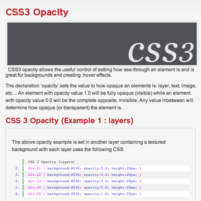
CSS3 Opacity Examples & Explanations
This opacity feature allows the user to control the opacity of any element, setting it anywhere from transparent to completely opaque. This feature has the simplest syntax involving just values ranging from 0.0 to 1.0 with 1.0 being the most opaque. Again IE users need to use specific Microsoft filter to enable the feature. For better control over the opacity of certain elements the use of RGBA color is recommended. By using RGBA color one can define color in CSS and can also establish the transparency of the color.
The syntax just involves specifying values for both colors and their opacity values. IE9 and all other browsers support RGBA while older IEs report bug while using RGBA. The bug restricts the color from showing up on the element. To fix that bug one could use hexadecimal color instead of RGBA and gradient filters to infuse color opacity.
Code Examples Below: CSS3 Opacity
#fadedElement { opacity:0.25; }
The above techniques are just a few tips regarding the CSS3 and there are more of such jQuery formulae. But all of those are still restricted to certain browsers; however the popularity and use of CSS3 is increasing everyday with web developers adopting it to ease their work. However the browsers are incorporating filters and features that enable CSS3 in their platform. Compatibility issues will soon be a thing of the past and designers can soon resort to working on the newer versions of CSS and customize the browsers to generate stunning user interfaces.
Bonus!
A neat little trick, if you are worried about certain browsers that don’t support the updated CSS3 techniques, is use Modernizr to detect if the features are available to use, and if not, fall back on something else. Nice way to make sure you use progressive enhancement wherever you can, and don’t sacrifice accessibility for convenience or performance.
Taking advantage of the new capabilities of HTML5 and CSS3 can mean sacrificing control over the experience in older browsers. Modernizr 2 is your starting point for making the best websites and applications that work exactly right no matter what browser or device your visitors use.

