Once someone establishes a journal or any other printed periodical, the design is among the most important aspects of the project. People should think of how the design will affect their readers, how they will react to it, and what will be the general impression of their periodical or catalogue at first glance. At the same time on the web you can find a huge number of sites that look absolutely awful, without even a hint of any design work. The way of presenting the content on the sites is hard on the eyes, and the site design seems very strange and unnatural.
This issues come not only from lack of advanced design knowledge, but also elementary ones as well. These include such things as h1, h2 and h3, some simple rules of matching colors and other things that even a beginning designer should know. That’s why I decided to post this piece of advice in order to encourage webmasters to improve their sites, and to have some general ideas of usability and user experience.
Spacing & Structure

Design for Readability
First of all there is the subject of spacing. In order to be more readable, appropriate spacing for your content is necessary. In fact, spacing is needed for focusing the reader’s attention on key points. Printed periodicals refer to spacing as the chief factor when grabbing a user’s attention. There are two main principles here:
- Provide sufficient space for recognizing the lines of text in your content. This means that you have to look at the space between letters and lines, and determine the readability of the text in general.
- Put some white space around your text. It becomes much more readable in general and draws more attention to the text itself. This is a widely used trick of all publishers and clever designers.
Also, USE HEADERS! Please! Headers help readers to systemize the content, and make it easier to read. Readers grasp your messages much easier when it is put in order using h1, h2, and h3. Search engines also find these easier to read, as well!
Typography

Applying Macrotypography For A More Readable Web Page
Typography is probably one of the most important parts of any modern web design. Take advantage of the tools we have available to us today that were not even here years ago, like the @font-face property in CSS, that allows you to use non web-safe fonts safely and beautifully on the web.
Fonts used on your website are as vital as spacing itself. You should use not only the appropriate size and color of fonts, but they should also follow the following parameters:
- Clarity on different screens
- Clarity on different sizes and resolutions
- Adaptability for the most used OS’s (Windows, Mac OS X, different distributions of Linux).
Simplicity is the best policy
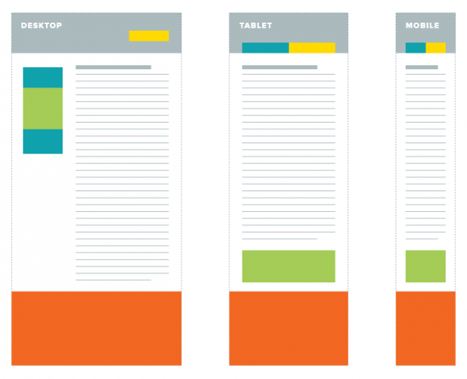
Challenges In Responsive Web Design
Break your content into small paragraphs. Do not use large ones; they are difficult to read and to understand. You should be doing everything you can to get to the point, quickly.
The color of your content should serve firstly the clarity and visual ease of understanding, and only secondarily serve the aesthetic aspects of the design. Classic background colors will do well, but if you are a good designer you may be able to take risks and watch the reaction of users, then tweak upon studying the results. Try different combinations of text and background colors to see which ones work best together.
These are some of the main principles of improving the UX and usability of your site for readability, and accordingly its success. Soon we shall explore even more factors concerning this topic, so stay tuned!


Yes, I believe that simplicity the best policy. What will you do with a site full of designs but not really readable, right? Interesting read, Heidi. I swear it was worth my time. Now I know how to deal with sites that are not really readable (if you know what I mean).