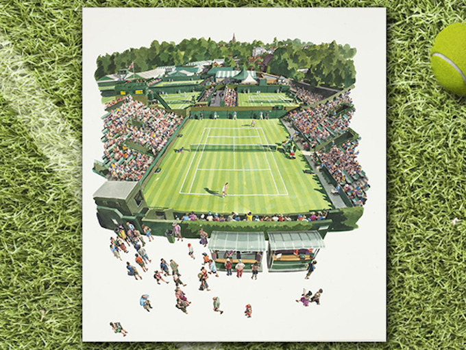
Wimbledon is considered the oldest of the four Grand Slam tennis tournaments; US Open (1881), French Open (1891) and Australian Open (1905). It started in 1877 at the All England Lawn Tennis and Croquet Club in Wimbledon, London.
Excluding the two breaks Wimbledon has had between 1914 and 1919 for the First World War and 1939 and 1946 for the Second World War, the tournament has taken place every year. Inline with this, the AELTC and Wimbledon have commissioned artists to design a new official poster with the event whilst Transport for London used their own designs to promote the London Underground serving Wimbledon as the District Line connects Central London to Southfields and Wimbledon stations, both of which are of almost equal distance from the courts on Church Road.
In 2012 and 2013, the AELTC and Wimbledon has ran a competition that encourages fans of Wimbledon to create and submit their own poster of which Wimbledon may choose to promote the event. In 2014, the AELTC joined up with American sports broadcaster, ESPN, to offer fans from North and South America to design the official poster for the first time.
St Ermin’s Hotel takes a look through the most recent history of Wimbledon posters.
1992
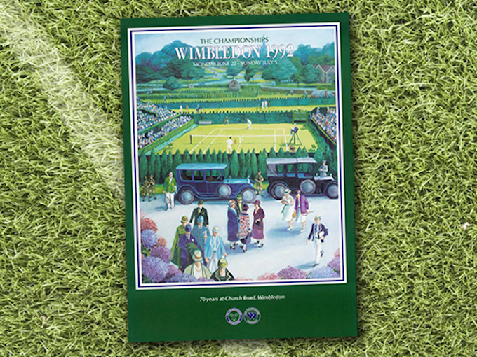
The 1992 poster incorporates the traditional green of the tennis courts along with a full colour illustration of the then centre court without its roof that was constructed in 2007.
The headline appears at the top of the poster and uses a serif font. The short celebratory statement, showing the event has been hosted and played for 70 years at the current tennis courts on Church Road, is styled in a sans serif font in an italics style.
The design also includes the Wimbledon logos, which first appeared on the tennis tournament programmes in the 1980s.
1993
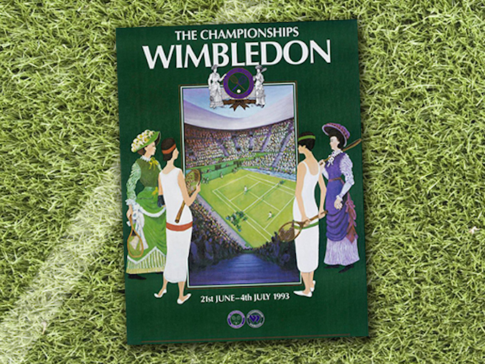
The background colour varies throughout the years, with 1993 reflecting the poster created in 1992, using the same dark shade of green. Illustrations of women appeared on the poster, watching the match being played in centre court. The illustration of centre court was significantly reduced in size when compared to 1992.
The sans serif font used the year prior was removed and all text appeared in one variant of serif font.
1994
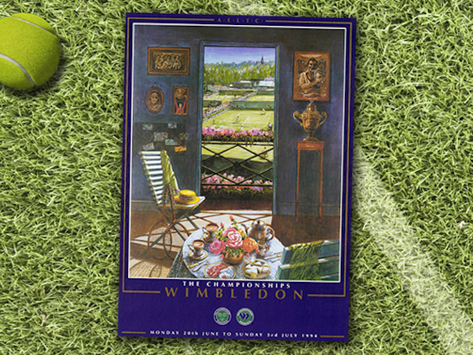
The 1994 poster uses the same dark purple background, as seen in the Wimbledon logos, combined with white and gold text.
The colour illustration increased in size, returning it back to the size as seen on the 1992 poster. It is also the first time AELTC appeared on the poster before being removed later in 2010.
1995
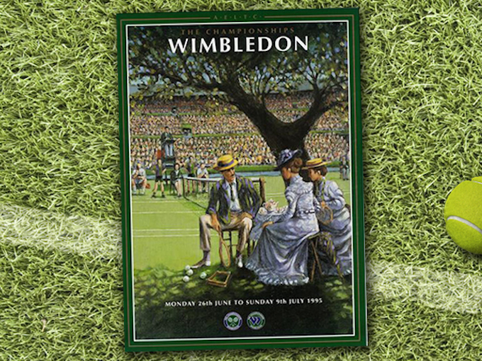
The 1995 poster design didn’t change much, if at all, except the colour illustration uses 95% of the space on the poster and the purple background was changed to the dark shade of green as seen in earlier versions.
1996
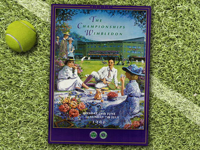
One noticeable design change with the 1996 poster is the headlines and the year “1996” are styled in a calligraphy font. The first letter of each word in the headline uses the same shade of purple as the background with the rest of the headline in the traditional green colour as seen in the logo. The remainder of the text on the poster is in a serif font.
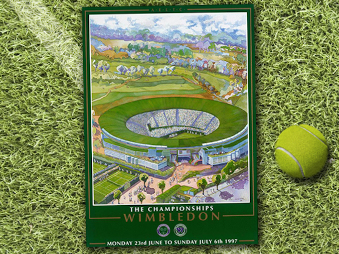
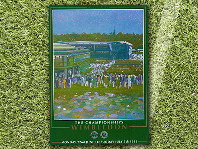
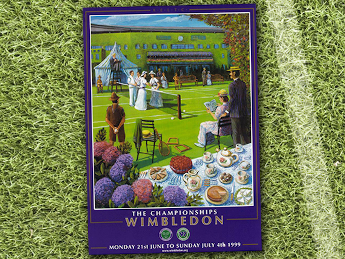
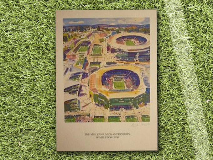
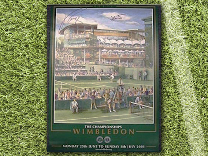
1997 – 2001
Between 1997 and 2001, the design of the Wimbledon tennis tournament poster didn’t change except the colour illustrations, which have become a regular piece of artwork on the poster.
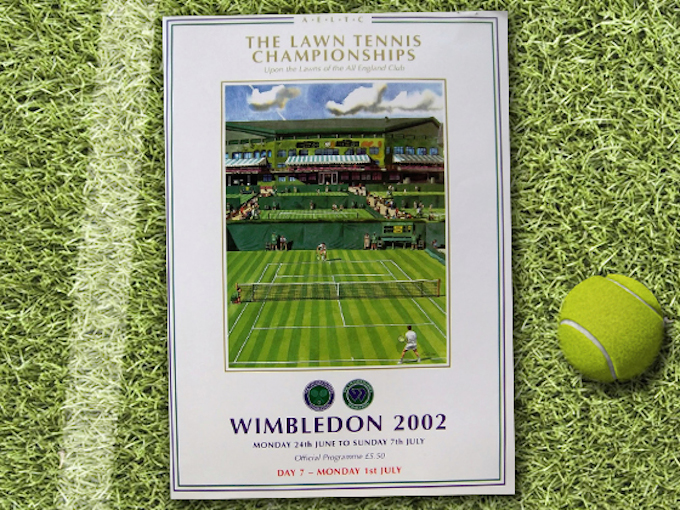
2002 – 2008
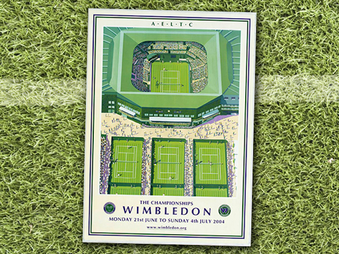
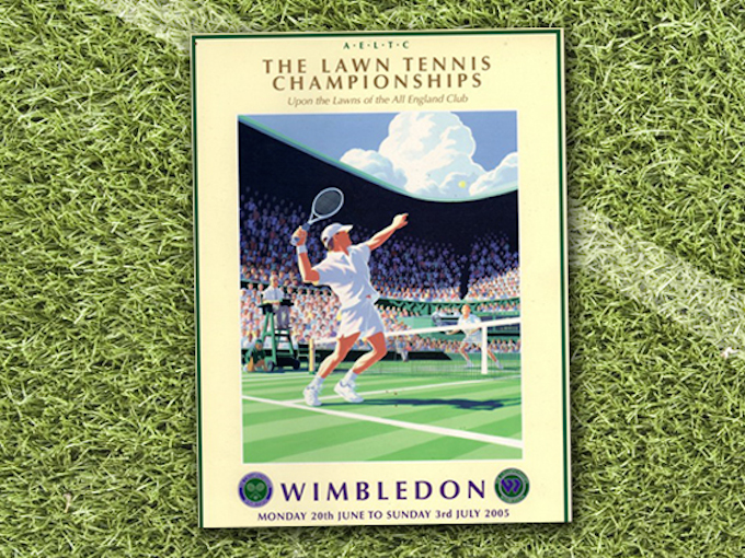
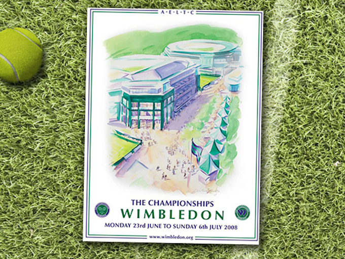
The design of the Wimbledon tennis poster in 2002 significantly changed with a plain white background being used throughout with the traditional Wimbledon colours, purple and green, used in the double border, which is placed around the edge. The same serif font used on earlier posters is also present on the 2002 version.
Between 2002 and 2008, the design didn’t change much, if at all. In 2004, the border increased in thickness whilst in 2005, a light yellow background was used instead of the plain white background as seen in earlier versions. In 2008, the border was halved in order for the AELTC wording to appear at top and the URL of the Wimbledon website to appear at the bottom.
2009 – 2010
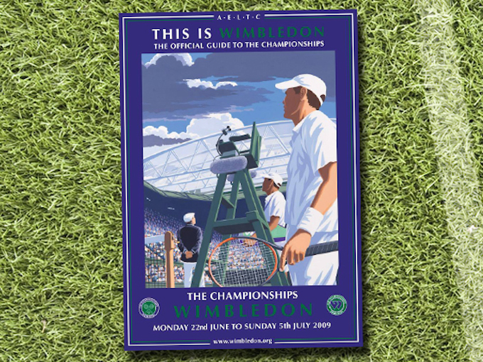
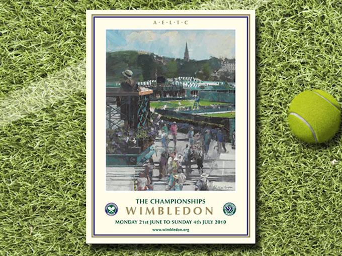
In 2009, the format of the design used between 2002 and 2008 wasn’t changed. Instead, the colour scheme changed with the traditional purple background making an appearance once again with white text and the wording “Wimbledon” camouflaged in the traditional green. In 2010, the white background from 2002 to 2008 made an appearance.
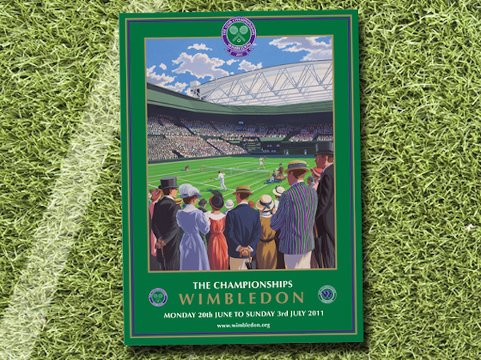
2011
In 2011, the format of the 2009 – 2010 design was used. However, the AELTC branding from the top of the poster was removed and replaced with the official Wimbledon logo.
The traditional Wimbledon green background was used once again, along with a combination of white and gold text. It was also the last time the website URL appeared as ‘www.wimbledon.org’.
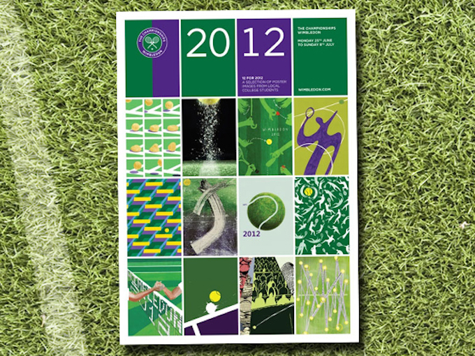
2012
In 2012, Wimbledon used 12 posters created by students from Kingston University, who were invited to enter a competition to design the poster as part of their Art and Graphic design curriculum.
The twelve shown had to abide by one guideline – the use of the traditional Wimbledon colour scheme consisting of purple and green. Other colours could be used but they had to use the Wimbledon purple or green.
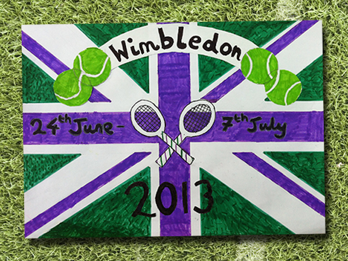
2013
In 2013, Wimbledon, The All England Club and BBC’s Blue Peter joined forces to create a competition that saw children from around the UK design the official poster for the tennis championships.
The poster had to include the purple and green colour scheme, the dates of the tournament, the word Wimbledon, showcase what Wimbledon meant to them and why they thought it was a unique sporting event.
2014
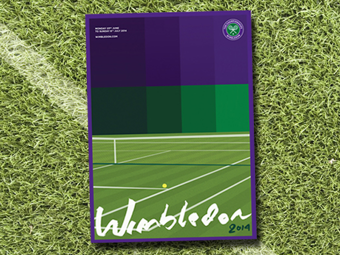
For this years tournament, citizens from North and South America were invited to enter a competition held by the AELTC and American sports broadcaster, ESPN, to create the official poster for the tennis tournament, which is now in its 137th year.
The winning design was by David Bartholow, who resides in Los Angeles, California, and inspired by the summer night of London and the mystique of Wimbledon. The poster also appreciates independent British graphic design and his lifelong dreams of visiting the All England Club.
St Ermins Hotel, Caxton Street, London, SW1H 0QW, Great Britain. Telephone: +44 (0)20 7222 7888.

