
Responsive design is an approach to web design that aims to create websites that are easily viewed across multiple devices such as desktop computers, smartphones and tablets. The importance of designing websites that can be viewed regardless of the device the visitor owns cannot be overstated; Cognita Digital Solutions reports that 48 percent of users surveyed felt that if a company’s website isn’t optimized for their device, that company simply must not care about their business. The consumers have spoken, but here are some of the other benefits of having a responsive website for your business.
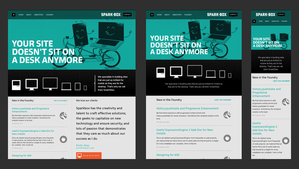
The Full Site in Any Size
Responsive Web Design: 50 Examples and Best Practices
A common mistake made by companies overhauling their websites is to create a “mini” site for mobile devices under the assumption that users will visit the “real” website from their desktop. However, this assumption can be fatal for your business. A recent study by the Pew Research Internet Project found that 34 percent of cell Internet users go online primarily using their mobile device. Responsive design will guarantee that users have full access to your content regardless of which device they choose to access it with. Especially with the popularity of cloud computing, businesses need their websites, documents and virtual drives to work and look good on multiple devices. And with all of the options available for cloud storage, responsive design could be a deciding factor.
Additionally, having a responsive website will simplify data analysis and marketing campaigns because your company will save the time and money by operating one responsive site rather than managing three different sites. As Internet use continues to shift toward mobile devices and customers expect quality websites, you cannot afford to lose consumers to competitors that have responsive sites.
Google Gets It
4 SEO Benefits of Responsive Web Design
Google’s search algorithms prefer responsive sites over non-responsive sites. And Google is a big deal. According to The Huffington Post, Google made up 67 percent of the market share for search engines in 2013, so playing by Google’s rules is playing it smart. Google prefers responsive sites because indexing one URL for one responsive site is much quicker than indexing multiple sites with multiple URLs. Even if your mobile and desktop sites are nearly identical, Google will push it down the rankings due to the behavior of these algorithms.
Google also prefers optimized sites because it is easier for users to share and interact with your site. If one person shares your mobile site on social media and then another person views that link on their desktop or tablet or vice versa, then there are a lot of people potentially viewing less optimal sites. These poorly designed sites create higher bounce rates, which also affects your site’s ranking. Users don’t like these problems so Google doesn’t like them either. And losing traction in Google could spell disaster for your company.
More Sales
Responsive eCommerce: The Results Are In
The simple truth is that you will increase sales if users are comfortable on your site. Research published by Visual.Ly reports that 48 percent of smartphone and tablet users that were surveyed complained that websites were not optimized for mobile devices. Furthermore, 69 percent of tablet users have used their tablet device to purchase goods or services over the Internet within 30 days of the survey. So, creating a site that is easy to use regardless of the device means that mobile users will spend less time fumbling to shrink or expand your content and more time shopping or learning about your services. Responsive design guarantees an overall better end user experience.
Finally, if your competitors aren’t using responsive design, it’s about time that you defined your business as the one that mobile users flock to. By dedicating the budget and time to creating a responsive website, you can stand out from other businesses in your field and capture the mobile market before they do.