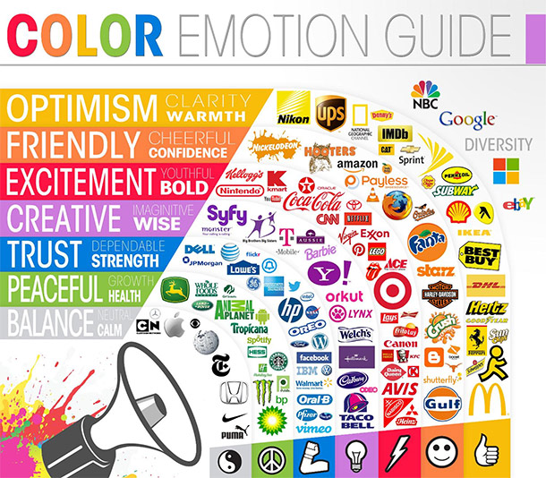
Color plays a large role in the perception of any brand and should be taken seriously by anyone looking to grow their company’s image. Colors can persuade customers on a subconscious level and even inform them about your company’s culture.
Pick the colors that speak for your brand and stay consistent with your message. A company that arbitrarily chooses colors to represent its brand can fall flat with the wrong color scheme — no matter how great the product.
Start With Research
The Psychology of Color in Marketing and Branding
Do you know what message certain colors are saying about you and your business? Color can convey a persuasive message, capture the attention of possible customers, send a powerful message about your company, and strengthen your business image. Research the demographics you’re targeting as well as your competition to find what colors would be the right match for your brand. Gender, age, race, and location are very important things to consider when choosing the right color.
While there is not an exact science to color preference and gender, plenty of research has been put into the topic over the years. According to this infographic on the color preferences between genders, blue seems to reign supreme across both genders as a one of the most universally liked colors. Both orange and brown seem to be generally disliked across the board. Another point of note is the fact that men seem to prefer bright colors while women tend to prefer colors that appear soft.
Color is interpreted differently around the globe depending on your location. For example, in America red is generally seen as a color of power, while in Asia it is seen as a color of good luck. These cultural differences are very important when deciding on the perfect color to cater to your audience. If your product is intended for customers internationally, perhaps choose a shade of blue to represent your brand because of its universal acceptance as a favorite color.
Doing research on your potential competition is another important place to start when determining the colors to represent your identity. Look into your competition and decide what they’re using that works, but be sure to differentiate your brand enough to stand out from the crowd. Depending on the industry your business belongs in, color schemes used by competitors can all be very similar, so be sure there is no confusion with your brand and the competition.
Subtleties in Color
“Look at that subtle off-white coloring. The tasteful thickness of it. Oh my God, it even has a watermark! “
Another interesting thing to consider are the subtleties between colors. Any slight variation in hue, saturation, or tone could change the effectiveness of your brand.
Sure, the color brown is largely disliked across the board, but that doesn’t mean you should just totally discount it. Tweak the color just a bit and you can come up with colors like “mocha,” “bronze,” or “caramel” all of which are well-liked colors. Maybe a person who doesn’t like the color pink might like close alternatives such as “salmon,” “strawberry,” or “bubblegum.”
Strive to think out of the box a little and create the color to represent your brand. Play around with color combinations that fit with your target audience and see which ones convey the message you are trying to get across. With patience and plenty of research, you will find the color that is best for you and your brand.
Quick Tips for Picking the Right Color

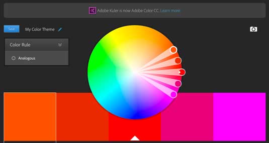
The 28 best tools for choosing a colour scheme
Choosing the perfect color for your brand can be tricky, but try not to overthink it too much. With a little time and effort, you will find the perfect combination of colors for your brand.
- Put plenty of thought into picking the right color not just for you, but specifically for the audience you are targeting. Just because pink is your favorite color doesn’t mean you should go ahead and make that the color to represent your business.
- Don’t choose simply “blue” or “red” to represent your brand. Dig deep into the color spectrum and get very detailed with the colors you choose. Consider alternatives like turquoise and cayenne or even something completely custom.
- Depending on the location of your target demographic, color could mean many different things. A person in North America will have a different interpretation on what a color represents compared to another person living in Asia or the east side of the globe.
- Don’t try to use as many colors as possible in order to please everyone. The overuse of colors in your branding could lead to confusion about your product and make it hard to decipher what your brand is all about.
The colors representing your brand speak louder than you might initially believe. If you put in the time to create the right colors, you’ll be able to communicate the right message to the right people.


