Designing a logo is rarely as simple and straight-forward as it appears. The best logos add a bit of personality and style, and helps to reflect the identity of the brand. Logos don’t always have to be uptight and corporate either – think of Amazon’s slightly playful logo. Some of my favourite logos appear – at first – to be quite simple and minimalist, but have a hidden extra quality to them. Using Amazon’s famous example, on the surface, it’s their brand name with a cheeky smile underneath.
But look closer, and you’ll notice that the smile also forms an arrow between the A and the Z(implying that Amazon stock everything from A to Z).
Clever, intelligent logos aren’t all that common, in part because they’re so difficult to create. That’s why – if you’re able to add a hidden message to your logo – it can be remarkably rewarding. I’ve written this post to help show off some of my favourite designs – hopefully this will inspire you to think about adding some meaning to designs that you create in the future. If you know of any more, I’d love to hear about them in the comments!
The logo for Seriously Open, a podcast about coding, combines curly brackets with a microphone.
Magic Coffee’s logo combines a coffee cup with a magician’s top hat.
Mounthat Guardian’s logo could either be mountain tops, or a smart hat and brim, depending on which way you look at it.
Hidden Planet hides the I, but keeps the tittle – suggesting the planet is drifting above the logo.
Simplion is a cloud hosting company – their logo combines clouds with technology in the form of pixelated rain.
The logo for Twins cleverly transforms the N into a 2, without affecting readability.
The logo for Timothy James – a musician – hides a musical note in the monogram, using the negative space.
The Museum of London logo uses colour to help illustrate how London has expanded over the years.
While not a real company, the logo for Elevator came from a personal designer’s typography project. The V and A reference the up and down arrows found in elevators.
Ezypak have used a mark that forms both the E for their brand name, and doubles up as a box, highlighting how they manufacture packaging supplies.
The logo for 5 Locks is incredibly simple, but includes two hidden features. The first is the 5 on it’s side, to form the L and O. The second is the hidden keyhole in the O that’s formed using the resulting negative space.
This concept logo for Hidden Home Inspections has a hidden home icon, tucked away between the E and N.
This design for Smart Repair merges a lightbulb – synonomous with the word “smart” – and a wrench which forms the bulb filament, to highlight the word “repair”.
This is a concept logo for a fictional company called Doctor, where the O and the C have been linked to form a stethoscope.
This logo was a concept for a cyber security company. Personally, I think the pairing of a fingerprint and a shield works perfectly, and forms a clean, beautiful and simple design too.
The logo for Double Vision is a playful take on the old red and green 3D glasses, and works well for a film studios company with a bit of personality.
The logo for Hidden You seems simple enough, until younotice the little hidden character between the E and N.
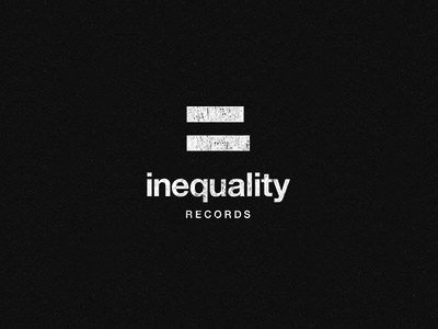
One of my favourite designs, Inequality Records uses an equals size where the bars are of very slightly differing lengths.
Idealabs combines their two brand words “idea” and “labs” by using a mark that both resembles a lightbulb and a beaker.
Above is a beautiful example of a very subtly done logo design – the back of the chair forms the text SIT, by slightly warping the first bar.
Have you found any examples of creative, inspiring and intelligent logos that you think deserve a mention in this roundup? I’d love to hear what you’ve found in the comments!
