
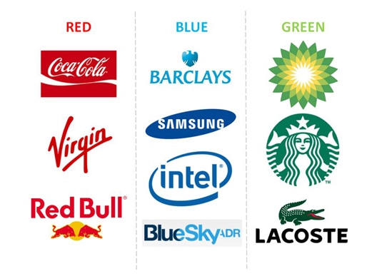
Many companies can easily be recognized by the colors they use to represent their brand. From the UPS brown to the Coca-Cola red, color plays an extremely important role in making a first impression that sticks. Countless hours are put into creating the perfect brand image for any given company, and for good reason.
What Color Says About Your Brand
How to choose a colour scheme for your logo design
What are you saying about your company just from the colors in your branding? Humans are naturally visual creatures, and because of this we rely mainly on sight to make first impressions. So what exactly is your brand telling consumers at first glance?
Depending on the colors used by your brand, your brand might scream energy, or maybe it speaks calmly and reliably. Maybe your brand is forward-thinking and optimistic. Maybe it is modern and cutting-edge. Do you know what a particular company is saying through the colors used in its branding?
Although there might be a few misconceptions about the psychology of color, the colors representing your brand play an integral role in your business. According to the study Impact of Color in Marketing, 62-90% of snap judgments made about a product can be based on just color. The colors used by your brand should always represent the product being sold.
Apple’s logo is sleek and modern, Harley Davidson’s is rugged and bold, and McDonald’s logo is bright and fun. All of these logos are representative of the products they sell and that is no coincidence. When your brand is seen, people should be able to clearly see the personality of your company. If the colors used in your brand aren’t reflective of what you’re selling, it might be time to go back to the drawing board and start reworking your branding efforts.
You can tell quite a bit about a company just by looking at its brand image, but what else makes the coloring so important?
Brand Consistency
12 magically meticulous design style guides

Many companies dive very deeply into the specifics or their brand image. When you think of a brand like Twitter, what colors pop in to mind? Blue, right? But what kind of blue exactly?
Twitter very explicitly lays out instructions on displaying their images in order to keep its brand consistent across all sites and mediums. Here, Twitter covers things such as fonts to use, proper sizing, and the usage of alternate logos when representing their image. They even go as far as to give the specific HEX codes for every color they use in their logo design to make sure their brand is as accurately represented as possible. So if you’re planning on using the blue Twitter logo, be sure that bird is not just blue, but HEX: #55ACEE to be exact.
Why would companies go so far just to make sure their primary colors aren’t just a tiny shade off? Brand consistency. Here are just a few key things that brand consistency will help out with.
- Standing out from the crowd – Your color and messaging should be unique to your business and set you apart from the competition.
- Encourage loyalty – Your brand must me memorable and staying consistent with your brand will keep customers returning and coming back to your product.
- Cut confusion – Using the Twitter example from above, Twitter doesn’t want the potential confusion that comes from the use of multiple variants of logos. Pick an image and stick with it.
Your brand should be readable and recognizable in all possible formats. Whether it be the web, print, or even in places like the back window of a car, be sure that your brand holds up in any medium. Choosing the right color for your business might be a bit tricky, but it is hugely important to any brand. All of these things can either make or break your business, and just a slight change in color can make a huge impact on your company.
Brand Image Done Right

Style Guide Best Practices

We know color is important in brand image, but that is not the only part of the equation to consider. Here is some other advice to help you decide the perfect brand image for you:
- While keeping a consistent brand image is important, don’t be afraid to change up your logo for special events such as the holidays. Companies like Overstock and Google do this, and it helps add personality to your business. Just make sure it fits your already established personality.
- Keep your main colors simple and don’t go overboard. Remember you want your image to be visible at any size, and an overdone logo on a small scale will look clustered and will be difficult to read.
- Research your competitors and take plenty of notes. See what they’re doing right and see how you can apply it to your brand identity, but make sure you can clearly differentiate your brand from the competition.
With these tips, you should have a great brand in no time! Let us know which tricks worked best for you.