
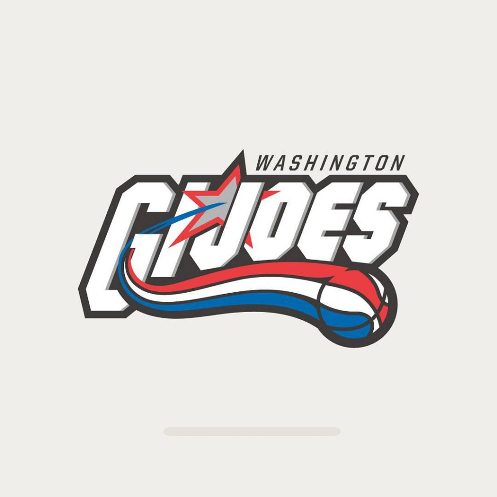
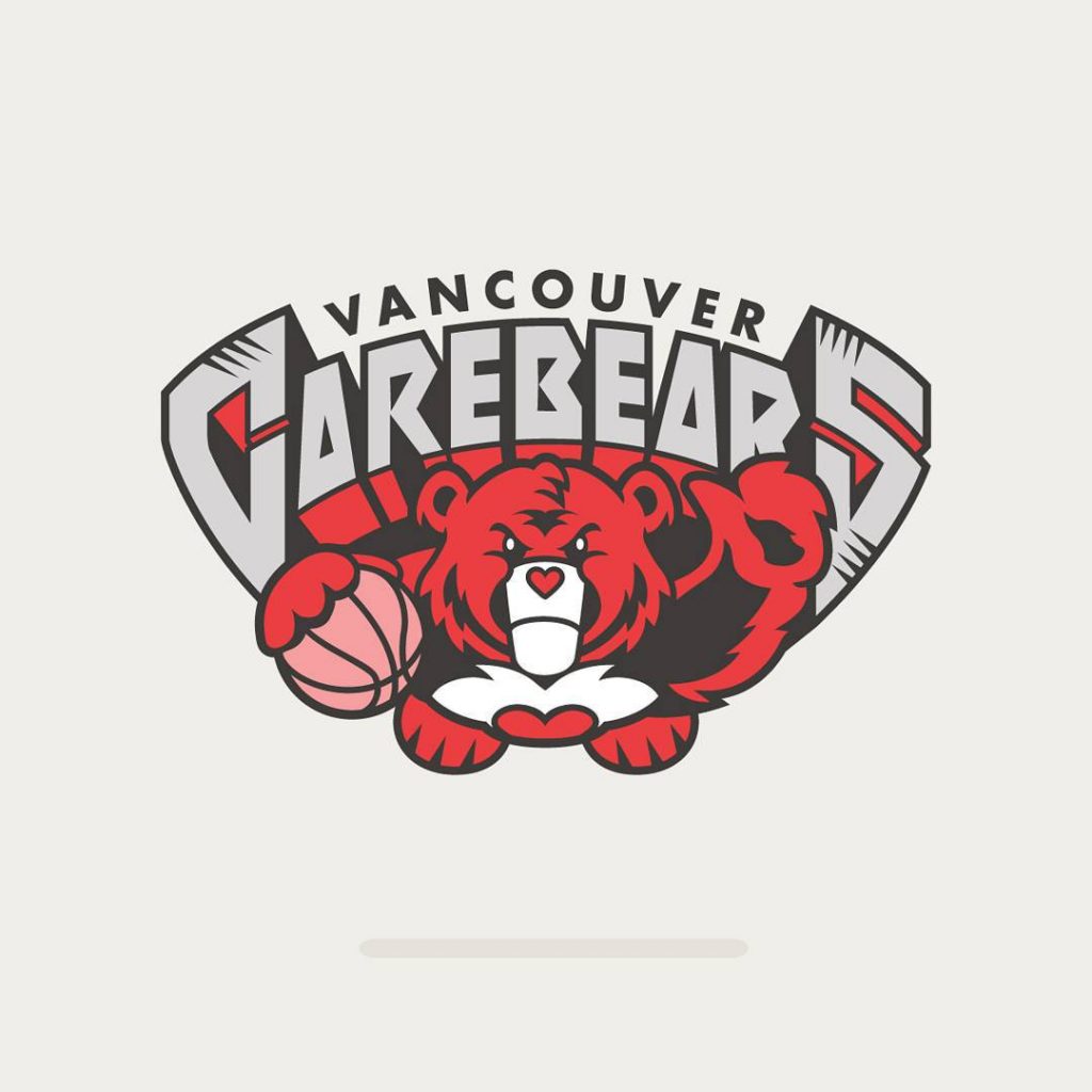
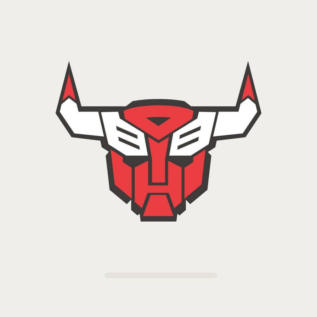
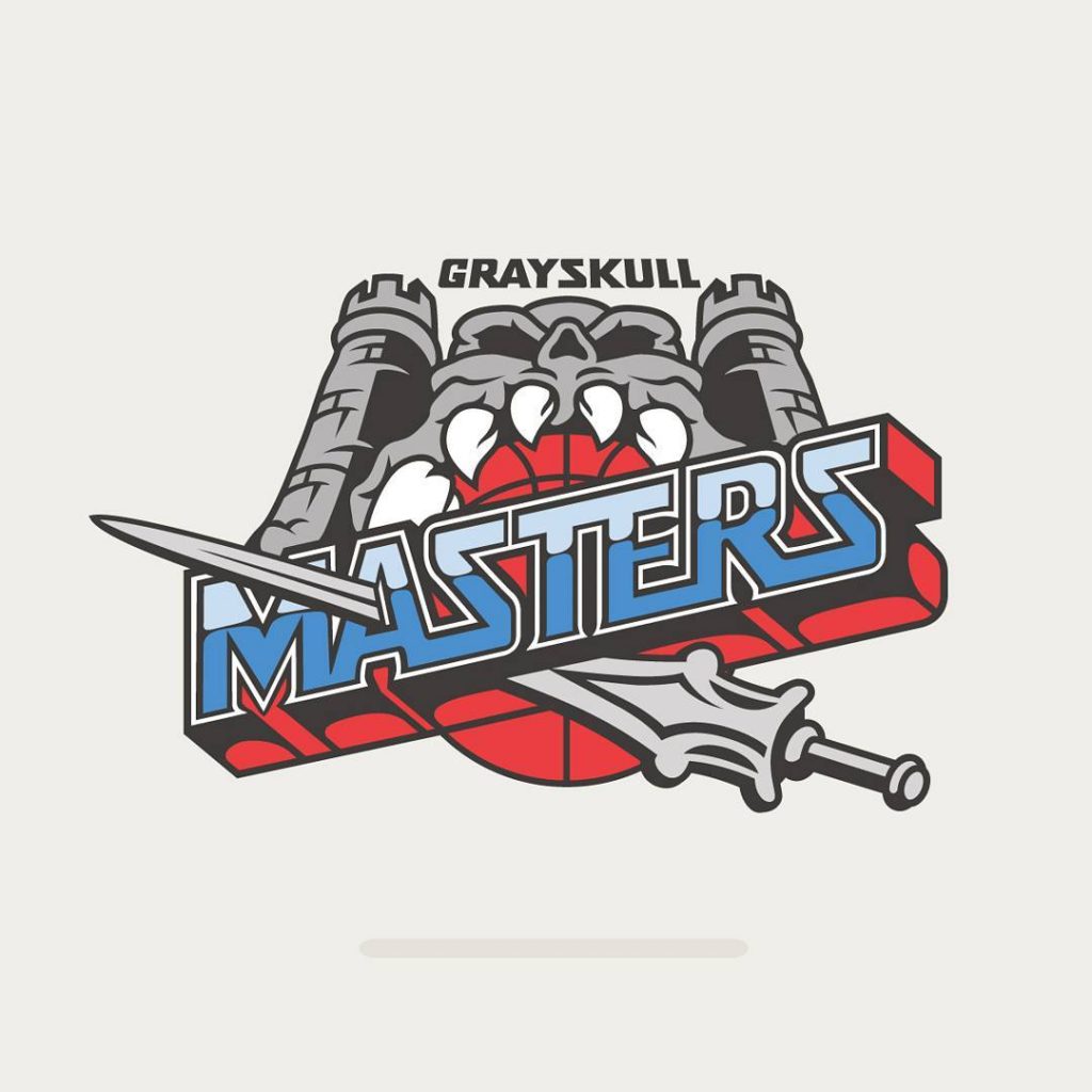
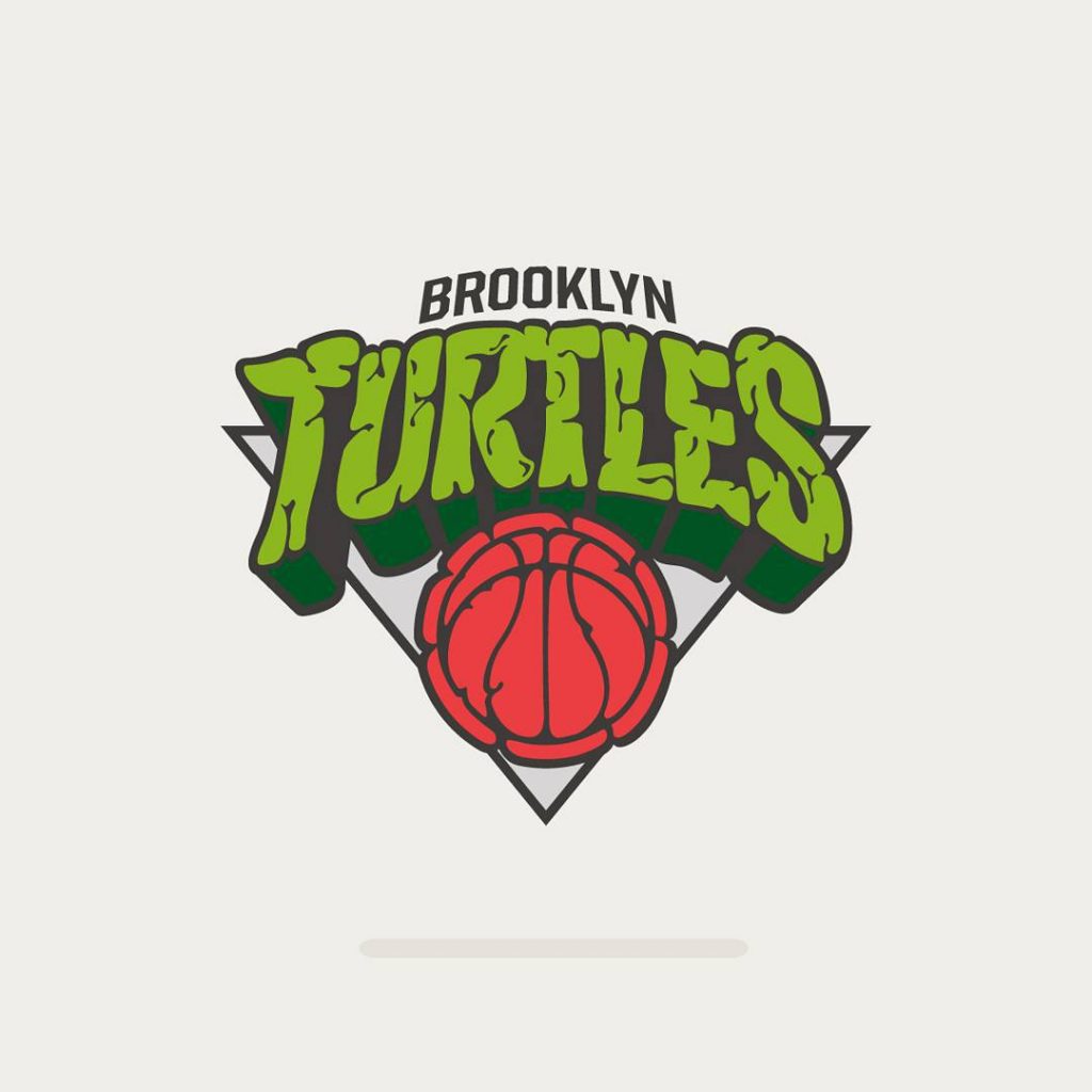
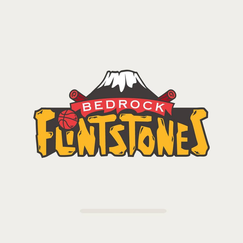
1. NBA Logos Inspired by 80’s Cartoons
Spanish artistic company Vanilla Lab have combined their love of basketball and cartoons to create a selection of NBA emblem redesigns inspired by their favourite shows. The New York Knicks have been transformed with the help of Brooklyn natives the Teenage Mutant Ninja Turtles and the Chicago Bulls have had a Transformer-style rework, in celebration of their victory over the evil Megatron, who tried and failed in his fictional bid to seize the Windy City.
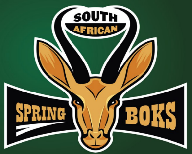
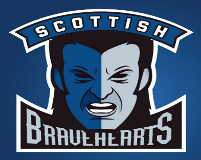
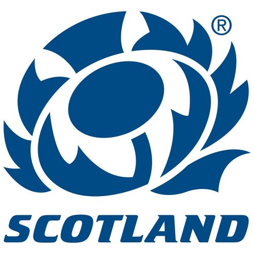
2. International Rugby with an American Twist
Ahead of the 2015 Rugby World Cup in England, BWIN put together an alternative guide to the tournament, which featured a quirky segment where the logos of the nations involved got an American Sports Franchise redesign. Scotland were given a cinematic rebranding as the Braveheart’s, using the iconic film starring Mel Gibson as the source of inspiration, whilst two-time champions South African Spring Boks have undergone a very aesthetically pleasing rework.
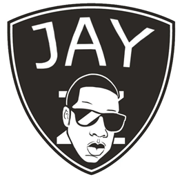
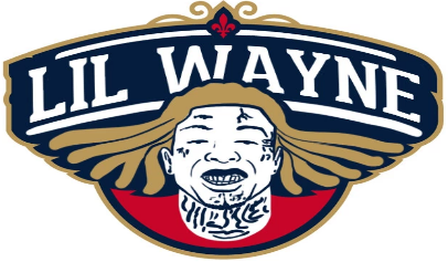
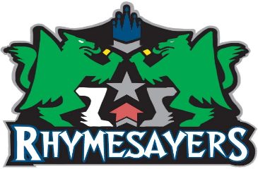
3. Basketball Versus Hip Hop
Hip Hop artists are often pictured following their favourite basketball teams and here we have three artists representing the cities they were born in. Jay Z takes on the New York Nets, Lil Wayne covers the New Orleans Pelicans and the commercial logo of Minnesota collective the Rhymsayers, mashes-up perfectly with the emblem of the Timberwolves. Click here for more NBA & Hip Hop collaborations.
4. American Logos given a European Revamp
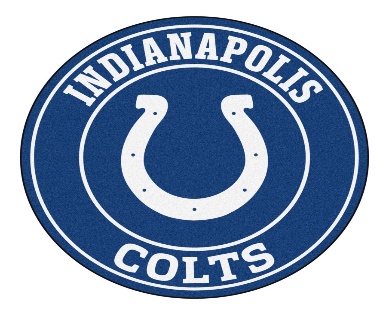
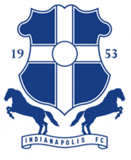
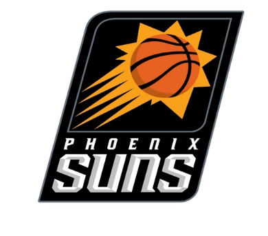
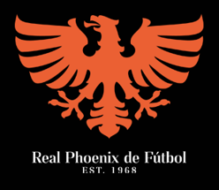
Unlike European soccer teams, American sports rarely feature a team emblem on their jerseys. Serbian designer Milan Vukovic has been working on designs for all the major NBA and NFL sides, giving them a very traditional, soccer-style rework. Here’s what the logos for the Indianapolis Colts and the Phoenix Suns would look like if they plied their trade on the other side of the Atlantic. If you want to see more redesigns like this, then visit Football as Football.
5. The Premier League goes Literal
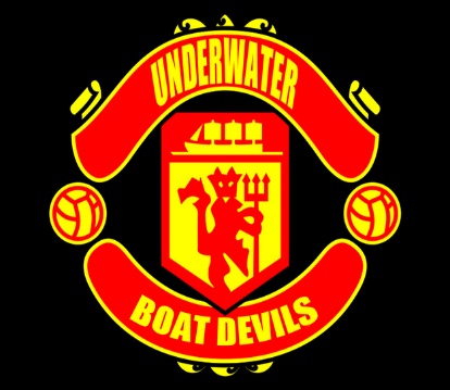
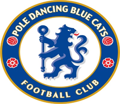
This whimsical, all too literal reworking of English soccer teams crest’s is a classic example of the satirical comedy Britain is synonymous with. Here we see the design of Chelsea’s and Manchester United’s badges summed up perfectly with a new, humorous title. Although this isn’t strictly a redesign, more of a renaming, they’re still very funny. You can find the other 18 comedic reworking’s of English soccer badges here.
6. Winter Is Coming… To the NFL
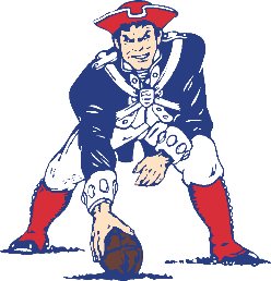
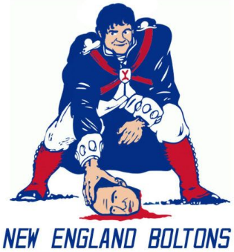
UPROXX and artist Dave Rappoccio have teamed up to combine America’s favourite sport with one of their most watched TV Series, as the NFL collides with Game of Thrones. There are a whole army of logos to look at but this twist on the New England Patriots iconic emblem, featuring the treacherous villain Ramsey Bolton, is a deviously divergent redesign.