Color has always been a crucial part of any design. Every designer that knows how to interact with colors correctly and how to apply them most efficiently will succeed much faster.
Today we want to focus on how colors can affect your brand in general. So let’s say you are at the very beginning of your brand’s identity development. Your next steps should be getting yourself a logo and working on the brand bible that will define how your brand will look overall. You know what deserves your attention at this point? The game of colors that you’re about to participate in.
Do Colors Actually Define Your Brand?
What do you think of when I say ‘Coca-Cola?’. That’s right, you see this giant red sign and become a bit thirsty. The main point here is that colors not only define how your clients see your brand the first time, but also what kind of memories pop in their heads when they hear the name of your company.
Yes, colors actually define your brand. Colors can evoke different emotions and associations in people, and they can be used to create a certain mood or atmosphere. For example, red is often associated with excitement, passion, and danger, while blue is associated with calmness, peace, and trust. When choosing colors for your brand, it’s important to consider the emotions and associations that you want to evoke in your target audience.
Here are some tips for choosing colors for your brand:
- Consider your target audience: What are their age, gender, interests, and lifestyle? What colors do they find appealing?
- Think about your brand’s personality: What kind of mood or atmosphere do you want to create? Do you want to be seen as fun and exciting, or as sophisticated and elegant?
- Use colors consistently: Once you’ve chosen your brand colors, use them consistently across all of your marketing materials, from your website to your social media posts. This will help to create a strong and recognizable brand identity.
Using the right colors can be a powerful way to communicate your brand’s message and connect with your target audience. So take the time to choose colors that are right for you, and use them consistently to create a strong and recognizable brand identity.
The colors used in your brand designs will always define your brand. It doesn’t matter whether you like it or not, some people will love your brand immediately seeing your bright red logo. On the other hand, some of them will hate it cause they have this weird trigger on red color. By all means, don’t use neutral colors just because you’re afraid of scaring someone away, that’s not the best solution here.
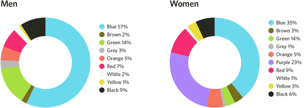
Our psychology is a very complicated thing, but what’s known for sure is that people tend to have different reactions to different colors. Men and women love different colors; reaction even depends on what country you’re from. The last one is confusing, right? But hear me out.
People from the US link the green color to money, right? ‘Spending greens’ will always mean only one thing in this location. However, if you’re from Europe, you link the blue color to the euro bills. This is a quick example of how different we all are, now let’s get back to design.
What Are Some Game of Color Basics?
Entering to the game of color requires you to understand some basics. While there are so many kinds of target audiences for different colors, we want to give you a few quick examples.
Forget about pink being a color for girls and blue being the one for boys. Studies show that both genders just love the blue color more than any other one.

Here are the main colors and their ‘decoding’ in the eyes of your clients:
Red
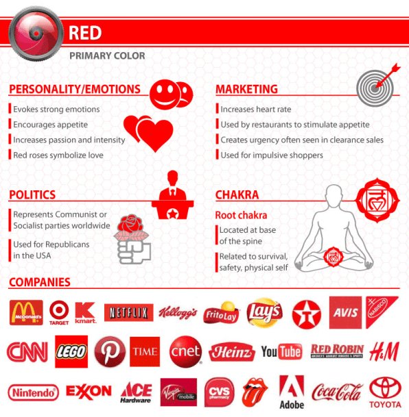
What Your Logo’s Color Says About Your Company (Infographic)

This is about passion, about resonating with your aggressive instincts. This colors will increase make your heart pound faster and breathe more rapidly. It gets your attention, you’re not getting away.
Blue
Represents the security and trust. Companies that use blue in their branding evoke the feeling of having a good friend by your side who knows you well and wants the best for you.
Green
Stands for wealth and health. It’s no surprise people tend to say that you should look at something green when your eyes are too tired.
Purple
![]()
FedEx Is Making All of Its Logos Purple and Orange, Its Most Recognized Color Scheme

Gives you a feel of mystery and sophistication. Some shades of purple can make you think of space adventures and some of them will give a tender touch of royalness.
Yellow
Want to motivate and give a big shot of energy? This one works great for positive messages and greetings. These colors is for giving a sense of warmth and coziness.
Orange
Usually is used to represent something fun, something joyful. This is what you use to reflect life at its fullest and a big dose of excitement.
Brown
Be careful, people tend to link this color to dirt. However, brands associated with nature love to use this one and it does deliver the message of strength and durability.
Black
This one is timeless. It represents strength and usually works great for very… very expensive products since it gives a sophisticated feel.
White
![]()
The Hidden Meanings Behind Famous Logo Colors

It is pure and noble. A very popular choice for health care, but also represents purity and softness.
Review Brands That Use Colors Right on Point
The Psychology of Color: How to Use Colors to Increase Conversion Rate

There are lots of examples out there, but let’s take a quick look at a few websites that have a very simple design yet utilize the colors so well that makes the interaction really pleasant.


Upwork is one of the biggest freelancing platforms. but their logo and brand colors are so on point. What is that you want to get while heading to the freelance job listings? That’s right, you come here for the money. The money is green, as we’ve already discussed earlier, so you automatically link Upwork with tons of money. Millions of job listings are already reviewed in your mind while you fill out the sign-up form. This is so simple, yet so good.
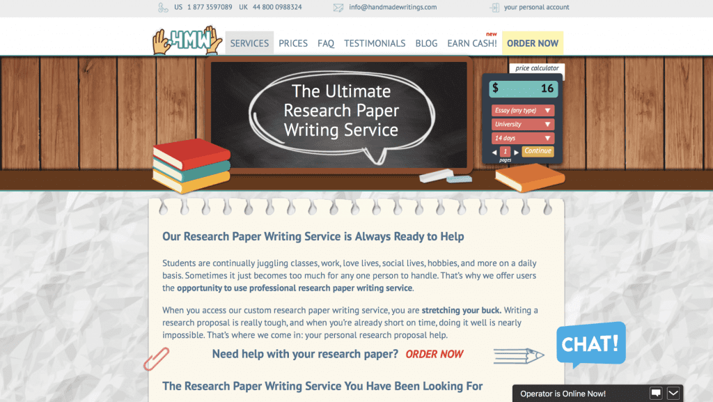

HandmadeWritings – the biggest research paper writing service, while their design may seem a bit old-fashioned, these guys know what they’re doing when it comes to using colors to engage with their visitors.
When you think of a good writer, what do you see? That’s right a good old yellow notebook. That’s why their design utilizes this color in numerous of CTA buttons and blocks.
My list can go long, we can think of New Yorker magazine (where everything is black and solid) or about The Outline magazine where everything is so acid and provocative. The idea is simple: know your customer.
Get Back to the Basics and Know Your Target Audience


Choosing the best colors for your brand is not only about what you love. This is about what your potential clients love.
Jewelry brands should be about sophistication and wealthiness, while a security company should look solid and reliable.
You need to work on defining your target audience and once you know the portrait of a typical client of your business, you may interact with him through colors!