When designing a business card, it’s important to remember that a business card should maximize visual impact and create a lasting impression. Now, that doesn’t mean that a business card should necessarily be aggressive or have a lot of design elements. In fact, some of the best business cards out there are minimal, with simple contrast.
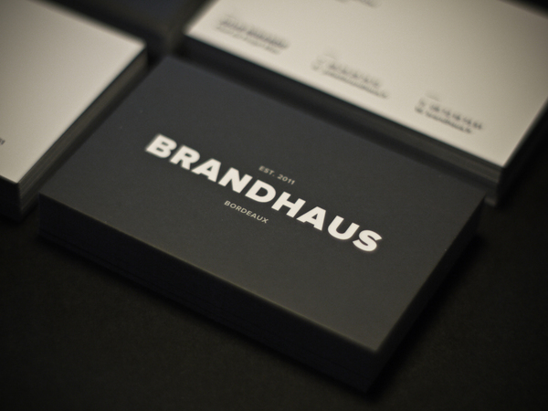
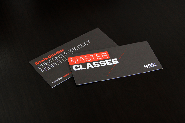
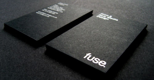
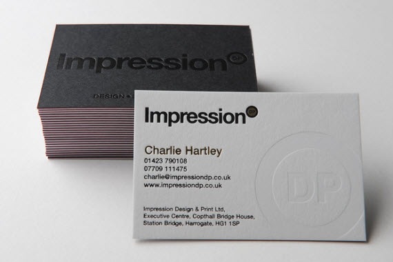
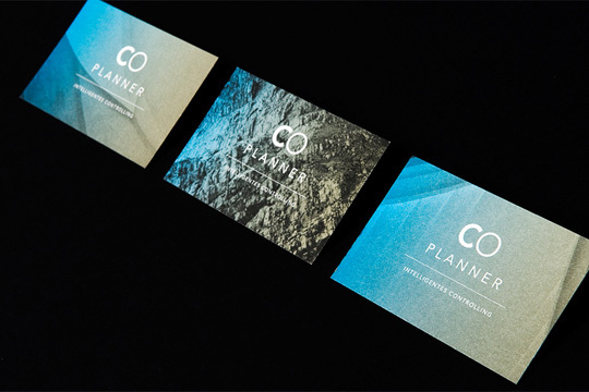
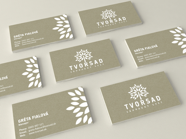
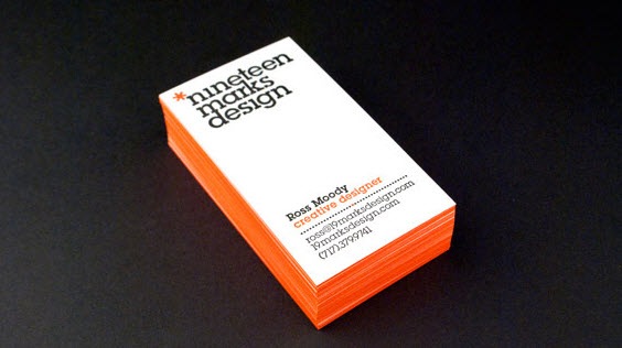
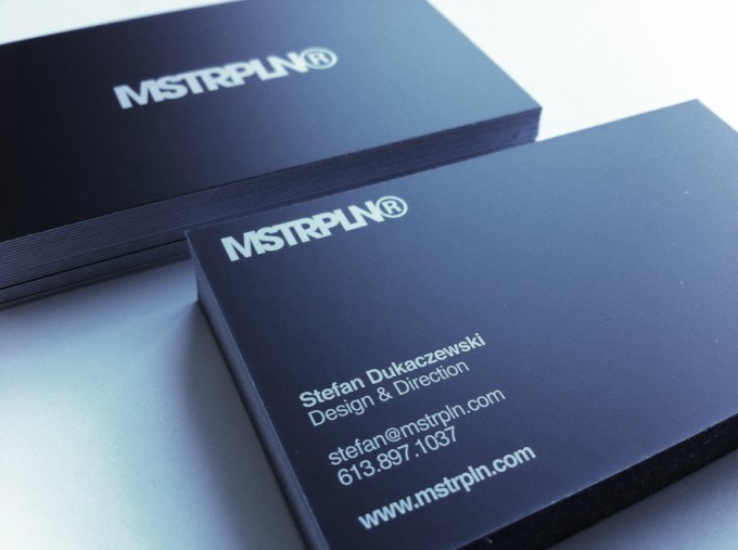
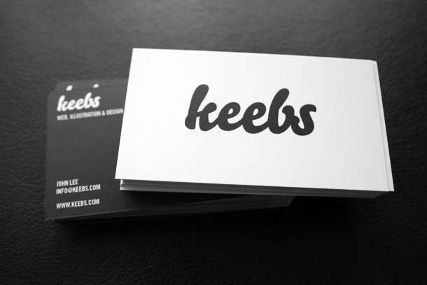
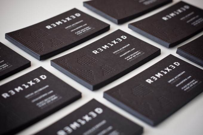
Using big, bold typography is one way to catch the viewer’s eye. Plus, not only does bold graphic typography catch the eye of business card recipients, but it also compliments the minimal business card style.
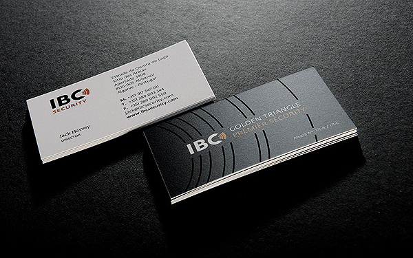
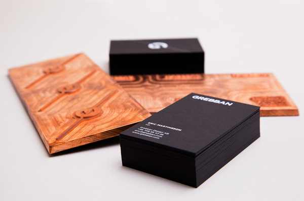
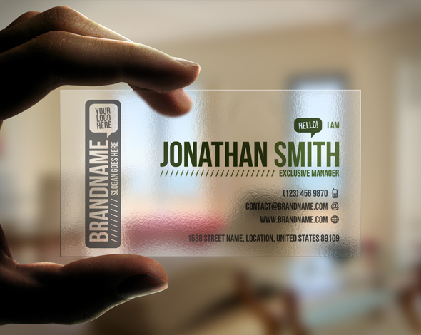
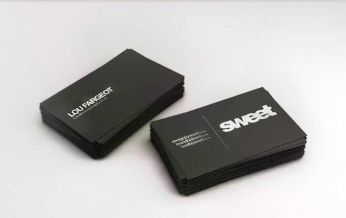
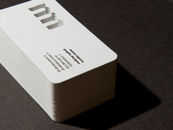
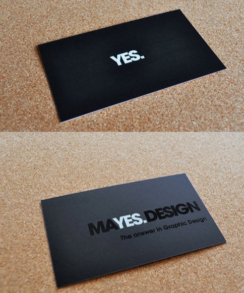
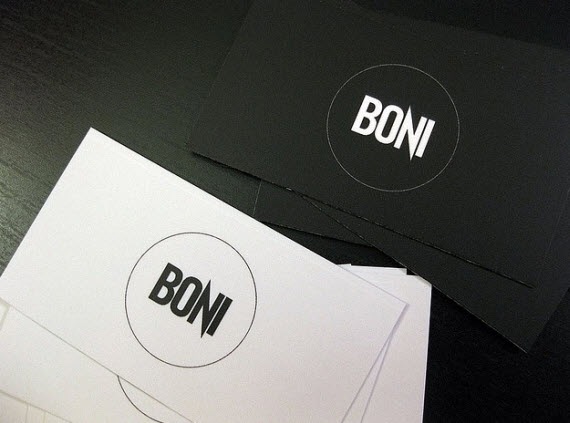
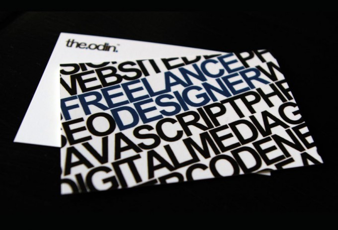
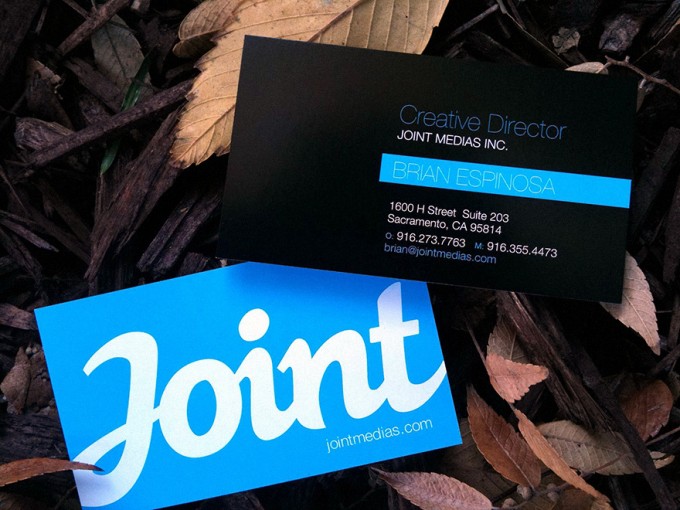
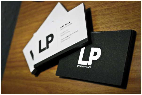
Here’s some examples of business cards with big, bold typographic design:


You like this? Don’t forget to follow us on twitter @andysowards and like us on facebook @andysowardsfan! We are also on that Google Plus & Pinterest thing.