Color plays an essential role in how we perceive a company or a brand. When you think of the golden arches from McDonalds, what feelings first come to mind? Now imagine those bright golden arches as a deep shade of blue. Would your feelings about the company change at all? Most would say yes.
Companies of all sizes are well aware of this and use color to their advantage when expressing their brand. Picking the proper color to represent your brand is very important for getting the right message across to potential customers. Understanding what a particular color says about a company is very important, and is something that can make-or-break any brand looking to get noticed.
Using Color to Get Across a Message
![]()
What the Color of Your Logo Says About Your Brand Also, how much some famous logos cost to design

Color is a very powerful thing—more than people would believe. The correct use of color is extremely vital to creating a positive image for your brand. Colors have the ability to convey messages and also play a large role in memory recall. While certain colors symbolize different emotions in foreign cultures and other parts of the world, in the US certain colors have a few universal meanings that most people can agree on.
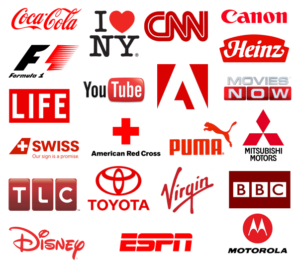

Red – A color used by some very powerful companies including Coca-Cola and Richard Branson’s Virgin Group, red represents passion and power. It implies a sense of urgency and excitement, which is why red has been linked as popular color for sports cars. When coupled with a dark color like black, it can be used to show aggression and anger.
![]()

Blue – Blue is one of the most universally adored colors across all demographic barriers. Many suggest that blue represents trust, integrity, and stability. Companies like Walmart and Lowes use this to their advantage when trying to portray themselves as reliable and trustworthy. However, using the wrong shade of blue could portray your company as cold or unapproachable.
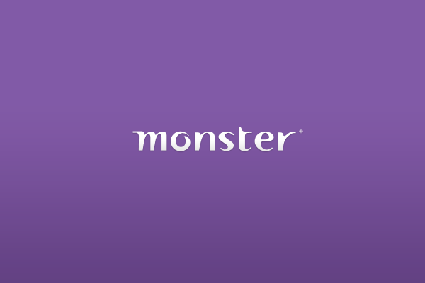

Purple – The color purple has quite an interesting history. Purple fabric used to be extremely rare as access to purple dye was very hard to come by. Only those in positions of power were able to afford to wear purple items. Because of this, purple is now associated with royalty, luxury, and extravagance.
![]()
Examples of Elegant Black & White Logos

Black – Just like purple, black is seen as a color of luxury. When your brand is trying to communicate exclusivity, power, and extravagance, black should be a top color of choice. Black works perfectly with companies like Mercedes that sell expensive products.
Green – Green represents sustainability, nature, and growth. Naturally, companies that use outdoor products such as John Deere will use green are their primary color. Many companies with an emphasis being eco-friendly like to emphasize bright shades of green in their branding. If green seems to be the best color for your brand, be sure not to go too dark with it, or your brand may come off as sickly and off-putting.
Yellow – Brands that predominately use the color yellow are usually trying to convey a message of happiness and friendliness. Yellow is also one of the most visible color in daylight, and it tends to be warming and inviting. Many fast food chains use yellow in their branding because it leads to a sense of urgency when eating which leads to a fast customer turnover rate, hence the name “fast food.” Yellow will catch the eye quicker than any other color, but make sure to use it sparingly as it can also be overwhelming in large amounts.
Brown – Brown is seen by most as the color of dependability and reliability. Companies like UPS use brown to get across their stable and trustworthy image to customers. Be careful though if you’re considering choosing brown as your primary color for branding. If it’s used incorrectly it can be seen as dirty and unclean. To make things even more difficult, brown is seen as one of the least liked colors.
The relationship between color and psychology is an often overlooked aspect of branding that has the ability to persuade costumers on a subliminal level. It is a fascinating subject that can really make or break any company’s branding efforts.
Using Colors to Your Advantage

How to master colour theory

Knowing what certain colors represent is one thing, but knowing how to apply them to improve your brand image is another.
Picking a color to represent your brand is much more than just picking an industry favorite color scheme. Research your target demographic and choose a color based on your findings — but don’t simply pick a color and be done with it. Tweak the shade of your chosen color and see how it affects what it communicates about your company.
A cool tone might describe your company as relaxed and laid back, while warm colors could describe your brand as exciting and energetic. A different shade of a particular color could mean the difference between a brand that stands out from the crowd and a brand that fades into obscurity.
Finding the right color to represent a business will decide how consumers will interpret your brand. Of course color isn’t the ultimate decider for a company’s success, but it is still incredibly important to represent your brand in the best possible light with the best possible colors. How important do you feel colors are in a company’s branding efforts, and what colors resonate best with you? Be sure to let us know!