The design of a website says a lot about what your company has to offer. Going for the gorgeous look is one thing, but functionality is still the priority. The user interface of a website has to meet certain expectations on multiple devices. Web design and development services can ease you into the entire process. To get a better grasp of what makes a great design, follow these nine rules.
9. Start With An Idea
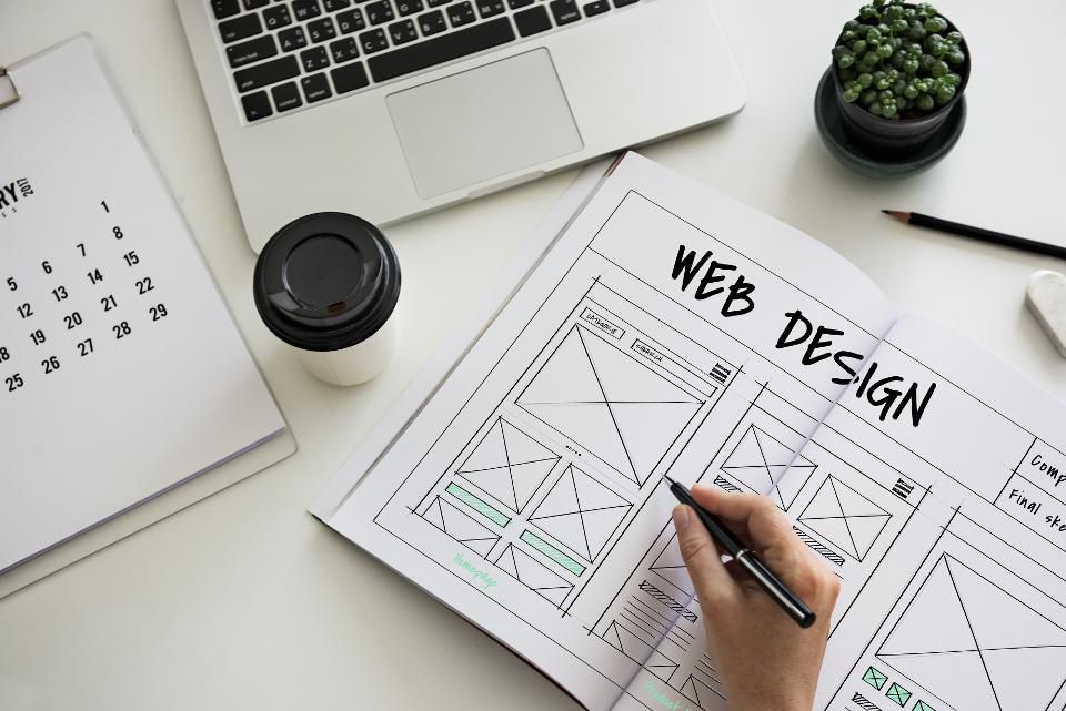
There should be a lot of layers to your design ideas. The rough sketch is not meant to iron out all the flaws, but instead is used to introduce possibilities. What starts out as a media rich interface may end up being optimized for text. You may find that it relays the information on the interface much better with this method.
And what starts out as a simple design may turn into an elaborate maze of media. It’s so intricate in the way it presents media that consumers can’t stop browsing the interface. Your rough sketch will give you the roadmap that lays out the foundation of your design. By starting with an idea, you gain more control over the finished product. There is big difference in quality when the design is rushed. The interface of a design that spends tons of time in the idea phase will prove to be the one that is the most useful.
If you work with a design agency, make sure that you find one that is receptive to your requirements. The best UI design agencies aren’t only good at executing plans – they exert as much effort in primarily translating your vision into a concrete UI/UX design concept.
8. Load Speed Is More Valuable Than Design

Why Site Speed & Design Can Make Or Break Your Google Ranking
Everyone wants to make the biggest spectacle possible with an interface. Flashy isn’t always better, and in many cases will create some serious loading problems. Media and other interactive features of a design is usually controlled by plugins and scripts. When one of these malfunctions, they can even be flagged as a virus. Companies should always make sure that there are no errors with a design, especially from scripts that load in the background.
Search engines will consider blocking a website if it proves to be too problematic. Pre-launch testing will get rid of the most serious bugs, but sometimes real-world testing will be the most important stat. Pay attention to load times and make sure that they are optimal for the page size. When a page takes too long to load, users will either refresh or move on to a new website. Interactivity should never come at the cost of speed. Nothing is wrong with extra features, but be mindful of webpage bloat.
7. Is It Optimized For Mobile?
Making the design mobile compatible is not mandatory, but is guaranteed to improve business. Every person with a phone that has access to the internet is a potential mobile consumer. Now with that large figure in mind, factor in the number of users on tablets. That is an entire section of its own in millions, and doesn’t even include the amount of people that still use netbooks. There are many long-standing businesses that still issue netbooks to their workers. The market for netbooks is smaller, yet it is still worth mentioning when optimizing for mobile.
Growing hardware expectations for video game consoles has also led to browsers being included with each software revision. All major consoles now ship with a functional browser, and that includes portable models. Add this to another set of people that can be loyal customers. Different screen sizes allows your design to be shown in its best state. With mobile options, users can see everything on screen in a format that makes sense.
6. Humans Are Visual Creatures

Visual perception in user experience design
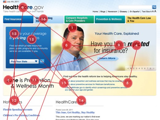
Eye candy is a real thing when you’re dealing with interactive design. It’s not just shiny and colorful things, but the placement of your text and media that makes a difference. This is known as the visual hierarchy, and it governs how attention grabbing a page is. Too much information in one spot makes things messy for any visitor. The idea is to put information in the most obvious places without disorientating the reader.
Getting the attention of the visitor isn’t the same as keeping their attention. An interactive design needs to persuade the user to explore a website. Not only should they look for information, but it needs to entice their natural curiosity. Every design is limited by the story it wants to tell the world. When your visual elements are in order, natural curiosity will always take over. This is another area where page stats can show what portions of the design are the most appealing. Pay attention to how long users stay on one page versus another when considering design changes.
5. Spend Time On The Headline
The headline of a design is a minor addition that can have a big impact. The most notable is when they are used correctly on designs that offer a service. Headlines or subheads draws attention to the most important parts of a page. It is the simplest way to engage users without putting a lot of focus on the visual elements. Think of it as being the least interactive part of a design, but one that can decide whether a visitor skims or reads a page.
A missed opportunity with the headline can lead to hours of wasted work on an interactive design. Does your headline fit with the rest of the optimized parts of the webpage? And has it been proofed for spelling, grammatical and spacing errors? These are all things you should be checking before and after creating a headline. A descriptive headline is a vital part of an interactive design that wants to draw in the user.
4. Understand The Fold
The fold is what users see before scrolling down the rest of the page. Every good webmaster understands the fold and how it impacts a visitor’s experience. Interactive designs that include a call to action must be aware of the fold. Spending hours on a message to have it cut off due to poor spacing is bad design. Clicks and retention rate are improved when the fold is followed. But even when the rules are followed, there are other concerns that can ruin the design.
A page that isn’t optimized for multiple devices and screen sizes will change your spacing. This is especially frustrating when your message is carefully crafted from the first to the last word. Personal user settings can also make text get cut off and force a scroll in unintended areas. You can prevent the screen size issue by implementing mobile versions of the page that work on multiple devices. Although you can’t do anything about personal user preferences, it is still better to fix the things that you’re in full control of.
If your business relies on CTA’s, consider making multiple versions of the same message. It will come in handy when you need to revise specific pages in your design.
3. Manage Information
Information heavy designs will always have to sort through spacing issues. A good rule of thumb is to use tall scrolling pages when there is a lot of data to go through. As an example, user agreements work best on tall scrolling pages. The default would usually be an embedded adobe format document. Many companies offer the document as an alternative download and instead present the full information on the page. You can do a lot with this type of page if you’re willing to load a few light plugins. Remember that interactivity comes in all forms, and a page with easy to use scrolling buttons is one of them.
2. Simplicity Is Still King

Origami can make UI/UX designers better
Sometimes you have plenty to say and not enough screen real estate to put it on. Instead of trying to fit your entire message onto one page, space it out over several pages. Another option would be to trim the fat and make it an easier read. Consider breaking up information into more digestible pieces. At the same time, you can add summaries to specific pages and add link to read more. This is a great way to gauge interest products, services and resources.
1. Always Strive For Compatibility

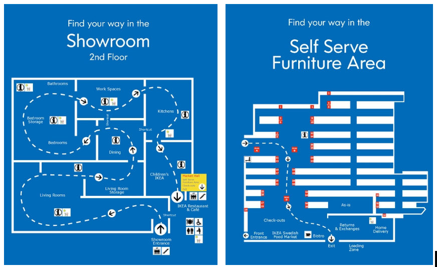
Searchers and Browsers: the Personality Types of UX
Page standards exist for a reason, and should not be ignored. Unusual layouts will make it harder for visitors to get your information. By ignoring too many of these standards, your interactive design gets wasted. There are some web browsers that will automatically change the layout of a page if certain conditions are not met. Doing so makes text and images intelligible, and sometimes they end up on top of each other. Visitors don’t want to deal with this headache, and will usually just click away from the page.
Also, when using script and plugin heavy designs, be aware of outdated versions. Always keep your design up to date and following the latest standards.
Wrap Up
There are no shortcuts to optimizing the user experience through solid design. Getting it right is worth the effort, especially if it improves the company image. You don’t get unlimited chances to make the design perfect, so get it right the first time. A good user interface will go a long way in making a website accessible.


