For people who do not have an eye for design, it can be tricky figuring out what will attract visitors to your site and what won’t. The key is to attracting visitors to your site is creating a website with a professional, clean look. Use these 7 tips to design a clean, functional, and conversion-worthy site.
1. User-Friendly Navigation
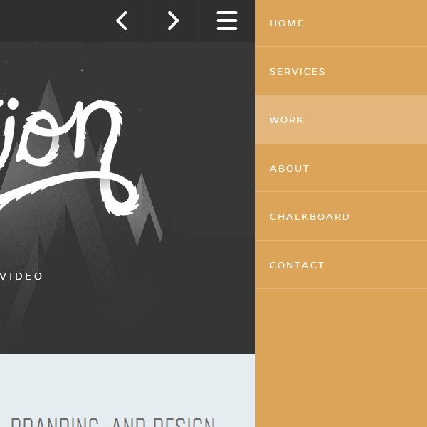
40 Beautiful and Effective Responsive Navigation Menus
For user friendly navigation, you want to make sure that you do not have too many pages or subpages. This gets confusing for visitors, which will eventually lead to them leaving your site. You want visitors to easily find the menu bar on the page, and to be able to move through pages easily.
You’ll want to avoid crazy designs, borders, locations and texts when it comes to customizing your menu bar. Most importantly, be sure your menu bar is placed inside the header along with your title, so that it appears on every page.
2. Minimal Features on Homepage
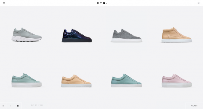
20 websites that use minimalism beautifully
First impressions are everything. Even though we like to say you shouldn’t judge a book by it’s cover, web users definitely throw this ideology out the window and won’t spend more than 2 seconds on a site with an ugly homepage. The last thing you want is your visitors to feel overwhelmed when they visit your site. To avoid this, you want to approach your homepage with a minimalist mindset. Only include the essentials on your homepage.
Don’t crowd your sidebars with advertisements or self promotions. You want to build trust with your visitors, and immediately exploiting them with advertisements isn’t the best way to do that.
3. High-Quality and Properly Edited Photos
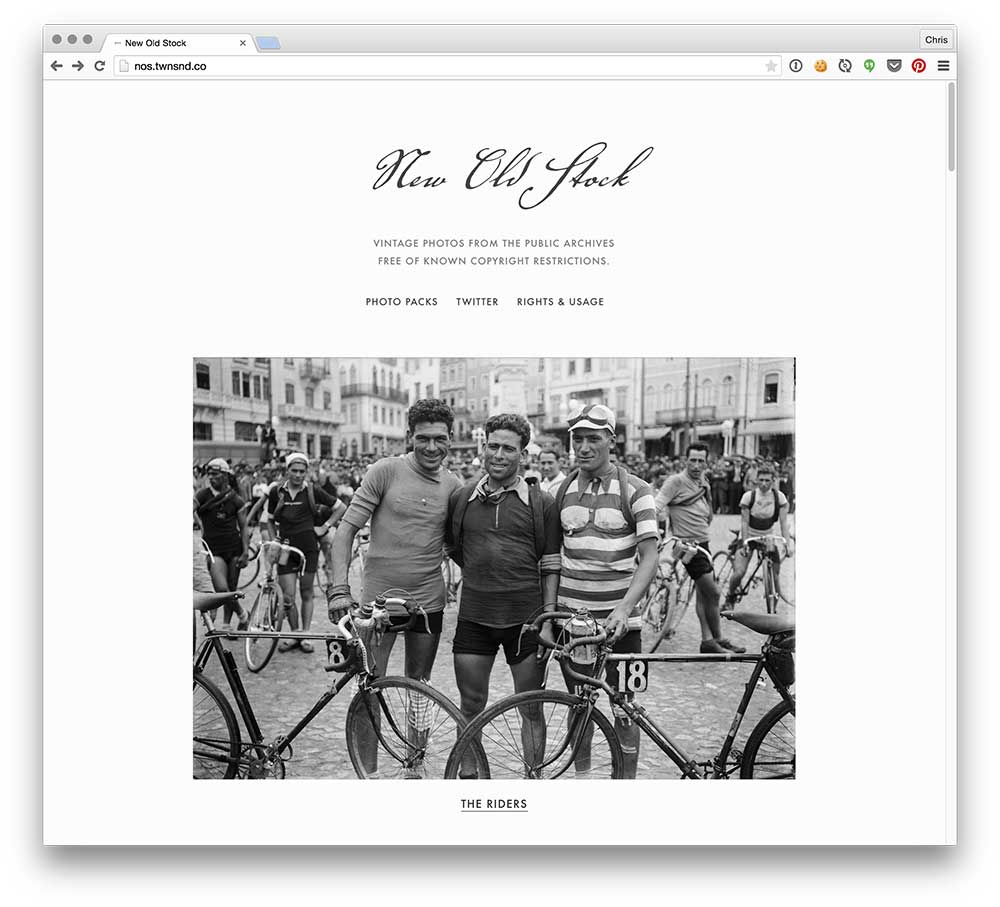
Sites with High Quality Photos You Can Use for Free
When it comes to priorities for your website, high quality photos should be at the top of your list. I like to suggest that you save money during your website build by doing most things yourself. But, you should always splurge on a good photographer. Pictures are what convey the most emotion, depict the clearest image of what your business is about and essentially pulls the whole site together.
You could have the greatest content ever, but no one will look at it if your photos aren’t captivating. Avoid Google photos and use sites like Unsplash and Pexels when looking for stock photos. These websites provide free, professional stock photos at your fingertips and will never having you searching through google for a stock photo ever again.
4. Pay Attention to Detail
12 huge web design trends for 2018
Details, details, details. Never forget the details. Make sure your texts are aligned properly, your photos are in the right places, and always triple check any text on your site before publishing.
Something people always forget to customize are those “Read More” and “Click Here” buttons. If you don’t customize them, most buttons will look like they are from 2006. Create a button without a border, with a black, thin font and a white background. There are too many buttons out there with chunky borders, weird shapes, and outdated text. Don’t be one of those people!
5. Don’t Ignore Your Mobile Site

Using Media Queries For Responsive Design In 2018
People often forget about their mobile site during the web design process. It’s important you pay just as much attention to your mobile site (if not more) as you do with the desktop version. That is where more than half of your traffic will come from.
Most all drop and drag website builder will automatically design the mobile version of your site as you go – but often times, you will need to tweak a few things to make sure things are proportional and properly arranged. Run consistent site audits to ensure that your website is optimized for mobile use.
6. Make Room for White Space

Whitespace in Web Design: What It Is and Why You Should Use It
Don’t be afraid to include white space on your website. In fact, I would recommend you have more. White space gives your website a spacious, open feeling. If you have a lot of content and paragraph style text, be sure to include plenty of white space to compromise it. If you included a bunch of adds with a bunch or text and a bunch of pictures, it will look extremely disorganized. Don’t feel like you have to cover every inch with ad space or text. If you want your website to look clean, white space is your best friend.
7. Have A Consistent Design
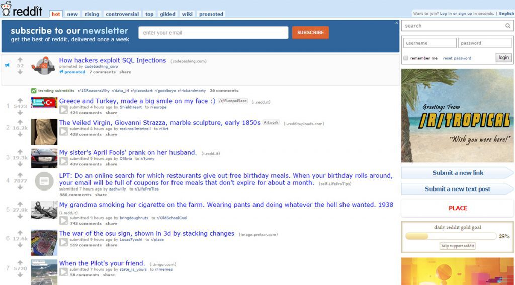
How To Apply Consistency in Web Design
Make sure your site as a uniform look. Pick a theme and stick with it. It sounds like it will make your site boring, but trust me – humans love consistency. To ensure you have a consistent, make sure your color schemes are used properly, make sure your headings are all the same font and your paragraph text is all the same font. Be sure your photos go together. If you took your photos and laid them out on a table out in front of you – would they tell a story? If so, you nailed it.
Having consistent themes and patterns throughout your site is not only pleasant for the eye to look at it, but it will attract more visitors and keep your site running smoothly. If you’re a novice starting out on a WordPress site, look for page builder plugins and templates themes that can simplify the design process. If you’re a Shopify user, search the marketplace for tools that can simplify the process.
The big picture? Keep it simple. You can always expand on your website as time goes on, but you can’t always clean up a giant coding mess once you’ve created it.


