Data visualization is an essential element for you to improve the overall design of your website. Among all the other techniques that one can apply on their website, data visualization proves to be one of the most effective for the simple reason that humans are very visual beings. By this, it means that they can quickly grasp and retain information through images. Then, there’s also a higher chance that visitors will enjoy coming back to your website because the content is broken up into visuals.
These images and videos do have a significant impact on the performance and ranking of your site. More than anything else, they help ensure that visitors will have a pleasant experience while navigating your website.
That said, here are some tips for you to apply in the pursuit of enhancing data visualization on your website:
1. Use Data Visualization Tools

Creating data visualizations isn’t always going to be easy. It’s expected that you will encounter some challenges, in one way or another. Especially if you aren’t well versed, and you’ve got to create it from scratch, you may end up confused about what you should do.
Thankfully, in today’s day and age, there are many data visualization tools to utilize that can help you along these lines. These provide a more natural way for your entire team to create visual representations of large sets of data. Rather than going through a manual process of creating the data, you can now go through an automated process.
In choosing from among the many data visualization tools, do factor in the following aspects that it should possess:
- It should be easy to use.
- It should have excellent documentation and tutorial abilities that feel intuitive to the user.
- It should have the ability to handle large sets of data.
- It should be able to produce an output of an array of map types, charts, and graphs.
- Its price should be justified by good value, excellent features, and great support.
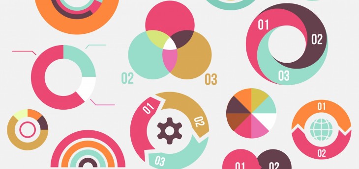
2. Focus On Infographics
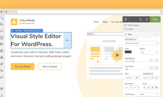
The 14 best data visualization tools
Infographics may seem like a fundamental factor. But from the perspective of the website designers or developers, this is one of the best and fail proof ways for you to offer information to your viewers. It’s also one of the most commonly used data visualization examples. Instead of rattling on through a lot of statistics, they can be better grasped with photos.
The best way to go about working on Infographics is to take the statistics that highlight specific topics, and then show them all in picture form. By doing this, you’re providing convenience to your website visitors, whereby it’s easier for them to digest large and sometimes complicated information. This is definitely easier said than done, so you might think about consulting a web design company to provide visual guidelines.
3. Apply The Data Visualization Technology Stack
If you wish to come up with accurate data visualization, your team needs to go back to basics. This means applying the data visualization technology stack that’s pertinent.
This would include the following:
- Data analysis, which includes data modeling and data cleaning
- Basic mathematics, including geometric algorithm and trigonometric function
- Visual basis, encompassing graphical interaction and visual coding
- Graphics, along with graph theory and computational graphics
- Design aesthetics, which includes design principles and cognition
4. Optimize Data Visualization For Mobile Use
Many users today are browsing the Internet from their mobile phones. Hence, this is a population for you not to miss out on, also when going about with your website design. For your visuals to be effective, they should ideally be delivered through a mobile phone interface. So you should be creating visuals that can adapt to smaller screens as well. Else, they could end up too small or distorted, which makes reading through them a challenge.
Have these guidelines in mind, as you optimize visuals for mobile use:
- Design your visuals so that they’re capable of being viewed on multiple resolutions
- Keep your files small
- Optimize the colors that you choose for your graphics
5. Learn The Differences Between The Basic Charts And Tables
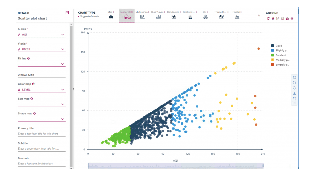
Identify patterns, relationships, and connections using data visualization
Before going for more complicated means of creating visuals, it helps to start on the primary forms of graphics. These are your charts and tables. While simple, they can do no wrong in terms of effectiveness in getting the message across. Plus, you’re also making it easier for your audience to comprehend the information that you’re trying to put across.
These are some of the general forms of charts and tables for you to master:
- Area graphs, which are the easiest way to track changes in information for one or more groups
- Line graphs show the different changes over time for one or more groups
- Bar graphs, which work for comparing different groups, or substantial changes over a specified period
Here Are Good Reasons For You To Prioritize Data Visualization
In closing, it’s worthwhile to discuss the benefits of data visualization, now that you already know the tips provided add up to the benefits you’re going to receive. That way, you’ll convince yourself further that you should, indeed, apply these data visualization tips.
- Data visualization triggers a positive change on your website. This is achieved through the use of dynamic charts, as these show information regarding the percentage of qualified leads that convert into deals, and where they are coming from. As a result, better marketing campaigns can also be created.
- Data visualization results in better memory and recall in the minds of your viewers. For this purpose, your website is better equipped to create the campaigns and attract sources that bring in the most effective benefits to your site.
- Data visualization creates faster effects on your site. With dashboards, for instance, you’re better able to visualize the lead pipeline and the current deals that are in progress.
Conclusion
You may have heard the all-too-familiar phrase that a picture is worth a thousand words. In truth, it is. Beyond just the social functions of pictures, in the world of business there’s so much that you can achieve from photos. Data can be put into words, but sometimes even this can be confusing to understand. Then, there are also those individuals who prefer to browse through images, as it relieves their boredom. With the pointers enumerated above, now it won’t seem too complicated or overwhelming for you to come up with the best ways of enhancing the data visualization on your website. All you have to do is start applying these tips today.