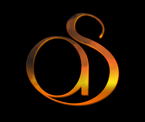

In case you are looking for some AS logo design inspiration….
There it is! The new logo for AndySowards.com! Some of you may have already seen this if you follow me on twitter (@andysowards). I was toying with a few designs before that some of my friends on twitter helped provide some feedback on. Now that the redesign is getting ever so closer to launching I figured I would unveil the new logo officially to the world. My Inspiration for this logo was to start off the redesign process with a new, sleek and clean look, and I think that this logo embodies all of that and will mesh well with the site feel that I am creating. Hope you like it! Let me know what you think in the comments below! Any feedback is welcome! 🙂 Hope you are excited to see the new site when it is ready!


Nice! You can stare at it for a while admiring the shape… 🙂
I like the form of the new logo, Andy. My only comment is that the curve at the top of the “S” seems to drop off too quickly.
Great new logo. I like it a lot.
That’s nice. I like the flow of the font.
Looks really nice mate, its nice how the letters transition from one to the other, gives it a natural looking effect, looking forward to the full redesign!
Looking good holmes! Its definitely sleek and nice contrast off of the black bg.
I like it Andy, did you use a specific font for the A and S or did you draw it custom?
Looking forward to the re-design (I’ve been anxious to see it for a while now, damn you!), all the best with Andy!
Thanks guys! I appreciate it!!
This is a test to see if I have trouble commenting on your site. BTW, cool new logo! 🙂
I really like the movement that shape makes. Go, Go Andy Go!