With an objective to serve the web development community in the best possible way, Adobe has been providing developers with the best tools and services that help them design high-quality responsive websites. Having pioneered the development of some the best software and tools to date, Adobe has been striving to elevate web standards by providing next-gen creative tools. From Photoshop to Illustrator, from Flash to Edge Web Fonts, Adobe has a proven track record of providing creative software. Recently, Adobe added a new tool to its existing lineup of creative web design tools. The new tool is called Edge Reflow and it assists developers in designing responsive websites.

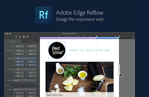
The primary objective of the tool is to help designers create websites that can be viewed on multiple platforms. The key features of the tool include responsive design capabilities for viewing on different devices, CSS 3 styling capabilities for customization, latest sharing functionalities, and easy previewing of page content. Offered as part of Edge Tools & Services, Reflow was first launched in September 2012 and is now perfected and provided to the web design community. The tool is available through a Creative Cloud subscription. Now let’s analyze the key features of the ReFlow tool.
Introduction to Adobe Edge Reflow
Introducing Adobe Edge Reflow (Preview)
-
Supports Flexible Designing: Developers can resize the design layout and check how it appears on different viewing platforms. The tool allows developers to easily select between desktop and mobile first designing.
-
Provides Multiple Background Layers & Drop Shadows: Developers can select different colors and gradients to apply to the images in the website. This lets them create attractive visuals that are suited for the latest high-resolution devices and systems. In terms of shadows, developers can create inset and outset type of drop shadows, both of which can be modified later.
-
Fully Customizable Styles: Developers are provided complete access to CSS specifications, which allows them to create their own desired border styles. Developers can make the most of the flexible grid system to modify any type of media query breakpoints so as to alter the gutter width and column count. In addition, developers can arbitrarily declare media query breakpoints to personalize designs to suit various screen sizes.
-
Easy Previewing & Sharing Options: With the tool, developers can preview and share website designs right from their browser. In addition, they can also extract the CSS codes used in development.
-
Other Notable Features: With much needed changes made to the Edge Code Preview, developers now get to see a live preview of the website. This feature works for HTML 5 developers working with HTML, CSS, and JavaScript. There is also a quick edit feature that lets developers modify on-page content without having to switch between documents. Developers can enhance their productivity using the code hinting feature for CSS and HTML.
Introduction to Reflow
The bottom line is that the Adobe Reflow software is an effective web design tool that lets web designers dynamically modify site design to fit different screens. The tool is most effective when used along with other Edge Tools & Services.