![]()
Driving visitors to a B2B website is not an easy task and several B2B marketers spend tons of money on promoting their websites. Some use traditional marketing tactics for promotion, but such strategies aren’t very effective.
To get maximum benefits from your B2B website and gain a competitive advantage, it is essential that you plan a road map for success. To give direction to your efforts, we have mentioned a few tips to improve the usability of your B2B website. These tips will help you achieve the maximum potential for your website, giving you the highest return on your marketing investments.
Understand Prospect’s Mindset

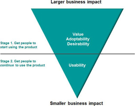
More Than Usability: The Four Elements of User Experience, Part II
According to several studies, it is evident that visitors have very little patience when reading your marketing message, and don’t always read it entirely. The visitors mostly look out for the content they need and spend as little time and effort as possible on finding it.
So to improve the usability, you must understand the need of your users and what they expect when they land on your site. Visitors immediately need the following questions answered:
- Have they indeed visited the right website?
- Do they understand what they can (and can’t) do on your website?
- Can they get the information they need and/or take the desired action that they came to your site to do?
Mostly these questions pop-out in the user’s head, when they visit any B2B website:
- What is offered by your company?
- Is there a way that I can contribute to this website?
- What should I do next?
If your website answers these questions, the visitor will be more likely to delve deeper into your website. Also, you must ensure that your website design and structure provides a good user experience along the way.
Testing Usability

The Difference (And Relationship) Between Usability And User Experience
Usability testing is very essential as it helps us to get in-depth knowledge about customer preferences such as how they navigate the site, what they understand from your website content, and more. Usability tests also evaluate the effectiveness of your navigation, messaging, content, organization, information architecture, usability, conversion, etc.
Use Easy To Understand Terminology

Complexity and User Experience – Understanding features in terms of complexity instead of functionality
You must make sure that your visitors actually understand the content of your website. Many organizations use the internal company’s terminology on their websites. Such complex terminology might not be easily understood by the visitors. If your customer cannot comprehend your website content, then they probably would not buy anything from you. Do a sanity check by showing your site to people with whom you have good relationship and faith, like your spouse, a customer, a friend etc. People who have no idea what your company does, are really good subjects – as they will catch things that you probably wouldn’t even think of. This can be done in a usability test or possibly a “user testing” group.
Webpage And Content Scanning: Make It Easy
![]()
5 Usability Lessons from Website Eye Tracking Studies
Visitors tend to scan your web pages rather than reading them throughly (there is actually a science researching the patterns similar to fractals found in nature). So, your content should be easy for anyone to scan and understand. To facilitate easy scanning, breaking your content into smaller pieces and give relevant headlines really helps visitors digest information. Here are a couple of tips to ensure easy scanning on your content:
- Using Points instead of long paragraphs as visitors don’t have time to read lengthy paragraphs.
- Link names should be in the context of the destination.
- Active Voice should be used.
- Short to the point, actionable text
![]()
Eye Tracking and Web Usability: A Good Fit?
Make Navigation Easy And Obvious

Can User Experience Be Beautiful? An Analysis Of Navigation In Portfolio Websites
It is very important that you provide your users with good navigation on your site. Users have a few questions in mind like where they are currently on the site, where they have been, where they can go, etc. A good navigation system is the one that supports users in browsing your website easily and effectively. So, it is your duty to improve the navigation of the website, and to do so you must add visual clues and hints to help visitors themselves navigate through your site. Below are some best practices that should be kept in mind when designing your web pages:
- Providing breadcrumb trail on the top of the page of the site to help visitors navigate back up the website hierarchy.
- Visited links should be highlighted using different color.
- Underline all your website links.
In The End

10 Great B2b Sites
B2B business involves huge investments in terms of time, efforts and money. Therefore, B2B marketers must focus their efforts in the right direction to drive the kind of traffic you deserve.
B2B marketer’s have a duty to make sure that the website adheres to the basic usability principles. The tips that we talked about in this article may help marketers to achieve the maximum online marketing results and also assist in removing the hindrances that can make prospects leave your site, rather than purchase your product or request a consultation!
We hope you found this resource useful, if you have any tips you would like to add – leave them in the comments below! Thanks for reading!


