A website is an ever-changing venture. All who have worked on the project have seen it getting changed ever so often after its launch that they don’t want to have it in their portfolio! So it’s a good idea to make a style guide for the people who assume ownership of the project post-launch. You can’t stop clients from ruining the website. A style guide will thus effectively establish the rules for future plans and changes.
Reasons To Have A Style Guide

Maintain Consistency With a Website Style Guide
-
A guide is simple to refer to at the time of handing over.
-
It gives you the professional look and clients will know there was a reason behind everything you did.
-
You retain control of the web design. If somebody does an awful thing to the project, the style guide can be referred to.
-
Neither will your branding, nor your design and message gets cheapened.
-
A style guide will compel you to classify and sharpen your style; you’ll have a more consistent design.
Branding Guidelines: Strategic Brand Summary

125+ Amazing & Beautiful Examples Of Branding Design Inspiration
Make it short but sweet. Give your vision for your design in a precise and brief manner and the keywords that people must remember when they design. Most people go to the picture pages right away, but there are chances that they will read some sentences here. The essence of good branding is powerful photography, along with some paras that define and inspire the brand. The initial sentence should send the message across. Beautiful photography should be intertwined with the primary message.
Logo Variations
Logos are very closely connected with brands, for the print as well as the Web. So have variations of your logos and elucidate minimum sizes. It’s important to clarify minimum sizes for reasons of legibility, for the crest can be shown on its own or with the tagline or name. Have your logos made with different colors and clarify which colors can be used. Designers can get many design options with Think Brick. The idea is to be both flexible and consistent.
Show Examples of What To Do and What You Must Not Do
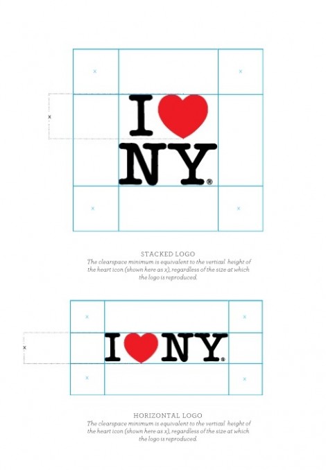
I Love New York Logo Brand Identity Guidelines
Being a professional you shouldn’t fool around with your logos. Many designers will think that they’ve done a fantastic job, but they are not right. It’s your task to point this out to them and tell them what they can do with a design and what they cannot. The I Love New York logo is a classic example of cleverly defining in their brand guidelines what you must NOT do with their logo.
Need For White Space
21 Inspiring Examples of White Space in Web Design
Never underestimate the necessity of white space. Incorporate a space reference, particularly for your logo. Don’t specify centimeters or inches; use a part of the logo itself, like a shape or a letter. In this way it’s immaterial if the logo is small or big; the space surrounding it will be adequate.
Colors Palettes

10 Beautiful Website Color Palettes That Increase Engagement
Color palettes are a must; and also for what the colors must be used. Include formats for the Web as well as print like Pantones, CMYK, (if they are still alive) and RGB. A CMYK substitute for Pantones must always be used for matching can be hard sometimes. Be clear about your primary as well as secondary colors and where/when to use them.
Fonts/Typefaces
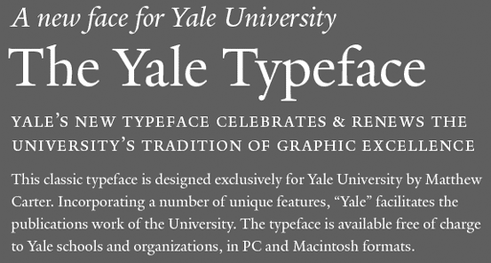
You will have to describe the typefaces you wish to use, like sizes, spacing, line height, colors, and headline vs. body font and so on. Include Web options for fonts that are non-Web. Yale University actually has a typeface of its own, designed by Matthew Carter, which it gives to its designers and employees. Yale also spells out when the fonts must be used. It has an exclusive Web font division which explains which fonts are to be used there.
Layouts/Grids
You will promote best practices and encourage consistency if you set up templates as well as instructions for grids. Generic templates help to curb over-creativity in the layout. For example, the Barbican has, in its website, installed flexible and customized building blocks, which mean they will in all likelihood stay in a grid.
Voice Tone
A huge section of a brand’s character is the copy. A terrific way to keep the brand’s consistency is to define the tone. When several people write the copy, the brand is able to sound as if it has many personalities. You will find this in easyJet, where both oral and written clear-cut personalities can be seen.
Guide To Copy-Writing
Copywriting: Successful Writing for Design, Advertising and Marketing
A style book on copy-writing can help those who need the client to write his/her own copy and still maintain consistency. Most people judge copy-writing in a sort of subconscious way. When reading, a human being’s brain instinctively seeks out evenness and patterns. If the copy-writing is poor it can spoil the flow of reading.
Images/Photographs

Choosing Images For Your Website – The Minimalist Guide
Many designers establish a singular quality in their images and photographs. Show some examples to your clients; explain why these choices are good. Show them with reference to your design context and describe to them why they were selected for that framework.
Bringing It Together
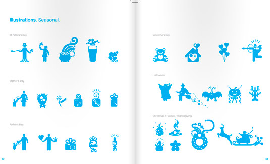
10 Magically Meticulous Design Style Guides
Show some examples of how the photography, logo and text will look together, and the chosen formats. Skype has done a great job of pointing out what it wants from designers in the way of photography and illustrations. It shows examples of the slight variations between bad and good usage. The guide is stunning and worth taking a look (along with all the other amazing design style guides mentioned in the link above).
What To Include In Web Guidelines
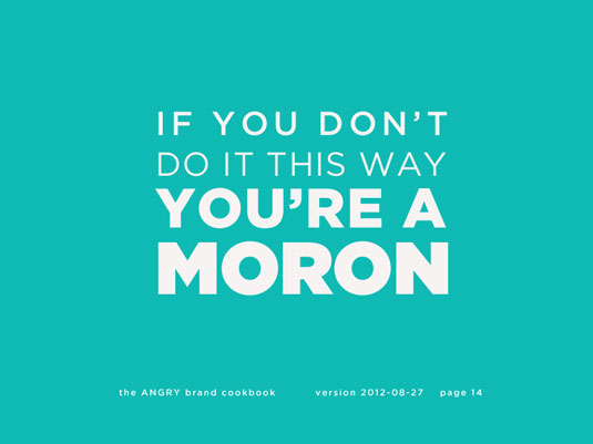
How To Create A Design Style Guide: 20 Pro Tips
Many designers create guidelines for branding but don’t include important Web style guides. Like the guidelines for branding, Web guidelines retain consistency — from styles of button to navigation architecture.
Order Of Buttons
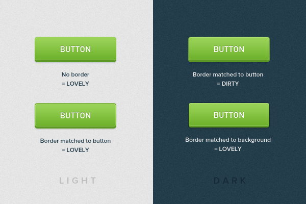
Principles for Successful Button Design
You have taken care to decide what all your buttons are for and painstakingly classified their states. But, regrettably, your designer has not fixed your hover states; or he/she has made their own — and they are terrible to look at.
Design a page which shows the functions of all the links, including buttons, the proper behavior of all of them and when they must be used. If a button stands out, clarify how many times at the most it must be used for a page. This is normally once. Classify the hover and visited and disabled states for all the buttons.
Icons Size, Spacing
![]()
21 Inspiring Examples of Icons in Web Design
A terrific way to endorse consistency is to define size as well as spacing. Another way is to show where your icons must be used. If icons are to be used sparingly, this aspect must be made clear.
Navigation

Navigation and Wayfinding – Interface Design
Good and consistent navigation can define a website’s success. Pages are sometimes added after the designing work is completed. So you must leave some space for these additions. A website will become cleaner if people get to know about new navigation tools and states that are logged in. A truly fantastic guideline would describe in detail seemingly minuscule functionality such as: what you must do with lengthy user names, the space that everything must have and more.
Basic Code Guidelines
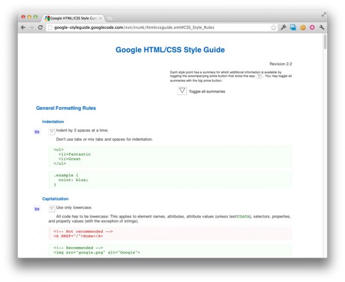
You cannot teach a person how to code like you; however, you can suggest some basic tips which will lessen the damage. These are:
-
Conventions To Name CSS Class – What to use? .camelCase or .words-with-dashes?
-
Integration of JavaScript – Is it jQuery that you are using, or MooTools? How do you integrate the new JavaScript?
-
Form Style – Incorporate error states, code and more stuff to make clear the style standards you need.
-
Doc type, requirements for validation – You permit some items that are invalid? Do you think CSS, HTML will validate?
-
Structure of directory – Clarify how it has been organized.
-
Accessibility standard – should ALT tags be included by people? Do atypical fonts use image replacement?
-
Testing Techniques – with which standard must they test?
-
Version management – What is the system you are using? How must they test in the new code?
Formatting
Writing an Interface Style Guide
Here are some good guidelines for formatting:
-
Incorporate a cover – this must have an example of best logo practices.
-
Make it attractive – it will not be printed in book form, but you can ensure that the branding tips are appealing to your viewers.
-
Include contact specifics – when visitors have queries, contact details will thwart making of bad decisions.
-
Make it simple to access, open – this usually means placing it in PDF style or online. Use images carefully.
-
Printability – Especially for international firms, keep big margins; in this way you can print the document to in A4 as well as US letter dimensions. In the case of online, ensure your printed style sheets display the documents like you anticipated. No white letters on black backdrop, please! You will not want your client to purchase another ink magazine each time he/she prints a copy.
-
Should be simple to change – Adding pages and effecting changing must be easy; for they will happen!
-
Make a mini-version – Compile a small but handy guide with only the basics, along with the fuller, big guide. Both of them will be put to use in varying circumstances.
-
Whenever possible, offer print templates – Letterheads, envelopes and business cards must have individual templates. Guidelines will assist people to place things in order but they normally will not help them to obtain the right mix or color arrangement.
Summing Up
What will be the size of your guidelines book? Hundreds of pages will not engage anyone except the most hard-working designers. So, a brief 3-page summary is best to use daily; a more detailed 20-page manuscript will suffice for intricate tasks. As they say, less is sometimes more!
I hope you have liked this small ‘treatise’ on website design guidelines. I shall be happy to get your feedback by way of comments!

