
In this tutorial, you will learn how to create a simple rock music flyer using Adobe Photoshop. You do not need any special skills or advanced training here. You just need Photoshop, some free creative resources, and of course your own active imagination. Just follow the steps below and you should be able to create your own unique design.
Here Is What We Will Be Making Today!
Final Image
Now Let’s Get Started!
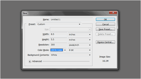
1. Our first step is of course to establish the document specifications. Now, there are a lot of different sizes for flyers, and you can even create your own custom dimensions if you like. However, for most printing companies, they prefer to use some standard design dimensions for most flyer designs. To get you started, below are the typical settings for flyer designs in Adobe Photoshop.
Just apply these as a foundation for your design.
a. Width: 8.5
b. Height: 5.5
c. Resolution: 300ppi
d. Color Mode: CMYK
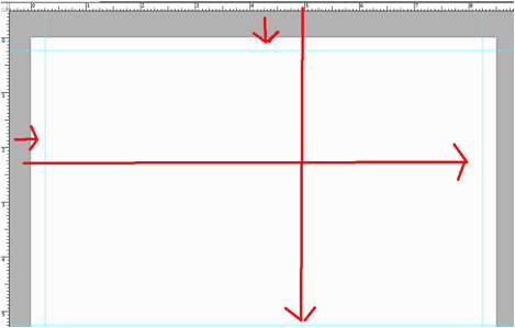
2. Once the new document is open, it would be a good idea to add up some guides. Guidelines will help you manage your design elements so that they do not look off or too close to the edge. So, bring up the rulers (CTRL+R). From the rulers, click and drag guidelines into place. Since our document is designed to be printed in half a letter sized paper, then we just need a margin. (others need an extra bleed guideline set.) Just count 0.25 inches from the edges of the document to get the security margin set.
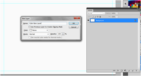
3. Now, first, we will create our background. Create a new layer by pressing CTRL+SHIFT+N. Name this layer “Color Bars Layer”.
4. Now, using the rectangular Marquee tool, create a large vertical stripe at one side of the layer. With the rectangular vertical area selected, fill it with one theme color. Use the paint bucket tool to quickly fill it. You can find lots of matching color themes in colourlovers.com. In our example, we created an initial blue stripe.
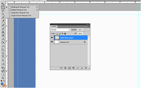
5. Just continue on with creating vertical color stripes until you fill out our whole layer. Vary the width of the vertical stripes of course, along with the variation of color. Make sure you have some very thin stripes scattered with dark colors for a great effect.
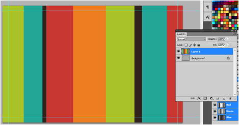
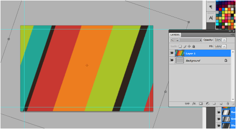
6. Great! Now, since this is a rock/musical poster, having straight color bars will just not cut it. So, with the color bars layer selected, we press CTRL+T to start the transformation. We then tilt/rotate the layer at an angle for that skewed effect.
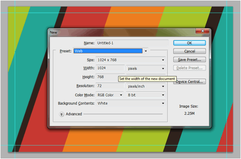
7. Before we move forward, save this document first, just in case you forgot. Now, we will create a displacement map. This will require a separate document. So we create a new document by pressing CTRL+N. Size it fairly large at 1024×768 pixels or higher.
8. Once the document is open, you can then add in a displacement texture. Now, for our example, we want to go for something a little bit grunge. So we copy paste a grunge type image from morguefile, into the document. Alternatively, it is possible for you to use the built in patterns in Adobe Photoshop. However the simplest way is to just look for a good grunge or displacement pattern on the Internet and copy-paste it in.
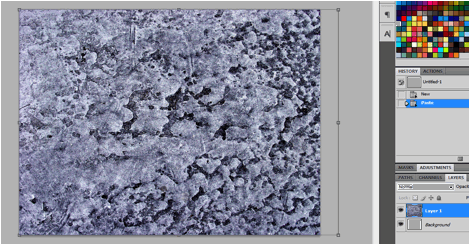
9. Press CTRL+SHIFT+U to de-saturate this layer. Then, go to Image -> Adjustments -> Levels. Change the three values below the graph, so that you have a more grungy black and white type texture in the canvass. You can start with these values first, and then adjust depending on your chosen image. (80,0.01,180)
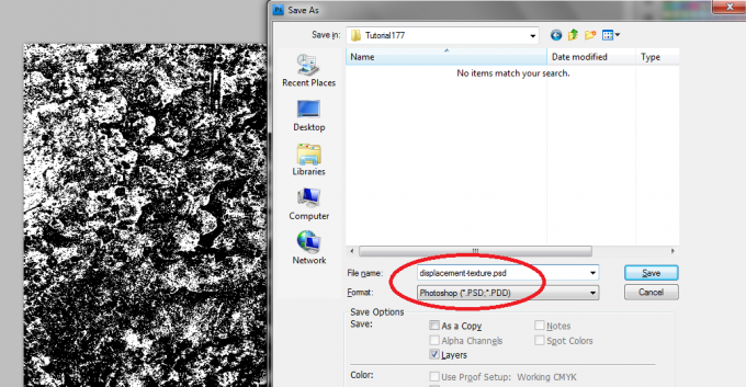
10. Once you are done, save the document as a PSD file. Just press CTRL+S or go to File -> Save As… Save it with a descriptive filename so that you can easily know that this is our displacement texture. Use the PSD as the file format for this save.
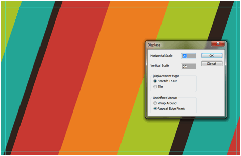
11. Great! Now, go back to our original design. Select our color bars layer. Then, go to Filter -> distort -> Displace. Once the displace window opens, insert in a 20 value for both the horizontal and vertical scale. You should also set it to stretch to fit and repeat edge with pixels.
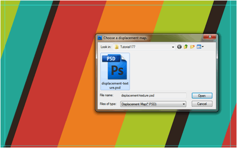
12. Then, you will be asked to choose a displacement map. Just navigate to the PSD document we created earlier and press ok.
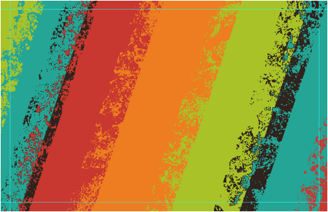
13. You should see a nice grunge effect get applied to the whole layer. If you do not like how it turns out, simple press CTRL+Z and try again with different displacement settings and displacement maps. However, our effect is great and we will keep it.
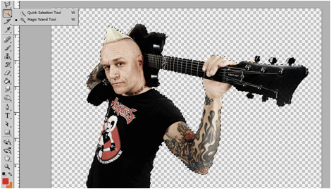
14. Now, we are ready to paste in our main rockstar image. In this case we got a nice image of a rockstar here. Before we paste it into the design though, we process the image by removing the model’s background. Just use the Magnetic lasso tool or the magic wand tool to easily select the background of the image, and then of course erase it using the eraser tool.
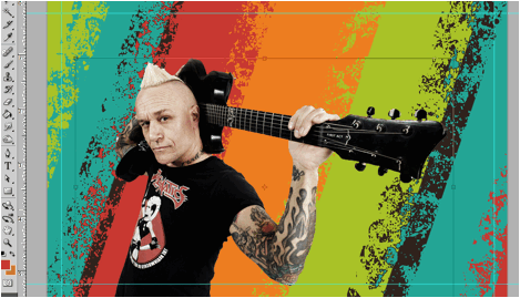
15. Then, we just paste it into our main flyer design. Scale it carefully by pressing CTRL+T and then holding the shift key as you click and drag the anchor boxes of the pasted in image.
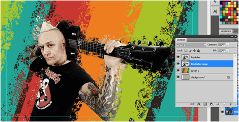
16. Next, duplicate our rockstar layer. You can quickly do this by pressing CTRL+J. This new layer should appear on top of your original layer. Drag this duplicate back to the bottom. Then, go again to Filter -> Distort -> Displacement. This time, use a 30 value for both the horizontal and vertical values. Choose your displacement map again afterwards. You should see a nice displacement again in the background, whilst the main image looks pretty great.
17. Now, using the rectangle shape tool, we add some darker block elements to our design. This is where the text for the flyer design will go. Once the rectangles are in place, press CTRL+T with those layers selected, and slant them a bit, just like how we slanted our main background layer.
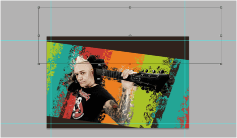
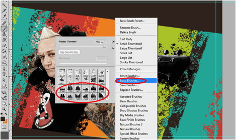
18. Next, we downloaded a couple of cityscape design brushes for Adobe Photoshop from a design site here. Then, load it up to your brush options by selecting the brush tool, and then right clicking on the canvass to bring up the list of options. Select “load brushes” and load the brush that you just downloaded.
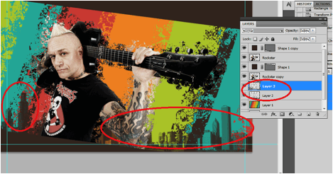
19. Create a new layer by pressing CTRL+SHIFT+N. Then, using the same color as your rectangle, splash in 1 or 2 spots of our city skyline brush.
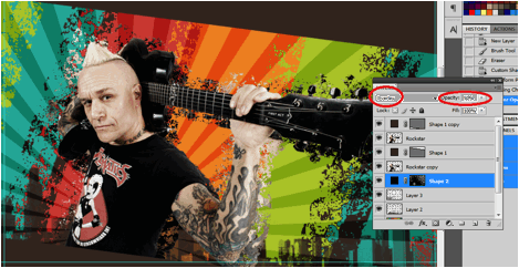
20. Finally, for an added effect. Go to the custom shape tool and select the option “registration target 2”. This is the shape with the rays spreading out. Add this into the design, just behind our model. Make it large enough so that only the rays are visible. Position it so that the rays emanate from our model. Use a black color for this shape.
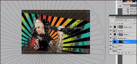
21. Then, change the blend mode of our rays layer to “Overlay”. Also change the value of its Opacity attribute around 50%.
22. Finally, we can add some text for our design. Using the text tool, we just type in our headline slogan and other details for the flyer. Just rotate it in line with our darker rectangles. Change the size and style of the text to get some variation from the headline and the details.

23. Great! That finishes our great Rock Music Flyer. You can now apply these effects to your own flyers.


This article about making a rock music flyer is insane . I say it insane from the view that it it is just like a video tutorial .I never fell that I need another video or another blog to understand and make it . this is so good and reader friendly . you really work it for every kind of reader and new photoshop user like me . It took also more than 3 hours for me to make it but I learn and deeply learn about some great feature of photoshop . I will keep following your blog hope in near future we will get some more tutorials that will help us to increase our knowledge on photoshop and photo editing .
this is a great tutorial i am still getting to grips with photoshop but this should help me no end.
phil