Metro Designs – Style Development
The word Metro is getting tossed around a lot in the web design and development community. This can obviously be attributed to Microsoft’s talk about the new Windows 8 operating system and its Metro interface, but that leads to some false sense of what a Metro design is. The title says it all really, it is content over chrome.
After speaking to a few colleagues of mine I decided to write an article to hopefully expound on this subject. I received a few negative responses when telling people I like the Metro style, and among the responses were statements like, “I just think the color scheme is too jarring”, or “I really don’t like to lay things out in a bunch of boxes”.
They are missing the principles of the design style and looking just at how Windows had implemented it on their various platforms (i.e. Windows Phone, xBox, etc.).
Metro has its roots in a very old concept we got from our friends in Switzerland about 60 years ago. It had an emphasis on clean, readable, and asymmetric design.
Here are a couple of examples of Metro based design:
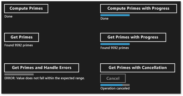
You can see in the example above (from this microsoft article) that it is possible to create something very attractive, with very little color.
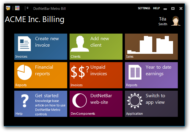
These guys have a great example of a tiled/colorful interface make note of the great iconography and typography. This is another great principle of Metro: the content should be obvious to the reader. So an pie chart icon should speak intuitively that it will be some kind of reports in there.
So what are some basic principles behind a Metro design?
Like all design style, there are guidelines, but no rules. Here are the three primary components to hit if you want to create a Metro styled site/application (as well as the point hit on in the above paragraph):
Typography
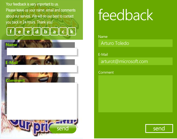
Metro Ui Design Principles
It is used as almost a subtle navigation for the user. Keep it clean, simple, and attractive. Typical Metro typography steers clear of serif fonts. Again this is a guideline, not a hard and fast rule.
Simplicity
Web design trend: Metro UI
The mantra here is “Content over Chrome”. Yes I am sure we all enjoy the big flashy websites with the laser-light shows in the background. It gets old though, and Metro prefers to have the focus on the actual content being presented, not being distracted by the background.
Response

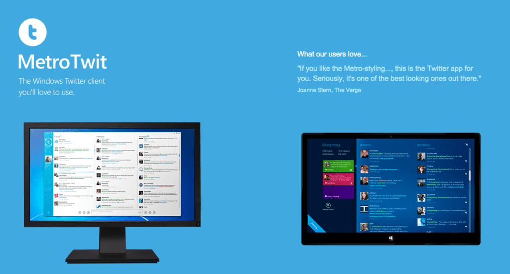
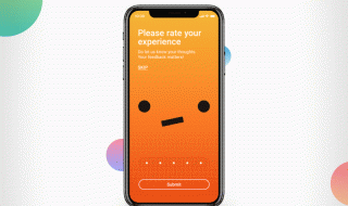
Metro Twit Website UI is a good example, but also the application itself is a great example of a responsive Metro UI
Perhaps the most important aspect of this style is its responsiveness. Everything on the site should respond in some way to a user interactive. If you think about the overall design concept, it is very flat: flat background, flat content areas, and flat text. By adding some interaction you make the design feel like a living thing. So if a user slides, swipes, clicks, drags, or smashes, there had better be some response from the user interface.
And there you have it. It is deceptively simple, but once you get the hang of it I believe you will find it a very rewarding design for the customer, the designer, and of course the user. And make note, no where in the definition of “What is a Metro Design” does it state you need to use hot-pink and magenta with square tiles. It is up to you how you implement it. A note on the square tiles though: they make sense, and are a great way to keep the UI easily understandable.


I am really digging this so called “Metro Design”, even I would call it great design in general. The Metro Twit example reminds me of minimalist design.
Yeah I really love Minimalist design – so the “Metro Design” trend is really exciting me 😀
For sure man. I’ve always been a partial to clean and simple design, even thought thats probably the most difficult designs to pull off, IMO.