Typography is an extremely important part of web design, but unfortunately many new designers often fail to appreciate just how crucial a role it can play. As such it is all too common for mistakes to occur that could even have a longstanding effect on the websites appearance.
While typography is far from simple and will require a great deal of effort, knowing the most common types of typography mistakes could go a long way to helping you avoid them in your web design:
Insufficient typeface variety
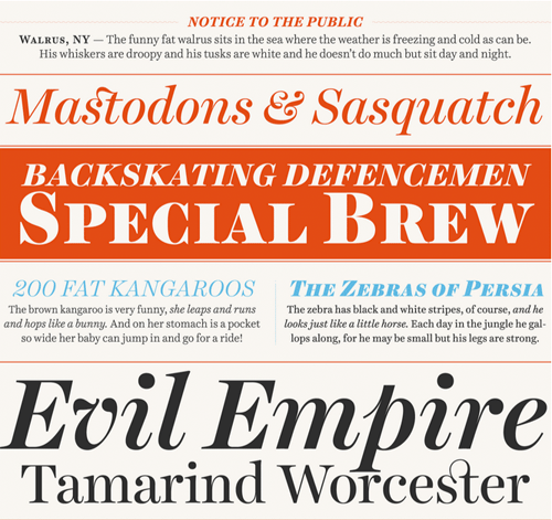
One More Time: Typography Is The Foundation Of Web Design
Changing up the font and typeface that is being used can help to establish a hierarchy of elements on your site. On the other hand too much variety will just make a website look messy and cluttered – which is bad too. As a rule of thumb try to use no more than 3 types of fonts on your website at any given point of time – with a clearly defined role for each in the hierarchy of elements.
Forgetting about contrast
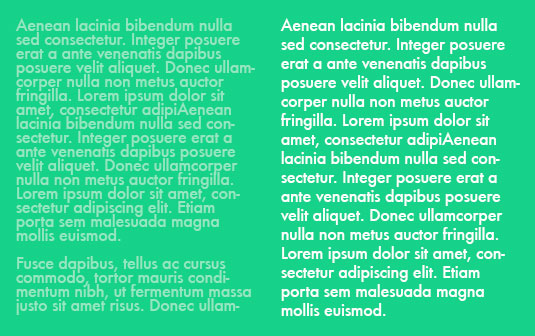
20 Common Typography Mistakes That Designers Make
In order for your typography to be clear and readable it needs to contrast against the background of the webpage. While designers take this into account in some cases, they often forget about it in others – such as in specific areas where the background may be a different color, or in certain cases such as hyperlinks (both clicked and unclicked).
Using absolute sizes
Many designers still use pixels to size their font – mostly because it is the system that they’re familiar with. However on a website using pixels as an absolute size is far from ideal, especially because on smaller screen sizes (such as mobile devices) it will shrink to the point of obscurity. Instead of using pixels it is far better to get into the practice of using ems – which are a relative size.
No fallback fonts
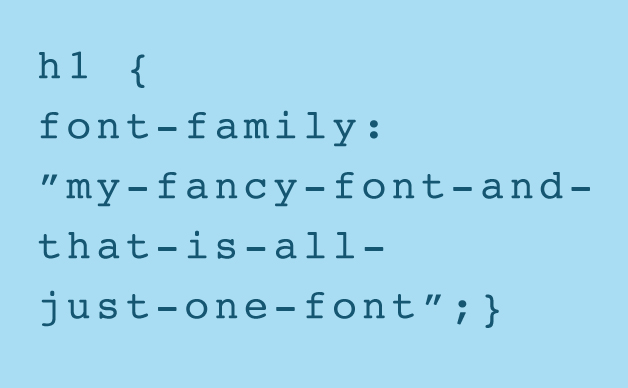
Web Design Tips: 7 Common Web Typography Mistakes
Although you may take great care picking out your fonts so that they are absolutely perfect for your web design – it is important to pick out at least two others that may be less-than-perfect but are still good enough. Using fallback fonts is a common practice in web design because they may need to be called upon if the main font choice can’t be loaded, isn’t supported by the browser, or any other issues crop up.
Cramped leading and tracking
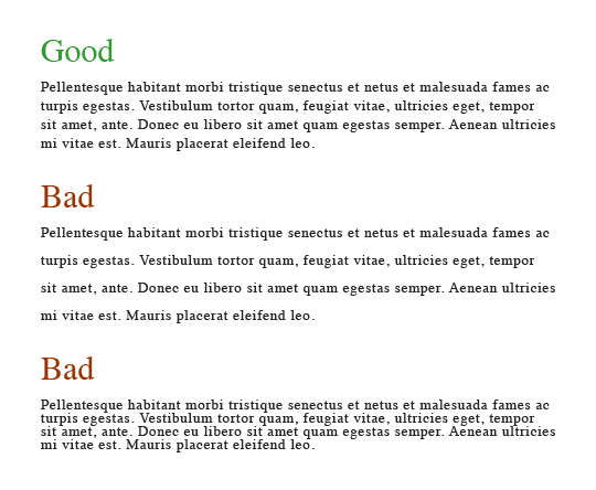
20 Common Typography Mistakes That Designers Make
Both leading and tracking are important to the readability of your typography because they affect its spacing. Essentially leading is the space between lines, while tracking is the space between individual letters. Unfortunately there is no one-size-fits-all value to use for either, as it will vary depending on the font in use as well as the desired effect that you’re creating in your web design.
Try to avoid all 5 of these mistakes in your web design and you should see a marked improvement in its typography. If you’re hiring a web developer then be sure to talk to them about your typography choices too, and maybe get their take on the best approach to use.

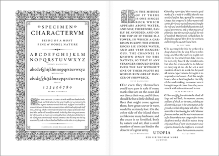



“Insufficient typeface variety” is a problem? When I was a wee graphic designer, _too many_ typefaces was the great sin. It was always possible to do a project with a single typeface. You didn’t have to, but you should know how to. It is an essential skill of typography.
Good points Abiatha! It’s good to have a breadth of experience here to tackle the wide range of applications Typography can be used for. These days we can get caught up in “Web Typography” which typically lends 1-3 typefaces across the website to change things up but also compliment each other and keep things consistent. In a “What’s old is new again” way I am sure a singular typeface used on a new site would be killer! Thanks for leaving your thoughts!