The majority of the people, interested in launching an online presence, don’t have the same acknowledgement in web design and network applications as the ones involved in – and working on the Internet. Yes, I am not afraid to state that some of the clients are lacking the elementary concepts used in creating, maintaining, and using websites. Personally, I don’t see it as a grave mistake or a serious lack of knowledge, as long as they have the wish and time to learn from specialists.
One of the most difficult situations for people ready to hire someone to create a website is to select the best service provider. No matter if it’s a freelancer or a web design agency, the report quality/price is capital. Beside this report, universal valid in any form of trade, there is another item that has a big role: the portfolio. This is the website where representative works are presented, followed by opinions of the past clients etc.; it’s the most objective prove that demonstrates the skills of the owner. A wise client will put in doubt the nice words of the freelancer/agency and will ask about previous projects and eventually, for recommendations from the past collaborators and customers. These are enough to make anyone understand the immense value of a competitive portfolio; it may be a considerable source of gaining clients, but it also may drive them to run away.
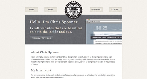
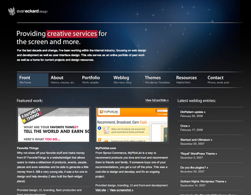
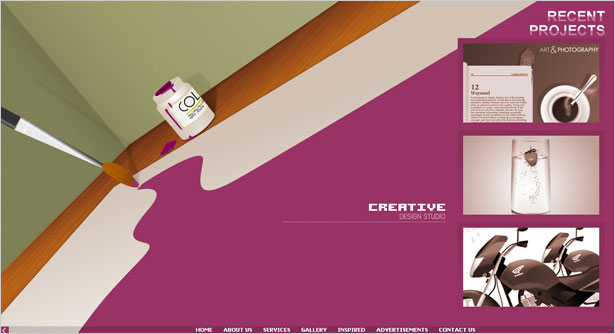
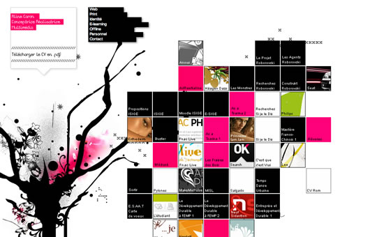
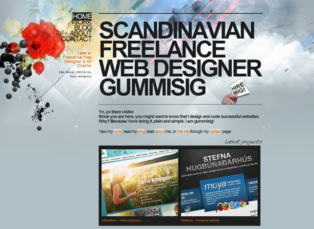
The construction of a portfolio isn’t very different from building other websites, but its importance and the personal attachment invested by the creator make it a difficult job. Logically, the layouts of portfolios have no restrictions related to design and obvious, everyone is trying to impress with his skills. Original or classic solutions, fixed or fluid layouts, no matter the preferences of the designer/owner, the portfolios are, the huge majority of them, quality items unless even masterworks. The great variations of styles and approaches make any recommendation about building portfolios impossible but in spite of that, this post is very useful for the ones who are building such a category of websites. The menu is a very important, it is the one that drives people to the places you want and it determines the number of pages to create.
As I said, this post is interesting; here you will have a good presentation of the possibilities to create a complete navigational menu of your portfolio. It is based on the experience and the preferences of the author, but also on a complete search of many quality portfolios. It isn’t fixed, hence your contribution is welcomed and I am waiting to find out your cool ideas.
The Home Page
It should be the main page of the portfolio; all visitors must first land on this page, and letting them know amazing skills right from the beginning. Usually, on this page must be short introductions to the other pages, but also your visitors must quickly found your field of activity even your strong points should be discovered. It will be great to inform your visitors if you are available for hiring or you are too busy to take their projects.
Many freelancers make a mistake, usually one that is not very important but when someone has a clever advertising strategy, this point can’ be ignored. The portfolio isn’t the equivalent of the website where you present your best works, it can be represented by the accounts created on various galleries as Flickr, Deviantart, Behance, Logopond etc or even on the job boards. The idea is not to stick with a single website, the more places you get exposure at, the more chances you have of gaining a client.
In conclusion a Home page (but not only this page) must include some links to these kinds of websites, this being a clear sign that the owner of the portfolio is active, meaning a savvy Internet user. Assuredly, there are too many advantages not to benefit from it.
The Portfolio (previous work showcase)
Here is in fact the entire essence of the website, it’s a stupidity to believe that there is a portfolio without items to present. In order to be attractive and successful there are some tips to pay attention to:
- offer a clear classification of the items, a complex mixture will put the interested people in difficulty, what would they think, are you a web designer, a logo designer, a print specialist? Clearly, it isn’t wrong to offer a large palette of works, but structure these very clearly.
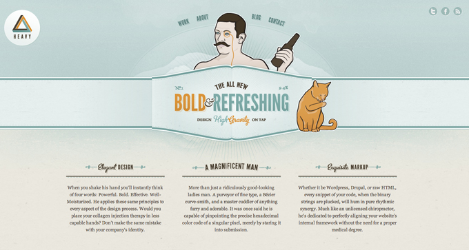
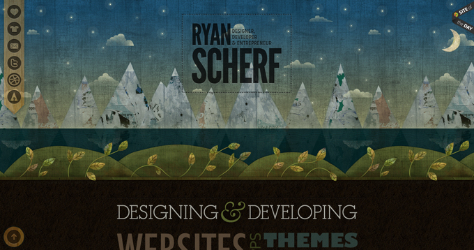
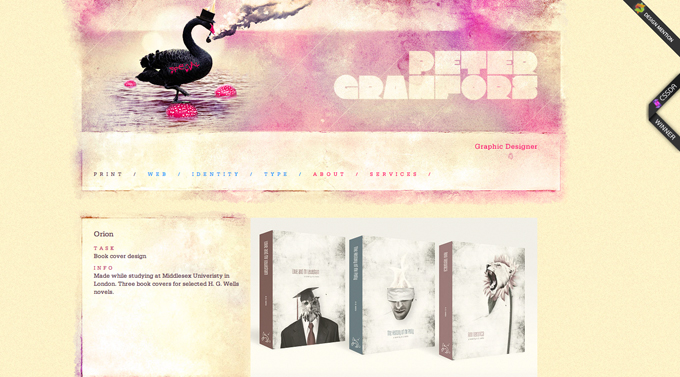
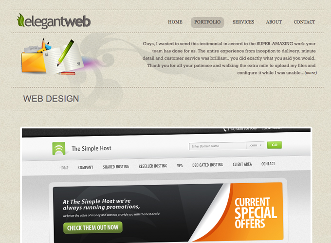
- it couldn’t be the worst sign of amateurism when offering low quality print screens or blurred images. I know that a quality picture has a respectable size, harms the uploading process and people are too busy to wait minutes until your website is completely launched, but to offer unclear images is by far a worst solution. There must be a balanced report between quality/size; the portfolios below are a good example that it’s possible.
- the Internet is full of websites using the newest type of sliding and the effects are amazing. Once your portfolio is a collection of images, it is highly recommended to use a cool sliding effect but at the same time it must be very intuitive and easy to use.
Testimonials
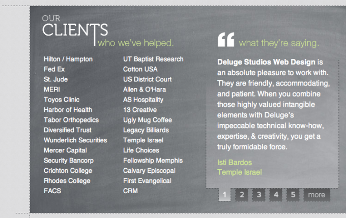
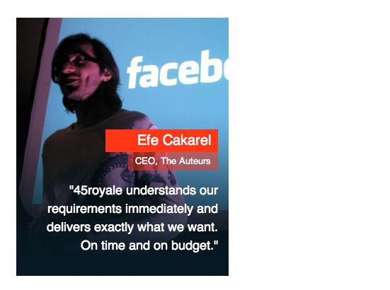
Many portfolios are ignoring this opportunity but clearly it is wrong to do so. The clients have trust in other clients and this is the reason to create a page dedicated to testimonials. It has a stronger effect when people who appreciate your work are well known or represent important brands. It’s optional, but it can’t have a negative impact to be more transparent offering possibilities to contact past customers. Anyway, the testimonials have the main scope to underlie the trust of your visitors, and why not, future clients.
To better understand the importance of good testimonials imagine that you are a customer willing to contact a very good freelancer. First, it’s quite probable that asking for the services of a freelancer is a novelty. Second, you have no experience and you tried to be very cautious.
Consequently, you have reservations when it comes to a person you never seen and the items exposed might be the real work of the freelancer or simple stolen items (you will say that maybe I am a paranoiac blogger but think twice when it comes to your income or expenses). The possibility to contact someone who previously hired the respective person is ideal to convince anyone about his talent and skills. Believe me, don’t forget to post testimonials and modalities to contact previous clients!
About Me / About Us
(Freelancer / Web Design Agency)
A wise “About me/About us” page contributes a lot in creating a special approach with the clients, normally they access this page after they admired your past projects and quite probably are content with what they saw. Too much information will create an ego-centrist idea about the owner and less will appear as incomplete; the moderation is perfect. Another pitfall is to describe you, your subordinates but neglect what you practically are offering, hence don’t overuse with personal opinions. In this case it is better to work on the idea to present yourself and not persuade the visitors, your items exposed must convince them.
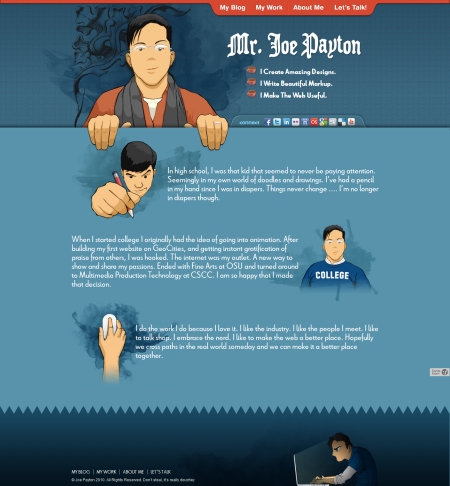
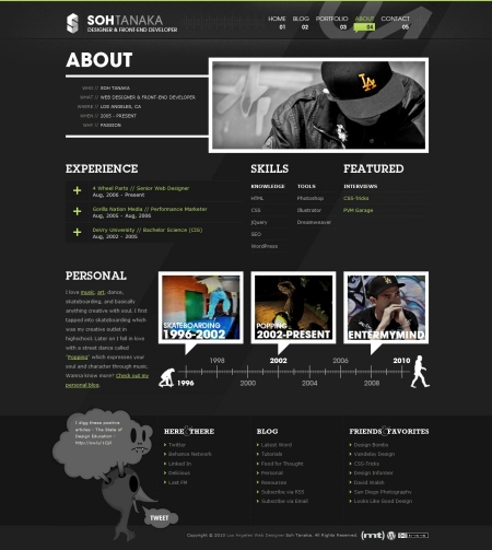
The “About me” page may be a good opportunity to reveal your creativity potential. Depending on each style you adopted, there are specific approaches: if you are official, serious giving the impression of an entrepreneur, a business-oriented freelancer, the text on the “About me” must follow the same line. I hardly image that someone can be creative when writing the content of this page but don’t worry, if it’s written correctly and in accordance with the highest standards of quality, then it’s alright.
If the approach is more personal, lacking any formalities, revealing more the designer part than the business owner, things stand differently, the “About me” page should be a place where creativity and quality make a good friendship. I strongly recommend that the text in this case must fascinate the reader… and the reader must be fascinated by the interesting way of presenting yourself and your area of expertise and not by the bluffer text provided.
Contact
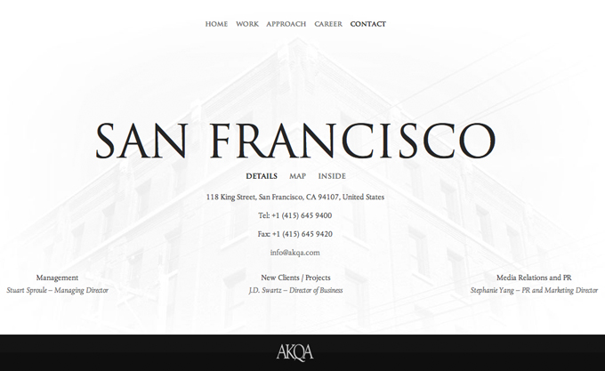
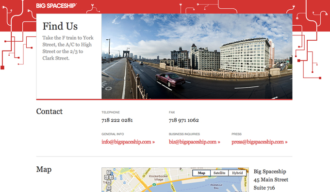
Finally, you won! The huge majority of people landed here are interested in contacting you and not to observe the beauty of the contact form. This rubric shouldn’t be just the old contact form or the email address; the inspired solutions contain social media profiles, multiple solutions to contact (Skype, Google Talk, Yahoo Messenger), your physical address (completely and using Google Maps wouldn’t be a bad idea either).
The main attention must be directed towards making a good impression on the visitors, any glitch clearly may annihilate all the other positive aspects. The contact form should match the style of the website, hence use it properly.
A professional freelancer can’t make his future clients wait and a quick reply to all the comments received is another sign that the man behind is an expert. This is a small detail, but it can also make a big difference.
In the end, don’t forget to link again to your profiles on the galleries I mentioned at the first point, you never know…
More Resources & Inspirations for the Perfect Portfolio
How to Build a Basic Portfolio WordPress Theme
Creating A Successful Online Portfolio
Creating the “Perfect” Portfolio
50 Inspiring Portfolio Designs
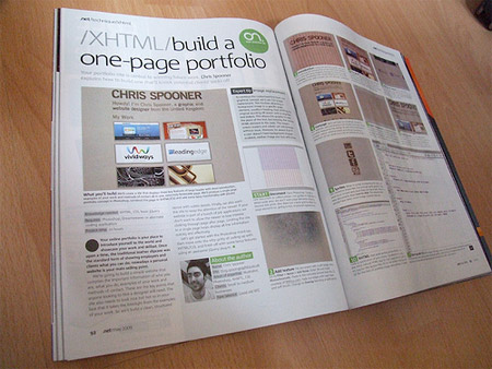
How To Build Your Own Single Page Portfolio Website
50 Creative and Inspirational Personal Portfolio Websites
What do you think of these ideas? There is nothing sensational, but I didn’t find a more complete description of how to create a successful portfolio, even if the subject is very important. Please let me know how you complete your portfolio! If you have any ideas to add, leave them below!


