With millions of active users, Facebook is undoubtedly one of the most prominent social networking sites. We can even say that Facebook has grabbed the attention of millions to the social networking community over the years. No doubt, the attractive profile views and user-friendly apps that we see today on Facebook are a delight to use but we shouldn’t forget the modest beginnings of the world-famous social network. Let’s take a look at the evolution of Facebook and the enticing apps it has incorporated over the years.
Facebook was first launched in February 2004. Founded by Mark Zuckerberg with the help of his college mates, membership in Facebook was first limited only to the students in Harvard University but was later open to universities in Boston, Stanford University, and Ivy League. Gradually, the site gained rapid popularity and started giving membership to anyone over the age of 13.
Facebook in 2005

Initially called ‘thefacebook’ the site sported a very simple profile page. There weren’t too many features, apps or tabs on the pages. The founder himself called it “clean and simple”. It was just the first attempt and that was when Facebook sported its simplest look. Users could just log in and make friends. Simply put the buzz and excitement was quite then.
The Mini Feed (2006)

In 2006, the founder and his team made drastic changes to the profile pages. Though the design was still in its incumbent stages, the web pages sported something much better than their previous version. Facebook Inc. launched personal feed on the profile page, and sported the topmost part of the page in blue while the rest of the page was seen it white. The radical change attracted lot more visitors to the social networking site. From the critic’s end, some felt that the redesign wasn’t as good as its previous version, mainly because they found it difficult to adapt to the new changes. Gradually, people started liking it and the uproar was huge!
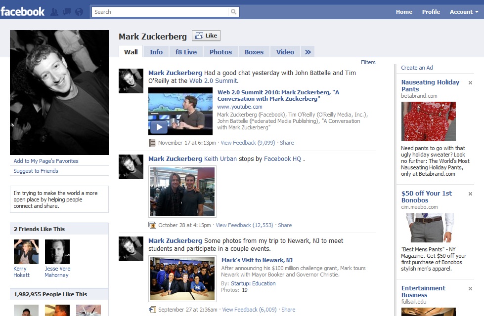
The New Facebook in 2008

Most of you would remember “The New Facebook” launched in 2008 wherein you had to visit new.facebook.com to login to your Facebook account. The 2008 version retained much of its previous version and added a few user-friendly tabs to make it easy for users to access widgets that were part of Facebook’s apps. This version was boosted by the inclusion of more personal feeds compared to the normal streams that were displayed in its previous version to make accessibility options easier for the users. The sidebar featured tools that were not much used by the users.
The Cleanup (2010)

Facebook called it “clean up” mainly because of the fact that it tweaked new elements and made the profile views much more elegant and presentable. In this version, Facebook originally retained most of its features and apps from the 2008 model but made a few noteworthy changes to attract more users. The inclusion of photo tags was one such feature that was liked and appreciated by many users. People who had a penchant for photo sharing were lured in by this version as it offered them a great deal of thrill and excitement to share their pictures with friends and relatives. Likewise, the addition of feeds also witnessed a sharp increase in number.
2011 – The Timeline

This is a big one from Facebook. As most fans who aren’t aware are eagerly anticipating for its launch, fans foresee a big change in Facebook’s profile page display. In this version, all your profile updates, polls, photos, videos and a host of other applications will be plotted on a timeline. This version will also feature “life events” for users to take delight from.
So, that’s about it folks! Post your comments on timeline and how do you think the next version from Facebook will be like?


That’s an perfect representation yesterday i was searching for something which i kinda just found here for getting motivated while working for my site how facebook has evolved from a room at harvard to this global level is quite inspiring thanks for the beautiful post Travis 🙂
One can see that the site gradually evolved till 2012. The timeline was a big leap. That’s why people sort of hated it initially. The change was not subtle and gradual.
I think this is true for any UI/UX process. As long as you evolve, people will be happy. But sudden jumps can upset people
Yeah sudden jumps definitely upset people, especially with a user base of facebooks size – but I think they get over it if it is well designed enough