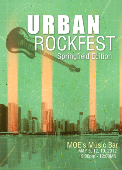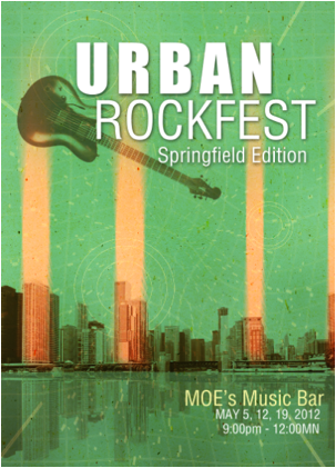
Many different kinds of music event posters have their own themes based on the venue of or the music genre to be played on the said event. In this tutorial, you will learn the step by step process of creating an urban style gig poster that is akin to the urban retro posters of yesteryear.
Here Is What We Will Be Making Today!
Final Image
Now Let’s Get Started!
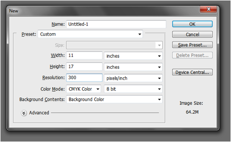
1. Setting up the document on Photoshop is the first step of course. You’re most probably looking into printing this poster so it’s mandatory to set the correct Width, Height and Resolution that is apt for poster printing. Remember to use a high value for the resolution (minimum of 300ppi) and set the color to CMYK color mode for four color printing.
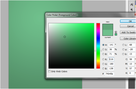
2. With the new document open, we first fill it out with a theme background color. In our example, we are going to use a fairly “washed out” (#8ca9c) green color as the foreground and a darker hued version based on this original color. Just use the “Gradient Color” tool to fill out the background.
3. Next, create a new layer by pressing CTRL+SHIFT+N. Then using varying sizes of a soft brush and a light green and dark green color paint some spots at random in our new layer.
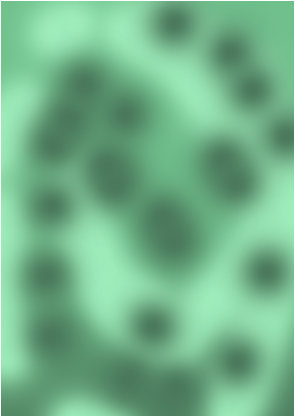
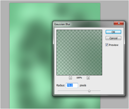
4. Next, go to Filter -> Blur -> Gaussian Blur. Use a very high value for the radius to make these brush strokes very blurry.
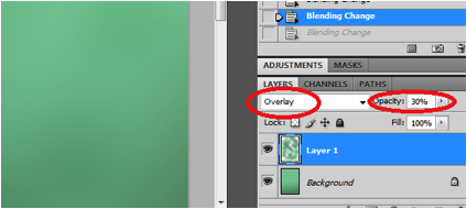
5. Then, change the blend mode of this layer to “Overlay” and change its opacity to around 30%.
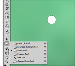
6. Great, we now have dynamic background layer for our poster. The next step is to add some foreground details. Using the Ellipse tool, inscribe a small very light yellow circle into our design. Take note that holding the SHIFT key as you inscribe circles constrains its proportions and makes it a perfect circle.
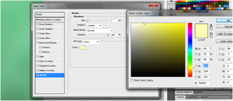
7. Change the fill of this shape to 0%. Then, double click on this layer and click on the “Stroke” in the layer options window and set the shape to have a 1px stroke of the same color of your shape. You may also want to reduce the opacity of this stroke layer if you want. (to around 50%)
8. Great. Now duplicate this circle two times and vary the duplicate’s size. Center the duplicates again to get this effect:
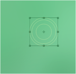
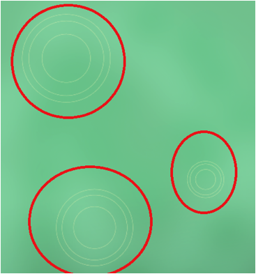
9. Group these circle layers into one group. Then duplicate the group two times for a total of 3 groups of these circles. Resize and re-position these circles creatively into the poster.
10. Now, we will create quick grid. If you are good with your hands and the mouse you can simply create equally spaced horizontal and vertical lines using the line tool. If not, you can use the “Grid” custom shape to create a grid. Simply go to the custom shapes tool and pick the “Grid” as your shape of choice. Then place a row of grid shapes (hold down the shift key to make them proportional) on top of our poster. Use the same light yellow color of course.
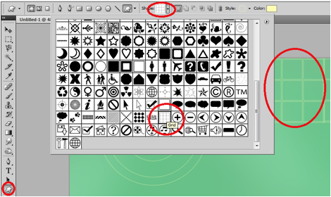
11. Then, merge the top grid layer as one grow. Duplicate it to make the next row, and keep duplicating until you create the grid.
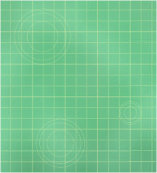
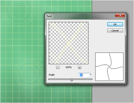
12. With your grid finished, let us distort it up a bit by going to Filter -> Distort -> Twirl… Use a 50% twirl value and reduce the grid’s opacity by 30%.
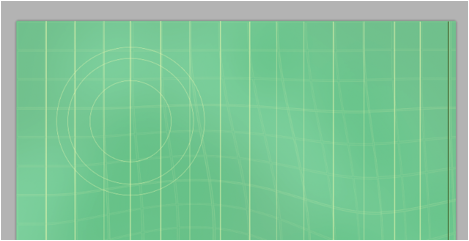
13. Now, using the grid as guide, create a set of horizontal lines of equal spacing like so. Do not forget that you can actually hold down the shift key and move the line tool downwards to create a perfect straight line. Merge all these lines into one layer.
14. Then go to Filter -> Distort -> Waves… Set the following values for the Wave Distort filter:
- Wavelength: Min-100, Max-999
- Amplitude: Min-35, Max-350
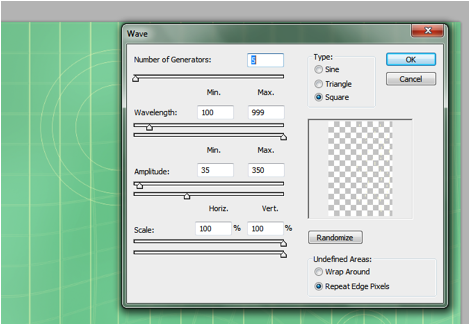
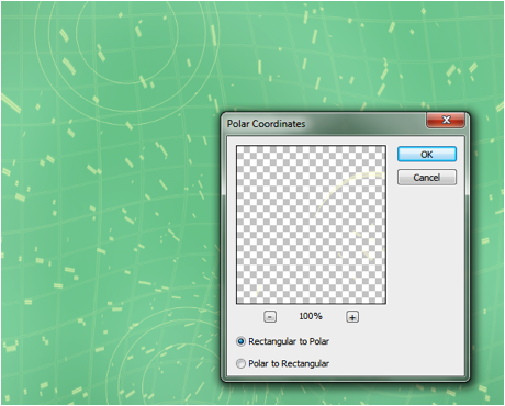
15. You will see the vertical lines get broken up. Afterwards, go to Filter -> Distort -> Polar Coordinates. Select the option “Rectangular to Polar” to change the orientation of the broken horizontal lines.
16. Finally, for the background paste in an old cardboard texture as the top layer.
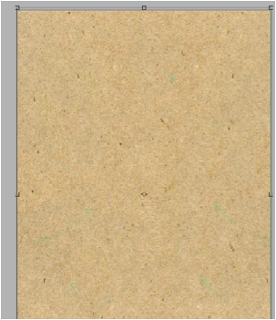
17. Then set its blending mode to overlay to apply it correctly to the design.
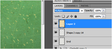
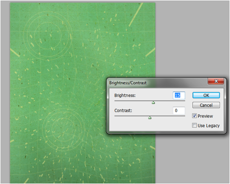
18. If you think that the texture darkened your design too much, you can try lightening it up by going to Image -> Adjustments -> Brightness Contrast and then adding some values to the Brightness setting.
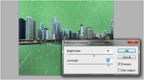
19. Paste in a picture of a cutout skyline. This will be our “Cityscape”. If this was from a real skyline, you might want to adjust the Brightness and boost the contrast to a high level to make the colors more lively and distinct.
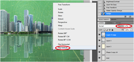
20. Duplicate the skyline image and then press CTRL+T. Right click on it to flip it Vertically and position the duplicate so that it looks like the reflection of the city. Reduce its opacity a bit.
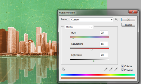
21. Merge both layers. Then go to Image -> Adjustments -> Hue Saturation. Change the Hue to 25, the Saturation to 55 and the Lightness to 20. Make sure that the “Colorize” box is ticked.
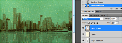
22. Finally, change the blend mode of the skyline image to “Multiply” to integrate it properly to our poster design.
23. Next, we will highlight a couple of buildings in the skyline. Behind the skyline layer, create a long red rectangle that fits a building and goes towards the top of our poster. Change the blend mode of this layer to “lighten”.
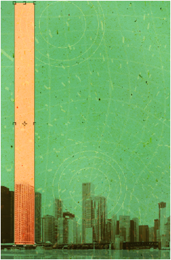
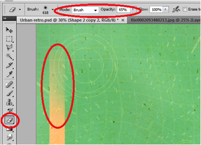
24. Next, using the eraser tool, erase part of the top of this red rectangle. First rasterize this layer by right clicking on it and selecting “Rasterize…” Make sure that you use a large soft brush, and reduce the brush opacity by around 60%.
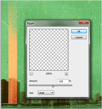
25. Next, apply two filters to distort our red rectangle. First go to Filter -> Distort -> Ripple… Set a 110% amount and set the size to large.
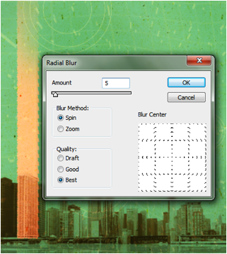
26. Next, go to Filter -> Blur -> Radial Blur… Then select an amount of 5, a Blur Method of Spin, and quality set to best.
27. Duplicate the process for the 2 or more buildings as appropriate.
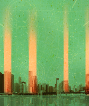
28. Great! Now, you can type in your title text. Use a white color for your text so that it is easy to see.
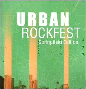
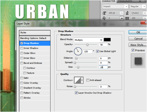
29. Then, double click on a text layer and on the layer styles window that opens, apply a drop shadow with a 20 size value.
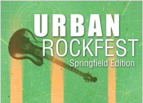
30. Next, using the same processing as the skyline, we place in a guitar image to reinforce the message of a musical event.
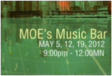
31. Finally, we add in some more detail text below the skyline. We changed one text set to a light yellow color to emphasize its importance.
32. Once done, you should have an amazing Urban Poster style with retro elements built into it. Even more impressive to your prospects is if you had matching brochures or business cards to go with your poster design. You can still use the steps in this tutorial but you have to make sure to adjust the dimensions at the very beginning. Goodluck!

You like this? Don’t forget to follow us on twitter @andysowards and like us on facebook @andysowardsfan! We are also on that Google Plus & Pinterest thing.

