
The rise and fall of technology trends can have a direct influence on businesses, but some changes tend to directly effect the way business websites should be designed and operated. One such trend is the ever-increasing size of mobile phones. The move from small screens to large phablets means that as a web developer you need to adjust your sites to fit these different-sized devices and your customers’s needs to boost your business.
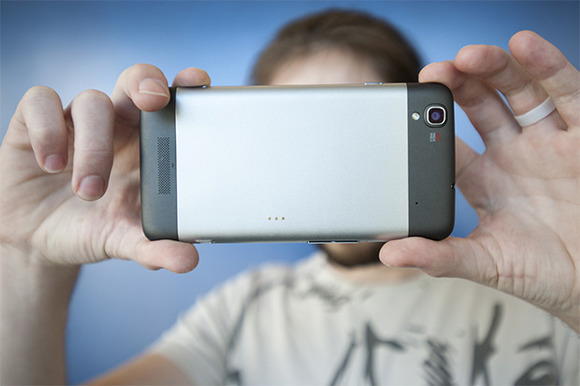
Buy, Buy, Buy
Why smartphone screens are getting bigger: Specs reveal a surprising story
Econsultancy analyzed its website traffic stats according to the size of screen its visitors were using. They found that the bigger the screen someone used, the more money that person typically spent on services. While they mostly reviewed the screen size of desktop computers, the findings are still interesting. It’s not definitive why a larger screen might influence someone to make a bigger purchase, but it could be that people want to see what they’re buying. A larger screen affords the viewer a clearer picture of the product and provides more readable text.
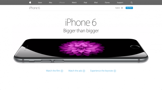
If your buyers are viewing your website from their smartphones, they may still make a purchase. But, if it’s true that larger screens can promote further spending, wouldn’t marketers be wise to target consumers with larger phones like the iPhone 6 or 6 Plus? And, shouldn’t web developers use this information when building a site for a client?
More Mobility
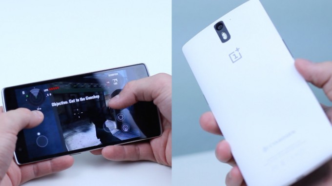
You’re spending more time playing mobile games than ever before
One of the drawbacks experienced when browsing or buying through a smartphone is the inability to see everything on the page at once. The need to scroll or click more can (in the best of circumstances) dissuade prospects from finishing a sale, or (in the worst scenario) annoy prospects enough to make them never come back. Consumers may take their frustration and subpar experience out on your business.
However, with larger screens like the ones found on the iPhone 6+ or the Galaxy Note, some of this dissatisfaction can be abated. By being able to see more on the screen, visitors can click and scroll less, and they often get where they want to be faster and with less aggravation. So, as the web developer, you need to design your business sites with these common problems and screen sizes in mind. Customers will continue to buy products on their phones and might go to a business with a more optimized site if yours does not suit their needs.
Expectations of Responsiveness
10 Web design trends you can expect to see in 2015
People continue to raise their expectations the more that technology caters to them. Most websites are already built with responsive design, but now there’s also a concept called responsive philosophy that is picking up steam. The idea is that each website should respond to the screen upon which it’s displayed and also should tailor its content based on the visitor’s location and preferences. You also might want to add a call-to-action that can be acted upon instantly if a buyer is in a certain area. Or, offer a discount if the phone recognizes that your customer is in your immediate location. These types of responsive (and preemptive) functions can increase a website’s functionality and your business’s sales.
So, as mobile screens continue to get bigger, business owners, consumers and web developers all stand to benefit. The screens promise more opportunities for marketing tactics by businesses, less aggravation to buyers and more work for web developers. Sounds like a win–win–win.