
Convincing calls-to-action, great testimonials and catchy slogans may not be enough to speed up conversion if good design is missing from your landing page.
The first thing that greets the eye of a visitor is the overall design of the landing page. Attractive design will encourage visitors to stay longer on the page and improve chances of conversions.
Let’s take a look at well-designed landing pages that can inspire you to come up with fantastic landing pages for your own business:
Shopify
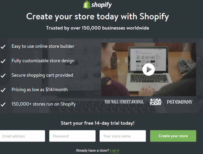
Shopify’s landing page sports a simple design and a neat layout, which make it attractive. All the content- text and visual is cleanly spread on the page and there is zero clutter. The use of video and bulleted text on the page makes for a perfect combination that catches your attention as soon as you hit the landing page. All the important content is right there in front of you. No time wasting!
This allows users to know the benefits at a glance; also, you only need to fill up three fields at the bottom of the page to create your own store on the fly! You can do that on your mobile, tablet or desktop because the design is web responsive.
Basecamp
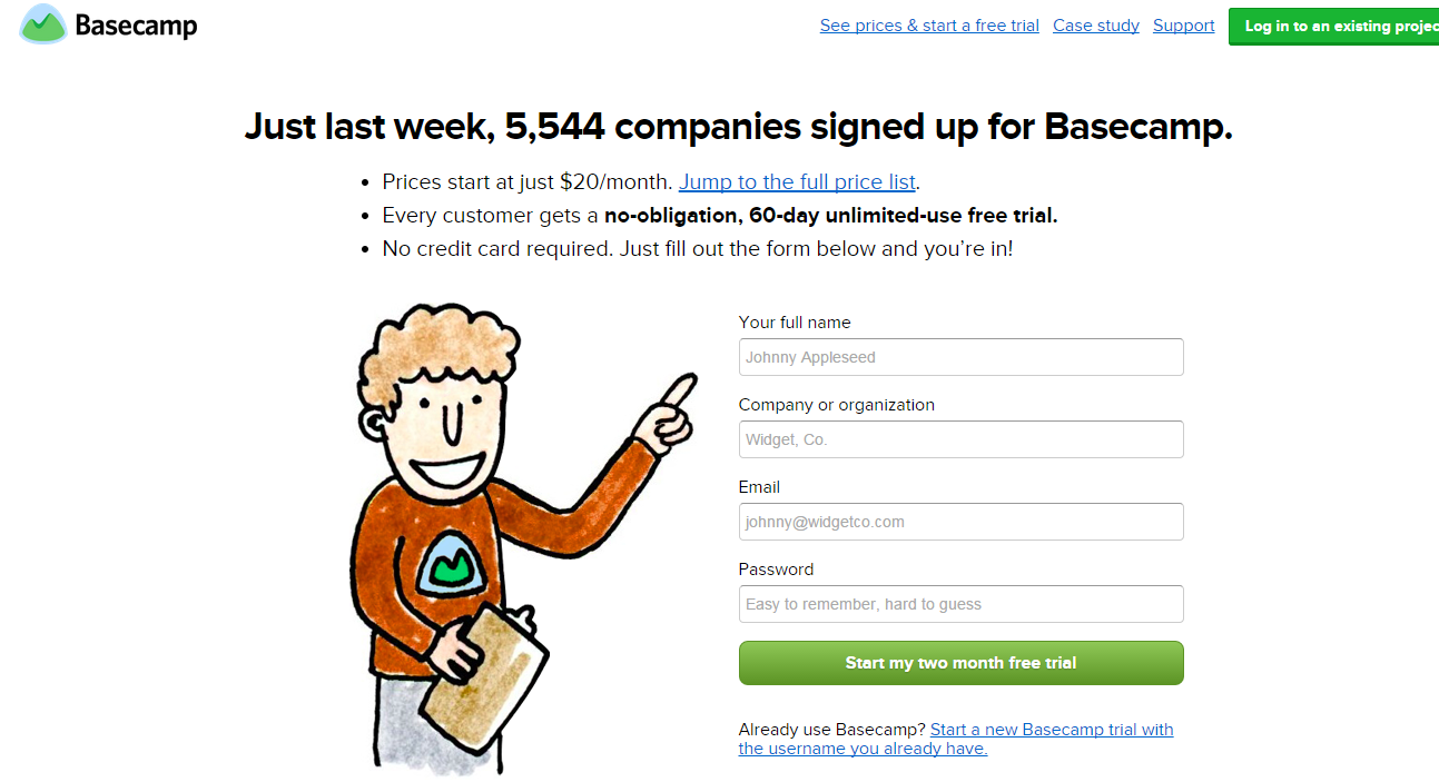
Basecamp has quite an interesting landing page. The colorful illustration of a man pointing to the form adds an element of humor to the page and also improves its engagement quotient. The pointing finger directs you straight to the form. This is very good use of illustration on landing pages.
This landing page is perfectly configured to persuade users to happily fill up the form. The freebie- 60 day unlimited-user free trial – is very impressive and encourages users to part with their email ID and name, and begin the trial.
Right Signature
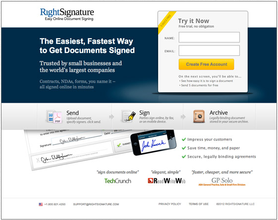
The landing page of RightSignature is a fine example of a landing page that nicely presents the core essence of the business.
The neat layout, good balance between text and design and well placed endorsements from clients are the highlights of this landing page.
These assure users that they are on the right track if they pursue CTA, an easy-to-fill, simple form distinctively visible on the top right corner of the page.
Those new to the concept of digital documentation can view the image of the digitized document and understand what the page has to offer. The landing page design and its content are able to target a broad audience base without creating content clutter. Good achievement!
Wisita
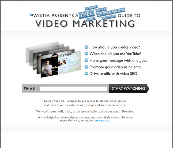
A white background, simple design and well – spaced text take you through the landing page without missing any important information.
A well-placed email field right in the middle of the page catches your attention the very moment you land on this page. A quick glance at the benefits and off you go to the freebie video guide on content marketing, if that area interests you or is your business domain.
Though the headline looks cluttered at first glance, spending a few seconds on it helps you understand the highlights of the product. It’s all about the benefits.
Monetate eBook
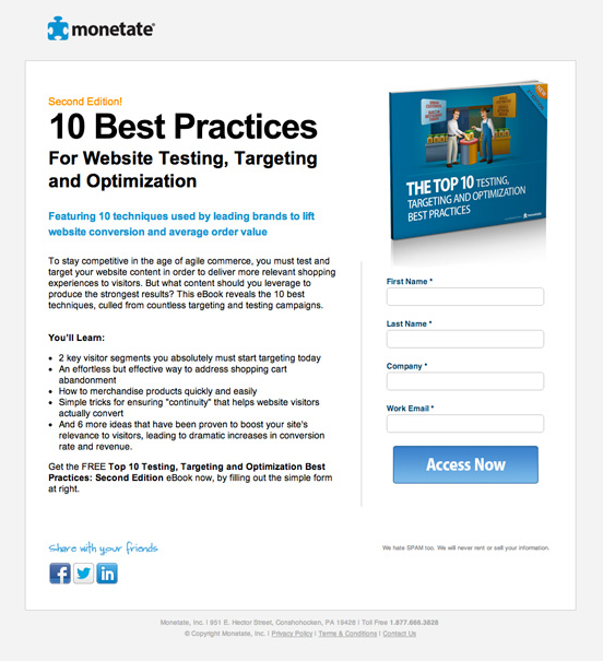
This landing page starts off with a good headline, which is followed by text that talks about the eBook’s highlights. Although this text borders on the explanative, its placement is perfect.
Also, the professionally designed eBook image on the right compliments the content well. The whole page has been evenly split between text (on left side) and fields, icons and images (on right side). So a balanced design overcomes the shortcomings of the long-form text.
MuleSoft
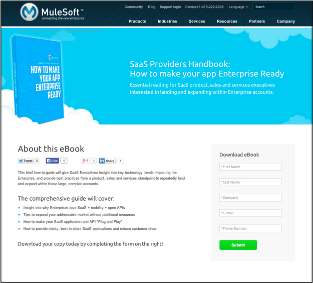
The cool light blue color and the eBook in the white cloud clearly reflect the business’s essence, which is SaaS based (cloud computing). Here, visual content does the talking and the bulleted salient features of the eBook convince visitors to fill the field on the left and download the free eBook gift.
Good use of color and the cloud effect urges visitors to share their details in return for a freebie.
This page has excellent execution of all the lead generation best practices that make for an optimized landing page.
IMPACT
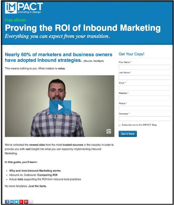
The dominant headline in the separate header box on top of the landing page sends out a loud and clear message to the readers.
The secondary headline compliments it well because it is from a trusted source; an authentic promise about what the eBook offers readers.
As you move down, you can click a video and watch what the presenter has to say to you. A face-to-face communication improves the credibility of the landing page. If that doesn’t make you want to download the eBook, there are bulleted points further down that try and convince you the eBook is just what you need. This landing page, answers the “what’s in it for me” perfectly and will definitely pull you towards the forms in the right upper corner.
Take five –steps and hit the “get it now” button and enjoy a free eBook.
Ring
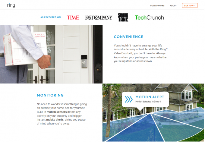
Ring is a doorbell with an in-built video camera with features likes motion detector and connection with your mobile phone so that you can detect any motion on your property.
The landing page nicely explains the product and the content is evenly spread across the page; you face absolutely no problems in understanding product functionality. The design is eye-catching, images impress against the white background and the readability factor is high. So, you will not miss the content even if you are in a hurry.
SqaureSpace
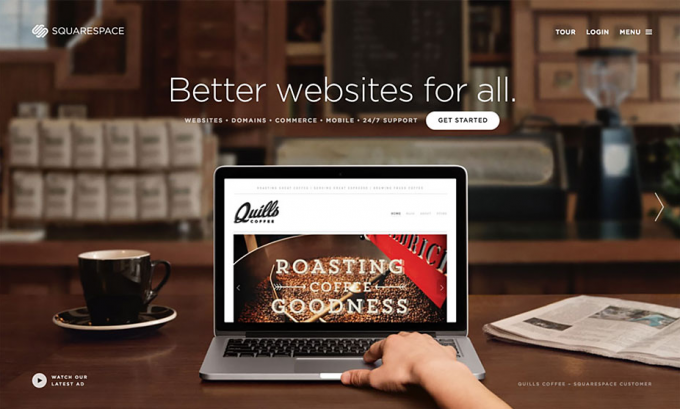
Squarespace helps small businesses and individuals go online by setting up their own websites, without the need of complex and time-consuming coding.
A big headline, dominating background image depicting a website (online business) sends out the core message quickly and with the necessary impact. Here, simplicity in design makes the page more attractive.
GumRoad
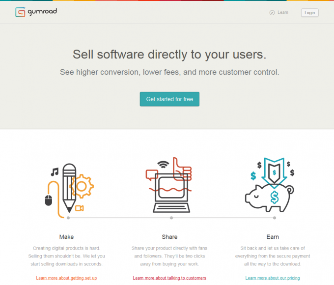
The top header box on the landing page says it all. It spells out the benefits of the business and urges an immediate call to action.
The three beautiful illustrations below this box explain how the entire system works with links to web pages that provide further information if you want to know more about the product.
Conclusion
A holistic creative approach that encompasses the design of visual content, text and user interface should be adopted to create ultimate landing page designs; these 10 examples tell you how it’s done.


I really like Noosfeer’s landing page. It is extremely simple and it gives the information in a glance!