Flyers have been around for decades, and they’re still used by hundreds and thousands of businesses around the world on a regular basis.
The reason for this is simple: flyers work, but only if they’re designed well.
If you’ve been contemplating designing a flyer for your business, you’ll already know that there’s a lot to think about. You’ve got to find a flyer printing company (e.g. www.overnightprints.com); figure out your message; work out your costs; and of course, hire a designer.
But even with a professional designer on board, flyer design isn’t always straightforward. Most people come in contact with flyers on a daily basis, so it’s important that you create something unique and beautiful if you’re going to stand a chance of making any impact whatsoever.
So, to get your creative juices flowing, I thought I’d round up some of the most stunning flyers I’ve come across, with the hope of providing some inspiration.
#1 – Mehrblick
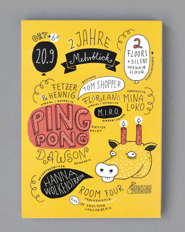
In order for a flyer to get noticed, it needs to be eye-catching, and this flyer from Germany is about as eye-catching as it gets.
It makes use of bright colours (predominantly yellow, but also red and black) to help capture the attention of its audience. It also features quirky illustrations and typography, which invokes a sense of curiosity into the flyer, prompting the recipient to investigate further.
Still, though, it contains all the information an event flyer like this needs, including times, dates and further information about the event itself.
#2 – MCA
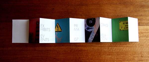
Flyers don’t necessary have to be single sided, as is proven by this multi-page, concertina-like flyer from MCA.
The flyer itself is quite minimalistic, with the design incorporating a lot of white space with minimal amounts of text. It also features colour imagery on every other page, which is what really draws your attention to the flyer initially.
By making use of just one typeface throughout, which is written in large uppercase typography, the flyer maintains its simplicity and readability.
#3 – Vulture Labs
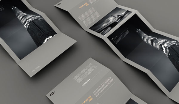
Vulture Labs has created a unique and eye-catching flyer here, which similarly to the flyer from MCA (#2), opens out in a concertina fashion.
When opened, the flyer reveals some stunning photography, which is spread across numerous pages of the flyers’ concertina design. It also features a minimal amount of text, with headings highlighted in a subtle orange colour for maximum readability.
You’ll also notice that the background of the flyer is a dark grey colour; this is certainly an odd choice, but it’s part of what makes the flyer so unique.
#4 – Cancer Awareness Foundation
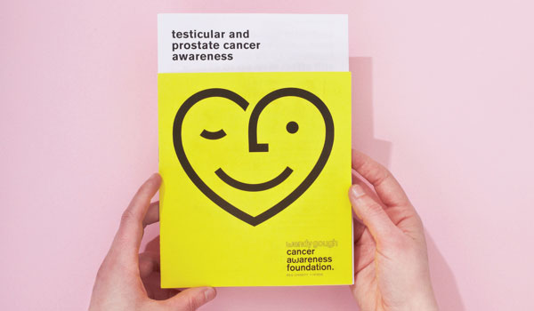
Wendy Gough’s Cancer Awareness Foundation flyer is about as beautiful as any flyer is likely to get.
Much like the Mehrblick flyer (#1), this flyer also makes use of a bright yellow colour in order to attract initial attention. It also features eye-catching, sans-serif typography, which is written solely in lowercase text (in order to keep things consistent with the brand).
Inside, the flyer maintains the yellow, black and white colour scheme, ensuring once again that the flyer is consistently on-brand.
#5 – Lovejoy
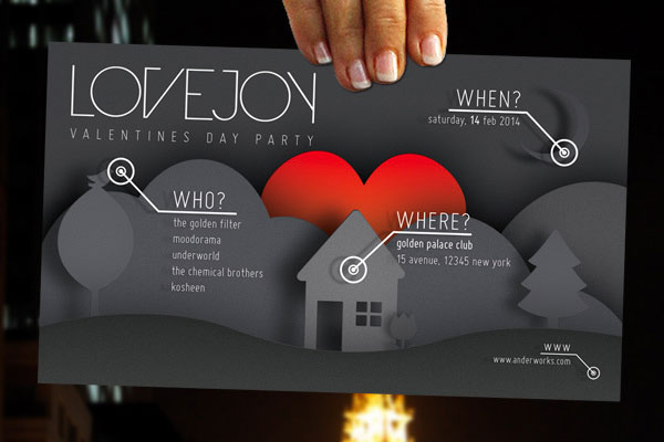
The golden rule of any marketing campaign is to ensure that everything is as clear as possible, and this flyer from Lovejoy does a fantastic job of this.
It’s clearly a flyer for an event, but rather than listing the information is a random, haphazard manner, the flyer lists all information under the subheadings: when, where and who.
What’s more, the background illustration corresponds to these three headings, making the flyer as simple to read and understand as possible.
There’s also an attention-grabbing, eye-catching, bright red heart in the centre of the flyer.
#6 – Volkswagen
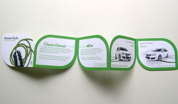
While most flyers tend to keep to a relatively standard rectangular shape and size, this unique flyer from Volkswagen strays from the norm.
It’s quite a small flyer, which makes sense considering the nature of the product it’s promoting (i.e. green cars).
By utilising less paper than a traditionally sized flyer, this design not only showcases the green nature of Volkswagens technology, but also promotes the technology in an environmentally friendly manner (i.e. by using less paper than a regular flyer).
Design-wise, the flyer makes use of a green and white colour scheme, which again, fits the nature of the product it’s promoting perfectly.
#7 – Eco Freako
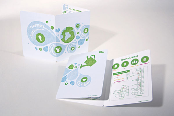
Here’s another flyer designed around an eco-friendly theme, this time for the brand, Eco Freako.
Much like the flyer from Volkswagen (#6), this flyer makes use of a predominantly green and white colour scheme, although it does also incorporate blue. Once again, this gives way to a very “green” design that suits the subject nature of the flyer.
It’s also worth noting that this flyer was printed solely on recycled material, and was used for an internal company campaign, which aimed to get employees excited about “going green”.
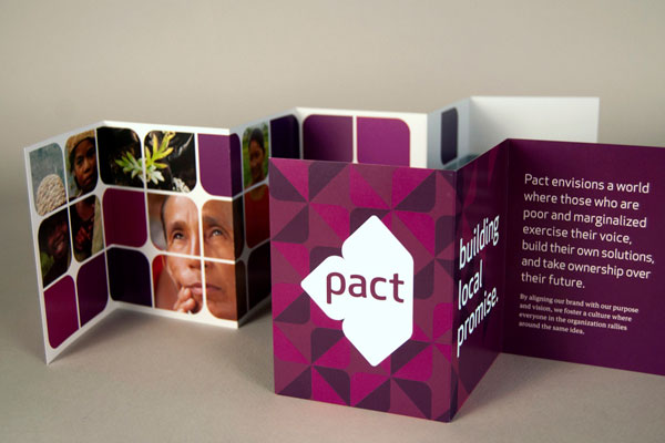
#8 – Pact
Much like the flyers from MCA (#2) and Vulture Labs (#3), this flyer from Pact also opens in a concertina fashion, giving way to a beautiful design.
It’s a flyer with an impactful colour scheme consisting predominately of purple and white, yet there are also other colours featured throughout, thanks to the use of stunning photography.
It’s also a bold flyer, with large sans-serif typography used throughout. Patterns are used to add depth to the simple nature of the design, which works well.
#9 – TVNZ
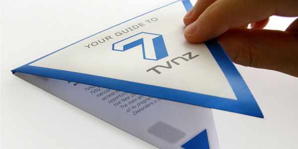
Similar to the Volkswagen flyer (#6), this flyer strays from the norm in terms of its shape and size.
When folded, the flyer is a small triangular shape, yet when fully opened out, it cleverly transforms into the shape of the number seven.
It’s quite a text-heavy flyer, but thanks to the unique folded design, you never end up overwhelmed by this, as the written copy is revealed in small instalments as you slowly open out the flyer.
#10 – Monster Hands
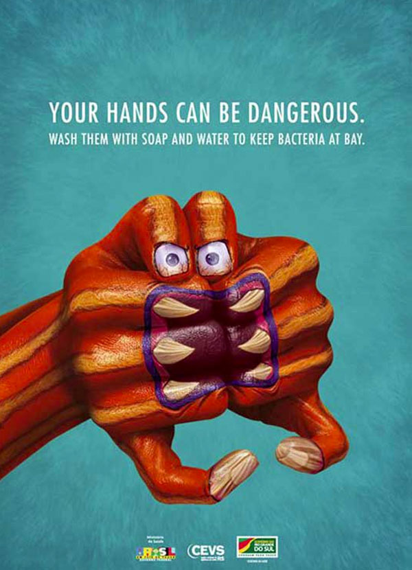
This flyer has a simple purpose: it aims to inform people about the dangers of their own hands, while also prompting them to wash them regularly with a simple solution of soap and water.
Clearly, it’s not the most interesting subject nature for a flyer, which is why the designers opted for the use of the bold (and somewhat scary) imagery you see above, in order to grab peoples’ attention.
It worked, too, as the “monster hands” centrepiece is a great focal point that is likely to capture the attention of anyone who happens to lay eyes upon the flyer.
#11 – HQ Drum & Bass
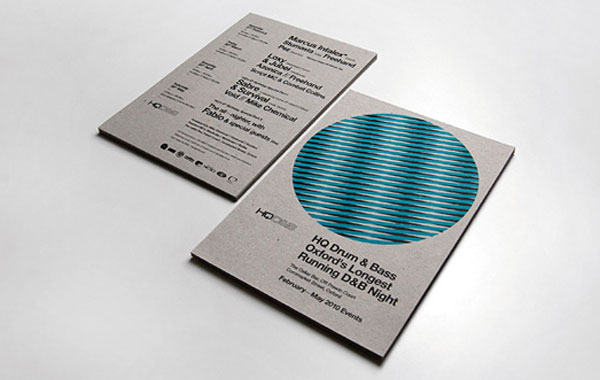
Much like the “monster hands” flyer above (#10), this flyer by Ross Gunter, which advertises an event named HQ Drum & Bass, works on a similar concept, although perhaps with a little more subtlety.
You’ll notice that overall, it’s quite a simplistic and bland flyer. However, you’ll notice that like the “monster hands” flyer, it also features an iconic eye-catching centrepiece; in this instance, it’s a large blue/black/white circle.
It’s this centrepiece that draws your attention towards the flyer, and prompts you to investigate further. Subtle, yet it works well.