The rise of smartphones and mobile technology has pushed Google to launch its Accelerated Mobile Pages (AMP) project, which promises to speed up load times on these crucial devices. Google is only one of many companies that is working to meet new mobile demands. Mobile technology is an important marketing tool, so mobile page design needs to change to reflect its new importance.
The Rise of Power

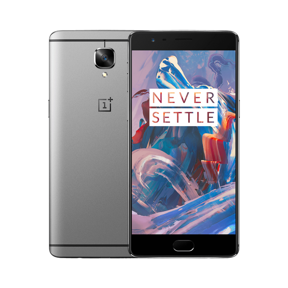
The OnePlus 3 brings a Snapdragon 820, 6GB of RAM, and aluminum body for $399
According to Moore’s Law, the CPU power in smartphones like the Galaxy Note5 will double in the next two years and continue this pattern for the foreseeable future. There is a direct link to this increase in CPU power and the satisfaction people have with using smartphones. For web developers, this influx of raw power has allowed them to mimic the design and functionality used in desktop-level websites. This gives designers the ability to develop something far better than a standard desktop website by using the speed enhancing shortcuts already in their toolkit.
An Application-Based Direction
How web design and mobile design are becoming the same thing
As CPU power continues its upward trek, mobile web access will become increasingly application-based. Currently, people are more likely to use their devices to transmit and review information on a mobile device than they are to create it on one. However, this is rapidly changing to the point that a contemporary web developer would be remiss in missing its future impact.
Developers should create their mobile sites so they have the ability to use application-based software embedded into the code. They should be able to work with common products like Microsoft Office in such a way that the application is enhanced with simple magnifiers and input techniques. In the future, they should be integrated with a fully functional product to produce new work.
Age and Usage
16 trends from Mobile World Congress that will reshape the year ahead
There is a huge difference in how a 20-something millennial and a 50-ish baby boomer surf the web on their mobile devices, so these demographic differences should be built into the responsive code of mobile webpages. Older users typically opt for hardware that offers a larger screen format while younger generations may look for novel functionality. So, developers that are targeting the older crowd should not fill up the screen with small text, and those looking to work with millennials should be on the cutting-edge and looking for the next trend.
The Rise, Fall and Rise Again of Skeuomorphism

How mobile became the perfect home for flat design
There is value in making something look like what people think it should look like. This is called skeuomorphism and mobile technology has used it in innovative ways. A great example of this type of design is smartwatches because, even though they are more like tiny computers, they still are designed to look like analog watches. Some people love the science fiction look of an anti-skeuomorphic device whereas others want a steampunk rendition of old meets new.
Designers should reflect on their brand image and decide where it sits in the skeuomorphic spectrum. If their brand caters to a demographic that understands Windows-based software, then their mobile design needs to show this. But if their brand promises something different, new and innovative, then common design limitations go out the window. As a warning, though, designers need to be sure that their customers will understand how to use their product when deciding to break the skeuomorphic rules.