Headlines serve multiple purposes. They are primarily attention-getters. They can lead you to what you are looking for, or even entice you into reading content you were not even looking for. A headline can serve as a call to action (CTA), although in most cases they direct your attention to the text in which the CTA will be found.
Headlines also serve as navigation aids. Imagine trying to navigate your way through a newspaper that didn’t use headlines! But their most important function remains the first one mentioned – they are attention getters. Being big and bold helps – after all, they should stand out from the rest of the text, but what they say also matters.
One other thing that matters with headlines is the font that is used. A good choice of fonts can set just the right tone for your website, poster, or printed add. People pay attention to fonts, even when they don’t know one type or style from the next. Some fonts will grab their attention, while other fonts won’t.
Finding the best free fonts for headlines can be difficult. It has to serve its intended purpose, and at the same time it has to fit in with everything around it (even when fitting in means standing out from the crowd – which of course it should).
So, where do you look, and what do you look for?
We’ve curated a list of awesome headline fonts to get you off to a good start. You can download any one on the list, and best of all, they’re all free to download.
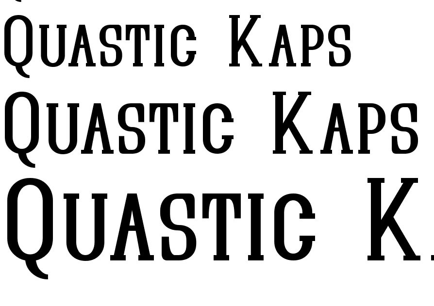
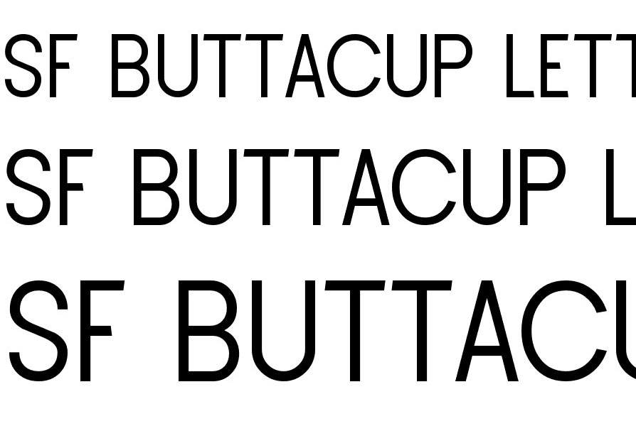
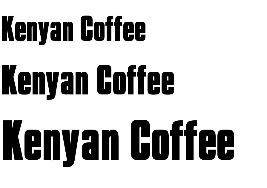
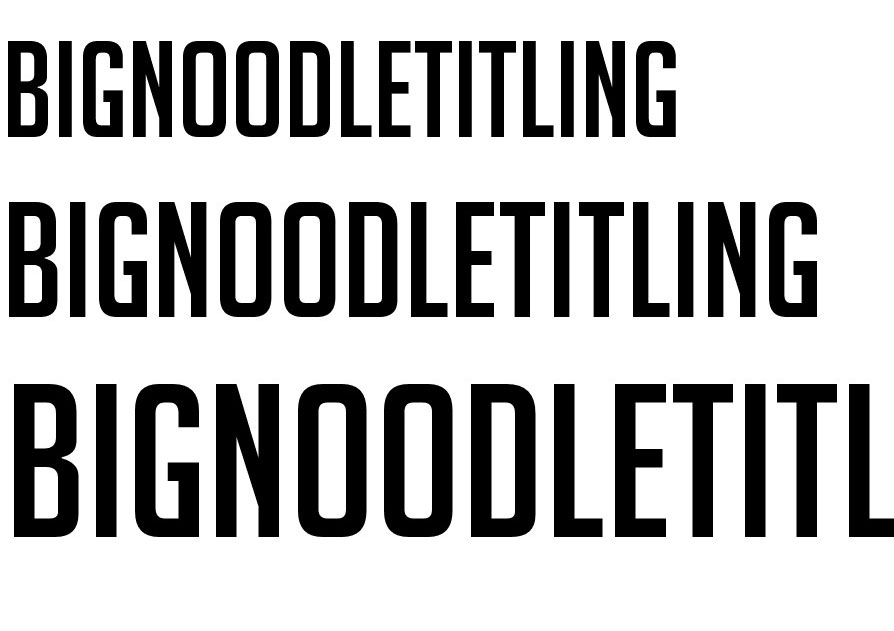
Free Headline Fonts
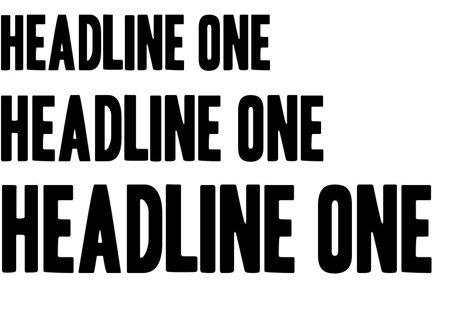
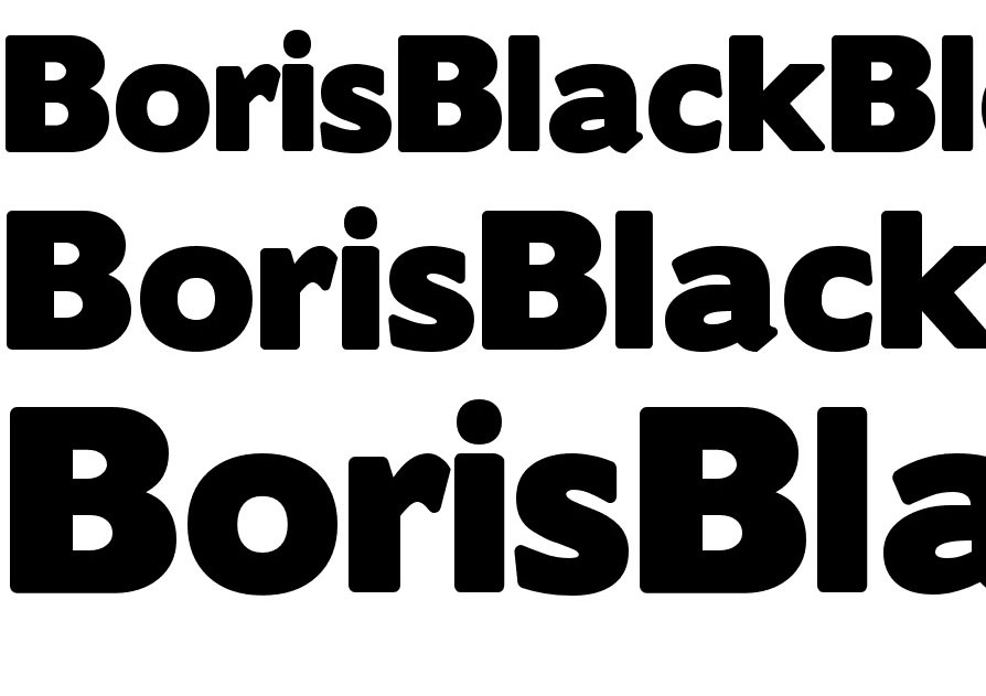
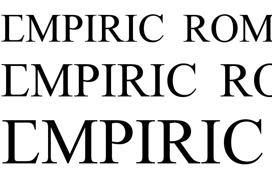
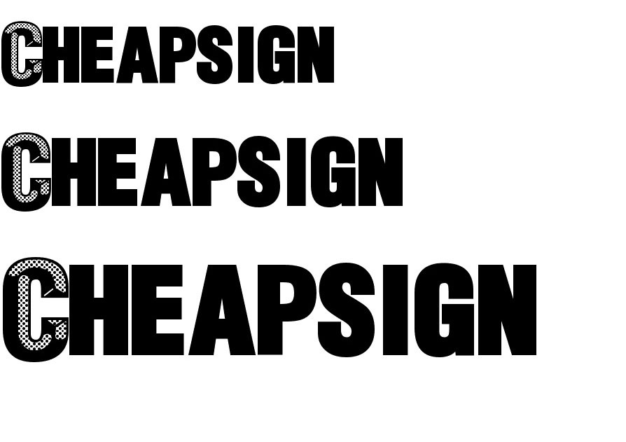
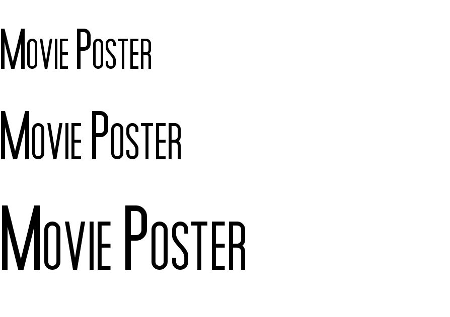
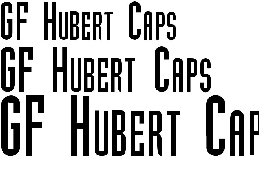
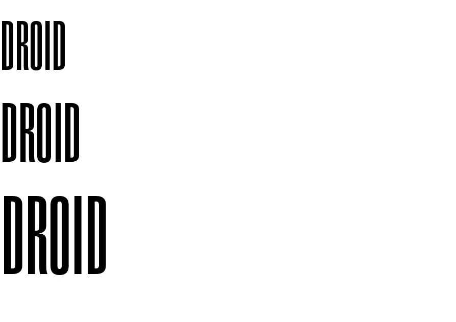
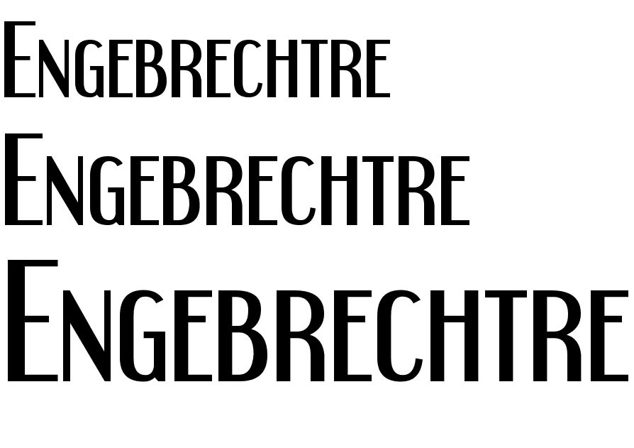
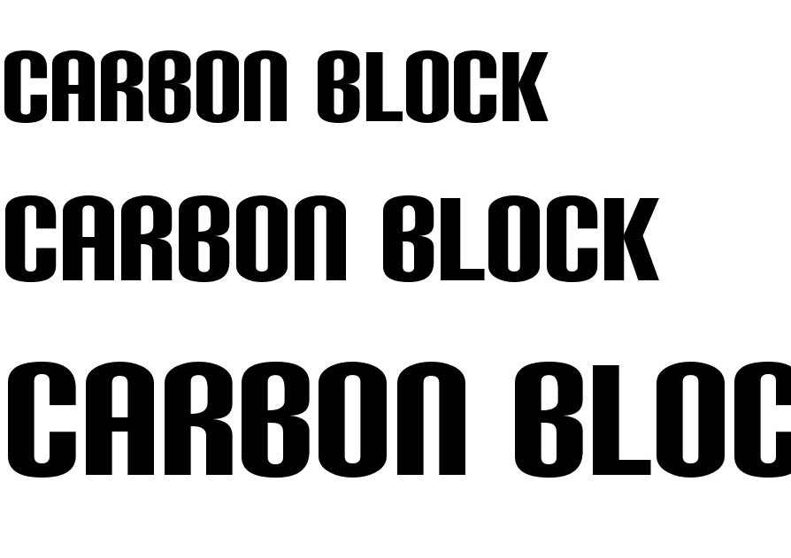
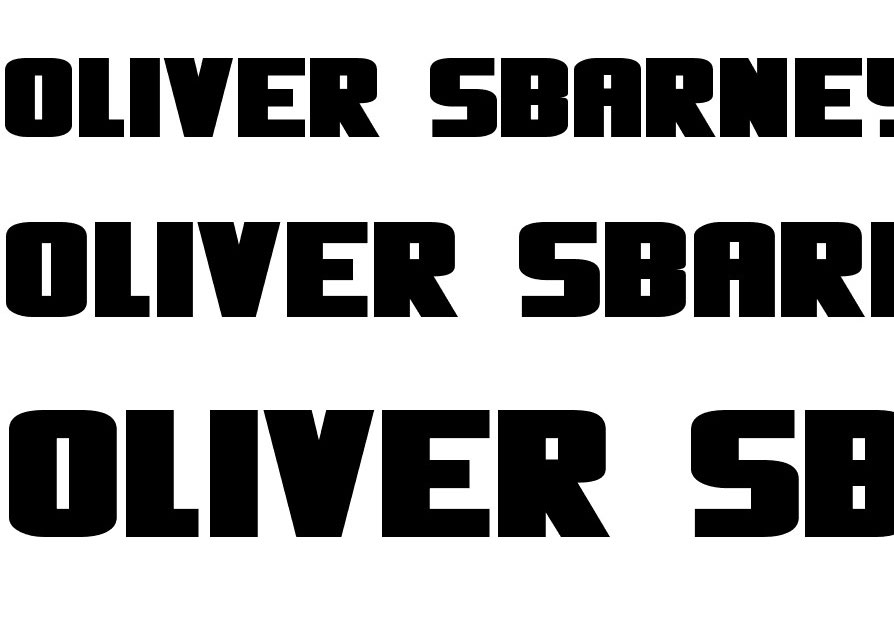
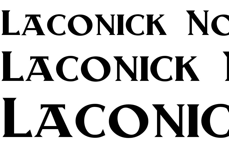
As you will see, most of these fonts are bold, which is a characteristic you might expect in most headline fonts. With three exceptions, these free samples are sans serif type fonts which is typically true of a majority of headline fonts.
All are highly readable, although in one case (Empiric Roman), the uppercase letters used are those found in the alphabet used in the Roman Empire. Plus, if you need numerals, you may have to bone up on your Roman numerals to get the right fit.
Several of these font styles include letters or the diacritical marks used in various European languages, and most feature numerals and punctuation marks.
Note that in several cases (Headline One HPLS, BigNoodleTitling) small cap letters are used as lowercase letters, a style that is particularly suited for headlines.
If exceptionally bold is what you’re looking for, our first sample, BorisBlackBloxx, is definitely worth a look; as is Oliver sBarney.
Why Headlines Matter
As we mentioned before, attempting to read a newspaper or news magazine would be quite a challenge if there were no such things as headlines. There’s simply too much content to consume, and you don’t necessarily want to have to read it all to find what is of interest or importance to you.
Advertising agencies, TV networks, magazines and newspapers, and websites face this problem. To attract and engage readers or users, they need to find creative solutions, and they need to be doing so constantly.
A headline can do more than point to content of interest. It can also serve as a snippet; something that summarizes the content of an article in a brief, succinct fashion e.g., Yankees Win Second Straight from Boston 3-2.
This is especially important in websites, where users tend to scan, rather than read from line to line, and top to bottom. Scanning is an exercise in quick judgement. We scan for words and phrases of interest, while subconsciously separating, grouping, and prioritizing the elements contained within a layout.
Scanning is how your website’s visitors find what’s of importance to them. Scanning also lets them disregard what does not appear to be important. You can’t necessarily control how users will scan your site, but you do have a measure of control over how easily they can find what they are looking for.
By making the right choices in writing, typography, and visual design, you can also direct users to what it is you want them to find or discover.
The Importance of Designing a Proper Headline in Web Design
Whether you call it interesting or enticing, there is a certain quality a headline must have to make visitors want to read further. Reading content line-for-line takes more time than most visitors will want to spend looking for something unless the content is either particularly compelling, or happens to be what just what are looking for. The challenge for the web designer is to do whatever it takes to help visitors make the best use of their time – a commodity that is generally in short supply.
If, as studies suggest, 80% of your visitors are going to rely on your headline(s) to decide whether to stay or leave, it only makes sense that informative headlines are of great value. Use your headlines as you would road signs. They will tell your visitors if they are on the right site, and if so, how to capture the quarry they are hunting.