Your website leaves the first impression about your business with your clients and your end users. It can rightly be called your commercial face on the internet. An artistically designed website bridges the gap between your business and your customers. Just like the powerful welcome address that cheers the jamboree, your prolific website acts as the entry point for those who wish to step into your business. In general, websites should be designed circumspectly and certain mistakes should be avoided while developing your website. This ensures that your site is free of flaws and is perfect for you to communicate your messages to the right group effectively. The common mistakes to avoid while developing a website are:
Confusing Visitors By Using Complex Designs
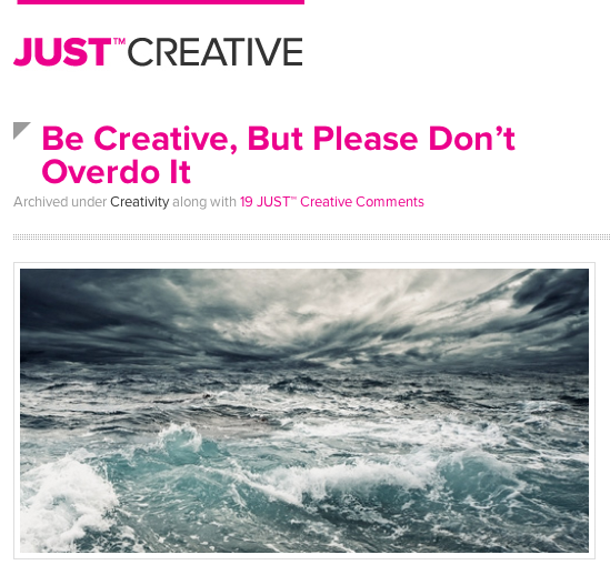
Be Creative, But Please Don’t Overdo It.
It is always recommended to use simple designs for your website as complex designs can confuse and irritate your visitors. The first few seconds they spend on your site is when they decide whether to stay on your website or switch to the next one. Use straightforward and relevant designs that suit your business or profession. Avoid overusing of Fancy Animations or Flash, loading your site with unnecessary information and making use of other multimedia features that bring down your site’s performance. Using complex and lavish designs will confuse your users and force them to leave your site immediately.
Making Flat Designs

The Web Designer’s Idea Book, Vol. 2: More of the Best Themes, Trends and Styles in Website Design
A flat web design pattern is one where all the pages of a website are arranged in a row that looks closely connected. In this design, every page is reachable from every other page. Flat designs are generally suitable for smaller sites with the basic web pages and it has the tendency to bring down the charm and magnetism of your site. The users might feel sick and droning while using such a lifeless websites with flat designs.
Difficult Or Illogical Navigation

30 Examples of Clean and Minimal Website Navigation – WDL
Intricate and illogical navigation test the tolerance of your users. Always ensure to use consistent and simple navigation in your website. Numerous navigational links, sections and dead links might cause frustration to your visitors and divert them away from your site. Simple navigation improves the usability and grants the best user-experience for your customers. Arrange and prioritize your navigation as per the theme of your website.
Using Saturated Colors

Colors in Web Design: Choosing a right combination for your Website
Avoid using saturated colors throughout your website as it can strain the eyes of your visitors. Even the most exceptional content may fail to convey the right message if it is unreadable with the use of saturated colors and bad color combinations. Many trust that saturated colors are bright, dynamic and attract the attention of the users but the actual fact is that these colors slow users down. Always make sure of using desaturated colors like gray mixed with small amount of blue or red, deep brown, deep blue etc,. These colors will give a professional look and keep the users moving enthusiastically.
Evading these common mistakes from your website design will help you attain your business goals and help your website thrive!


Great tips! I especially agree with not over-doing the creativity.