Author Bio: Tomer Lerner is an award-winning designer and a UX Manager at Webydo – the code-free website design platform for professional designers – where he manages the UX development team to push beyond the limits of creativity.
Strong typographic design skills are an important part of working on the Web today. At Webydo, we’ve understood that well executed typography ensures that the content on websites is easy and enjoyable to read and ultimately contributes to the overall success of that website.
So how do you know if your typography is up to snuff? In this article, we will cover 6 questions you should ask about a website’s typography.
1. Do the fonts chosen include easy to distinguish letterforms?
One of the most important principles of good typography is readability – after all, the text on the websites we design is meant to be read by that site’s visitors, so ensuring that all text is easy to read is critical. When considering readability, the first area that you must look at is the letterforms in the font you have chosen.
There are literally thousands of fonts available to use in your designs, but not all of those fonts are conducive to readability. Many fonts include letterforms that are difficult to make out, making the words and sentences they spell out very challenging to read. Fonts with very thin letters or overly ornate designs, two traits you will find in many script fonts, can make the content hard to read, and when content is hard to read, you risk that people will simply not read it at all!
When evaluating font choices, look for letterforms that are easy to distinguish from one another. This does not mean you need to only stick with sans-serif fonts with thick, bold letters, but it does mean that if you decide to utilize more exotic font choices, that you must always be mindful of readability.
2. Is the contrast sufficient?
Adequate contrast between the color you select for your text and the background on which that text sits is another factor in website readability. Black text against a white background may not work for all designs, but purely from a contrast perspective, you can’t get any better than those choices!
While text will very low contrast may look visually appealing as a design, it is unusable, and since website must be used to be successful, you have to find a contrast that both looks good and is sufficient to make it easy to read.
Contrast also plays a role in helping to discern one type of content from another, especially when you consider hyperlinks. By using a contrasting color for links versus the rest of a site’s text, you clearly show visitors which text is “clickable” and which text is not. This makes it easier on a site’s visitors get around the site and complete whatever actions they came to the site to accomplish.
3. Is the size of the text readable on all devices and screen sizes?

Different screen sizes requires different font sizes. A font size that looks good on a desktop computer may not be large enough on small screen devices like smartphones. On the other side of the equation, text set very, very large may make a bold impact on large screens, but may be way too large to look appropriate for small screens. You need to look at the size of your fonts and adjust them based on the screen size of the visitor accessing that site. Responsive web design will allow you to do this.
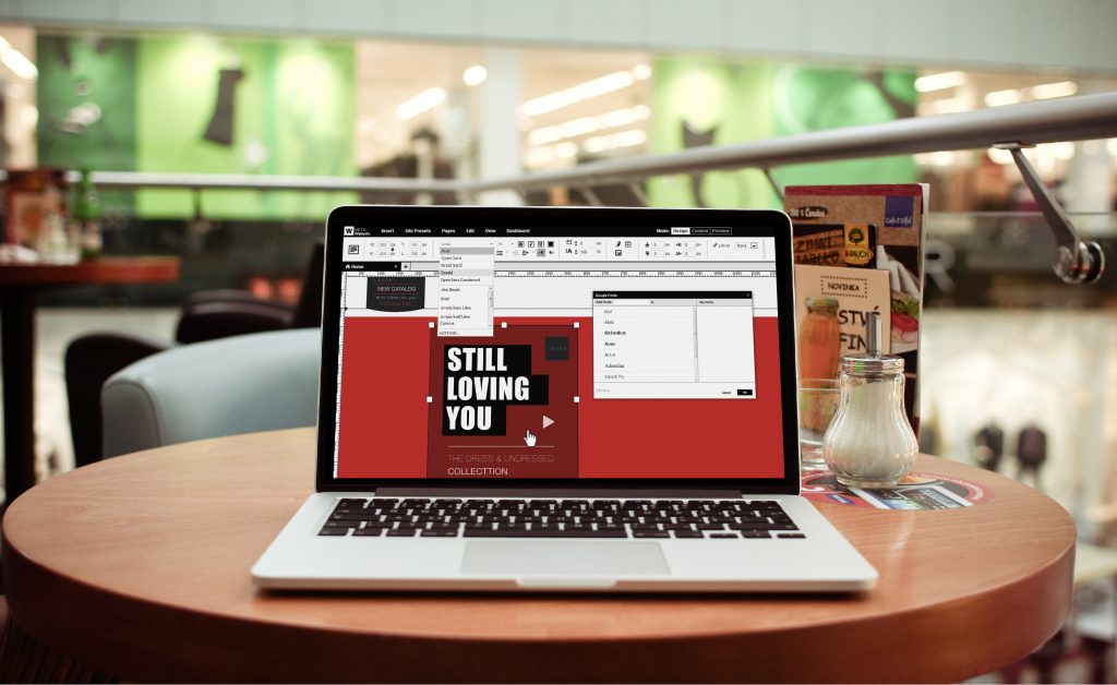
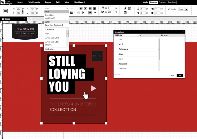
Having a responsive website that reflows its layout, and adjusts font sizes, for different screen is a critical component to successful sites on today’s Web. Websites can be hand coded to be responsive, or a platform like Webydo and their Pixel Perfect Responsive Editor can bring this same functionality to a site without the need to hand code anything. This can give designers complete control over all aspects of a site’s design, including font styles, for all screen sizes.
4. Will the fonts display for all visitors?
For years, websites were limited to using “web safe fonts”, a select group of fonts that were all but guaranteed to be found on user’s computers (which is where websites traditionally loaded the font file from). With the rise of @font-face and web fonts, the variety of fonts that can be reliable used on websites has increased exponentially. This is accomplished by including font files along with a website in the same way you would include other resources, like images.
You can also link to font files that are hosted at 3rd party solutions like Typekit, Google fonts, or the aforementioned Webydo platform which includes hundreds of open-source fonts that are optimized for web delivery. By using web fonts, you give yourself an exciting range of typefaces to choose from and you ensure that those fonts will display accurately for all visitors.
5. Is the white space around text adequate?
From a readability perspective, we have already covered the concepts of letterforms, contrast, and sizing, but one additional factor to consider is the spacing, or “whitespace” around content.
Good typography includes adequate use of whitespace, allowing readers to easily process the content and see where one piece ends and another begins. Unlike printed pages where space is often as a premium, websites can scroll as the content on a page gets longer. This means that you do not need to cram too much content into too small a space simply to get it all in. By spacing content out, you allow the site to flow more naturally and once again, you improve the reading experience for site visitors.
6. Does it look good?
While the previous 5 questions have all focused on readability and the technical aspects of a site’s typography, you must also ensure that the design looks good and that the fonts chosen and the styles selected work with the overall look of the site and the brand of the company whom that site is for. You should never disregard a site’s usability of the readability of the content, but that does not mean you need to sacrifice the visual aesthetics of the site’s design. A successful website is one that works well and looks great, and with so much of the Web being text content, a great looking site is one whose typography is attractive and well executed.
When evaluating your site’s typography, address the technical considerations covered in this article, but also remember to simply ask whether or not the typography looks good!