Web design has evolved tremendously. Much of this can be attributed to the numerous studies that have been devoted to concepts like user experience and design elements such as typography.
Yet, designers still continue to make the same old web design mistakes that date all the way back to the early years of website design. Effective web design should help visitors to track down the info that they are searching for, but many website designers fail to achieve this and as a result the following four fatal web design mistakes still rear their ugly head today.
Fees or prices that are hidden

10 Principles of Effective Pricing Pages
Whether it is the price of a product or fee for a yearly subscription, potential customers want to know exactly what they will be required to fork out in advance before they initiate a transaction. If the prices and fees cannot be found easily, your visitors could feel that you are being dishonest. Needless to say, it could mean that you will clinch fewer deals.
Content cannot be found

4 SIMPLE STEPS FOR PERFECT WEB NAVIGATION
No visitor wants to decipher a website. However, there are still several website designers that place the content somewhere that visitors will have a hard time finding it. According to the web design Perth agency Magicdust, something important such as the contact details should always be just a click away no matter which web page of your website visitors are browsing.
If a potential customer cannot find what they are searching for, the chances are pretty good that they will simply go to another website instead where the content is organized in a clear, easy-to-understand fashion.
Unpleasant user experience
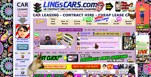
Bad Web Design: A Look At The Most Hilariously Terrible Websites From Around The Web
If you want to ensure a great user experience, it is key that visitors do not find it too much of a challenge to interact with your website. One mistake that countless websites make is that they do not search the whole website for searchable terms or the results that are returned to the visitor do not match the words that a visitor entered into the search bar.
Too much info
Reducing Cognitive Overload For A Better User Experience
Confusing information architecture is one of the web design errors that will lead to an unpleasant website experience for your visitors. As a matter of fact, information architecture should be the essence of effective web design as it makes it easier for visitors to understand your content so that they can easily locate the desired info.
Many times web designers include too much info which just ends up overwhelming visitors. As Internet users do not exactly read the content (they typically simply skim it), your website content should be divided into shorter paragraphs. Listing information by using bullet points can also ease reading.
So, why won’t these four web design disasters die out? The issue can partially be attributed to the fact that so many website designers simply do not know enough about usability.
So, if you want to be a successful website designer you should make it your top priority to offer your visitors a first-class user experience. Fail to do this and you are giving your customers one more reason to support your competition instead.