Is your personal or business website gathering virtual dust instead of welcoming an ongoing stream of relevant traffic? Then it could be due to one, some, or possibly all 10 of these deadly sins of website design:
- Your website isn’t optimized for mobile traffic (i.e. it doesn’t have responsive design). This is a massive mistake, considering that 51.5% of all internet traffic around the world is on mobile devices — and the number is rising each year.
- Your website is loading too s-l-o-w-l-y. Research has revealed sites that load in 5 seconds or less have 70% longer average sessions vs. sites that load in 19+ seconds.
- Your website doesn’t have clear and easily visible contact information. If there’s one thing that visitors hate more than anything else, it’s digging around looking for contact information.
- Your website doesn’t have standard, intuitive structure. Imagine going into a grocery store and having no idea where anything is, because there are no aisles or signs. Well, that’s what visitors experience (that is, until they flee) when each page is like its own site-within-a-site. Navigational simplicity and consistency is a must!
- Your website’s text is difficult to read. What you want is dark text against a light background. This website that is offering the VenomRex 601 20” wheel for the Ford F-150 does it the right way: clear, crisp fonts that scale.
- Your website is only trying to make search engines happy. Yes, you need to pay tribute to Google if you want your website to rank in the search engine results page for relevant keywords. But you don’t want to forget that it’s human beings — and not search engines spiders — who will actually read your text. If it’s incomprehensible SEO-speak, then they’ll hit the back arrow and never return.
- Your website doesn’t have search functionality. For every person who knows how to use the address bar to search a site (site:domain keyword), there are 99 who don’t.
- Your website has auto-loading videos and audios. There may come a time where this is standard fare and a best practice. But for now, most people don’t like (or just hate) auto-loading content.
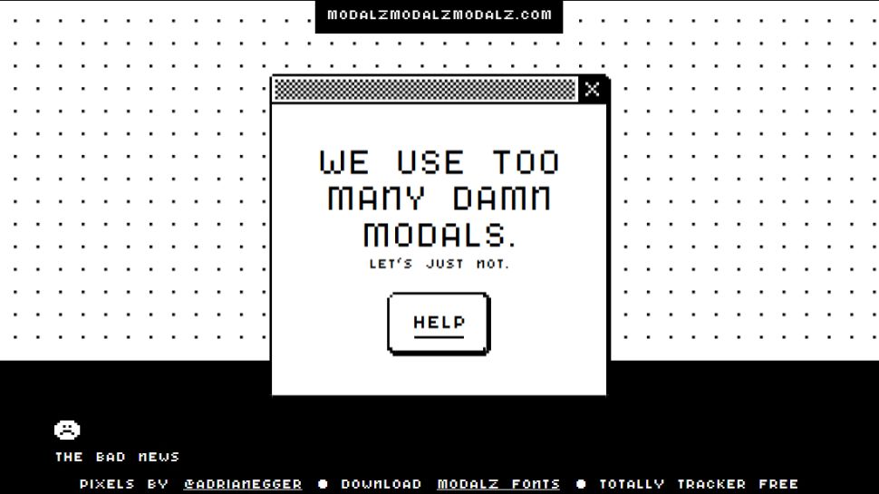
- Your website inflicts visitors with endless popups. One or maybe even two small popups are fine — for example, you may want to invite visitors to download an ebook or subscribe to your mailing list, or you may want to proactively let visitors know about your cookie/tracking policy. However, you want to be as non-invasive (and non-annoying) as possible.
- Your website’s social media buttons don’t work. It’s hard to grasp why this mistake is being made since it’s so easy to fix, but it’s surprisingly common.
If your website is committing one, some, or perhaps all of the above 10 deadly design sins, then your mission is clear: fix them ASAP! You’ll generate more traffic, engagement, impact and results — and really, isn’t that what you want from your website?


Pop-up ads are an eyesore. A common user like me would think that there’s a malware that could potentially damage my system so I just leave the web page without having to read any of its content.