Mobile devices like smartphones and tablets are becoming ever more popular, with their market share growing by leaps and bounds every year. In fact, it feels as though “dumb phone” users are quickly becoming the minority. In 2014, mobile device users surpassed desktop users worldwide with over 1.6 billion users, with the trend projected toward 2 billion users in 2015. As the number of mobile devices grows, so does the percentage of web traffic that is allotted to these devices. Make sure you’re prepared with a mobile-friendly website.
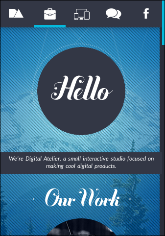
Not only do you need to have a web design that looks good on a mobile device, it should automatically reformat itself to best fit the users’ screen. This is called responsive web design (RWD), and using it on your site is one of the best things you can do for your web audience.
Responsive Design Choices

The Next Big Thing In Responsive Design
Responsive design fixes many of the problems that early mobile web design experienced. As mobile device screens got larger and the networks they communicated with became more robust, users demanded that they begin to get the same style of design they were used to on their desktop.
Several advantages exist for RWD, and these advantages can help you gain and retain customers. First, RWD ensures your website will look great regardless of the platform. From Apple, to Samsung, and everything in between, RWD allows the information to reorganize itself using simple rules according to the device size. This ensures the best and most efficient user experience. Because of this type of information uniformity, the user can get familiar with the site whether they are at home or on the go.
Behind-the-Scene Advantages

The Pros and Cons of Responsive Web Design vs. Mobile Website vs. Native App
Beyond the front end user impacts, however, are very robust tools and advantages behind the scenes. Google has released guidelines about ways to better take advantage of their search algorithms, and having a RWD site is among the most important — especially for smaller business sites. In essence, because a RWD design uses only one URL, it makes it easier for Google to index. And what makes Google’s search results happy, makes your web traffic happy. Having only one website to deal with also keeps your costs and hassle to a minimum.
There isn’t a need to develop a completely stand-alone application to get information to your customers when a website can do the same with fewer resources and less maintenance. Apps can be great if you are trying to promote a very specific function such as a game, but the apps cannot have the same amount of synergy that responsive design can. Traffic to your app will be tracked separately from your web traffic. Thus you will have two separate traffic metrics rather than one cohesive audience.
Responsive web design will continue to be a must as time goes on. Make sure your company website is up-to-date with a fresh, modern, responsive design that attracts and keeps customers on your page.
Good Examples of Responsive Designs
THE 14 BEST EXAMPLES OF RESPONSIVE DESIGN
50 Awesome and Inspiring Responsive Website Designs from 2014
21 Fresh Examples of Responsive Web Design
4 ESSENTIAL LAYOUT TRENDS FOR 2015
The top 5 trends in app design for 2015
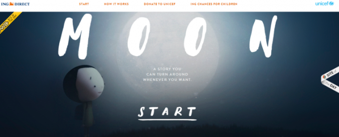
Find inspiration for your website by visiting sites like Disney and Studio Ghibli who have implemented some impressive RWD concepts onto their sites. Figure out what features are most important on your site, and highlight those among your design’s priorities. When it comes to mobile site success, function trumps form!







Nowadays,
Responsive design is very important for multiple device users. Because google ranked those site easily that site is fully responsive.