Liven up your website with a design overhaul that not only drives in viewers, but also has them hang around and explore your website. You do not need a mystique charm to do this; just get the details right and you are done. Here is how you can make your website exceptionally catchy, read on!
We all agree that attractive illustrations, creative website design outlay and convincing content can draw visitors, but sometimes it just does not seem to work in your favor. If you have ever been on the creative side, you would know how it feels when you have the trendiest theme on your website and still has to struggle with low viewer involvement.
Your web design should be laid out in such a manner that it entices the viewers to explore your website, hold them through your message and finally leave it to them to take the action.
It does not matter whether yours is a corporate site or it has a social message, you can take some good information from this write-up.
A caveat: There is not an ultimate secret ingredient to creating a spellbound web design, but it takes a series of things put into perspective, which goes like this…
1. Evoke a Eureka Moment!

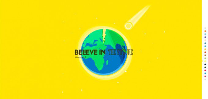
GRABBING ATTENTION AND BUILDING A MOVING EXPERIENCE WITH SHAPE
Assemble graphics and content to create an ‘Aha’ moment. That is when the viewer engages with you emotionally and sticks on. Two ways of doing this are (A) Keep the web layout coherent to avoid having your visitors flee mid-way. (B) Couple this with prominent (if not large), inspiring and high-resolution graphics.
Learning here is: Create a cohesive visual experience. Shades and strokes stir up emotions that evoke involvement – leverage it and create a striking appeal that sticks to the viewer’s mind. Combine that with compelling content and you are pretty much through to creating the coveted ‘Aha’ moment.
2. Tell a Story

30 COMPELLING EXAMPLES OF VISUAL STORYTELLING ON THE WEB
We all love the water cooler gossips in the office and the stories around the bonfire with friends. We are all ears when these stories are been shared. Now that you know this, translate it on your web design to engross your viewers. Get yourself a story-driven website! Consider going through some good movie websites for inspiration.
Learning here is: This is the time-tested way to get anyone engaged. The catch here is that you have to be a really good storyteller. Learn the tidbits about information hierarchy, it will help you to better understand viewer’s psychology and design your website with high possibilities of conversion.
3. Escape from the Conventional

30 Fresh Websites with Unique Non-Standard Design
We all love greener pastures and are attracted to the unusual. Brainstorm to find out how you can make your web design different, something that stands out. High-definition graphics coupled with distinctive typography is a good starting point. Typography can be powerful in putting your message across with an impact.
If you keep doing what others have been doing, you will be yet another one in the crowd. However, if you present your website differently, your message will stand out in the crowd and get attention. It might be an intense process to discover a unique spot, but it is rewarding….
Learning here is: Leave an indelible impression with the way viewers interact with your website. Just as you like to have your favorite ice-cream flavor over a zillion of other flavors, similarly design the web layout such that it sticks to the viewer’s mind and they want to keep coming back to it. The key here is research + creativity. And yes, respect the line between unconventional and weird.
4. Keep Essential Elements above the Fold

Designing for the New Fold: Web Design Post Monitorism
With solid online competition, it is difficult to get viewers. And if you get them on your site, you definitely want to make them stay. People spend more time (relatively) on the content that shows up on the screen without scrolling. Design it effectively. Smartly place the call to action here, promotional offers or the sign-up button so that you can benefit from impulse responses.
Learning here is: The information should be arranged such that the visitors can quickly find what they are looking for AND it should promote exploring the site beyond the primary information need.
5. Make something, and then make it Better

Iteration – A cyclical process to improve the quality and function of design.
Those who know the rules of chess do not win the game every single time they play. With practice, you fine tune your skills and get better in the game. It takes incremental improvements to get to the website design that your target audience loves and want to stick around.
Learning here is: Iterate. You guessed it right, the decades old Japanese concept of Kaizen fits great here. Give your website design your best shot, and then test it. Then test it yet again to see which pages are liked the most, and can you do a similar thing with the pages that have a high bounce rate. There is no shortcut to success.
Bonus Tip
Have a Roving Eye for Inspiration

Top 20 web design trends for 2013
Get inspired, stay inspired, and create an inspiration. Google up ‘inspiring web design’ to get a whiff of inspiration from the zillions of other websites. This will help you push through your creativity block. The idea here is to have fun with your art and if you are stuck, allow yourself a breather.
Learning here is: Take time off to inspire your mind. To uncover that killer idea, sometimes you might be required to take a step back. When you are inspired by someone’s work, you get the pluck to stretch your boundary and explore your craft. You might not end up with a masterpiece, but will land up with something special.
Learned the Rules? Now break them – That’s Creativity

Design Patterns: When Breaking The Rules Is OK
If you already have a website or have an outlay ready, look at it right now. Remove all the distractions, shave off all that shadows the impact of the message and things that dilute it. Keep only the necessary. After you have chiseled out the baggage, what you have is a website that creates an impact. And now that you have made a place in the viewer’s mind, it’s difficult for them to get it out.


hi
nice article thank fore sheering
useful tips
Awesome Website design tips! Thanks for sharing.