Your landing page is where you truly convert your visitors and convince them to take some type of action. Regardless of what’s happening outside the landing page (PPC ads, Facebook ads, etc.), all the money in the world spent getting people to your page will prove worthless if your landing page isn’t optimized to convert visitors.
Every decision you make for your landing page counts: from choosing the right hosting solution to arranging your layout, there’s no detail that should be overlooked. Whether you’re starting a website for the first time, or are redesigning it because your analytics show it isn’t doing well, there are several things to keep in mind when constructing your page.
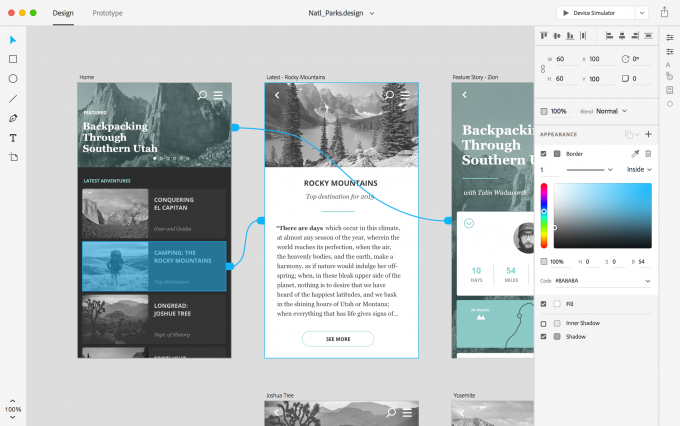
Great Design Gets Noticed
Time To Take Your Website To The Next Level!
Web design matters more than you think. Regardless of the validity of what you have to offer, people like to judge a site by its design in the same way they judge a book by its cover. Poor interface design will result in bad first impressions. In fact, one study that asked a group of people to search health-related websites found that 94% of those individuals consider design to be the primary indicator of trust , rather than content. This is true for many other industries, too.
The importance of great web design should make it a top priority. Design issues on the page can send people running to the pages of other domains. Common design issues include too much text, lack of navigation, bad use (or no use) of images, and stiff or corporate aesthetics. Cluttered or unattractive pages give the impression that the business or individual either doesn’t have the funds to support a good design or simply doesn’t care about how they look.
With so many pre-made templates on the Web, there’s no reason you shouldn’t be able to impress visitors. Sites like ColorLib are filled with articles highlighting the best free templates for web designs across all niches. Additionally, check out competitor sites to see what they’re doing to capture audiences.
Make It User-Friendly

Thinking of Starting Or Scaling Up Your Online Business? Now’s The Perfect Time
A user-friendly website is necessary for success. To make your site user-friendly, there’s usually only a few changes you need to make or elements to keep in mind. One of the best ways to stay user-friendly is to make content easy to digest. Your typography and layout is very important here; you don’t want blocks of text (even when you’re trying to educate a potential customer), and you don’t want text that’s too small or large.
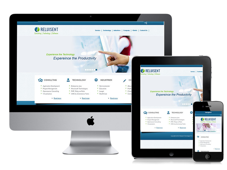
Having a responsive design is critical, too. Responsive web design makes your website easily viewable across any device, and also speeds up your load time. Other user-friendly things to consider? Don’t play sound upon site visiting. Forget the Flash intro. Don’t force people to sign up before browsing. The goal is to entice people to stay, not make it easier for them to run away.
Have Proper Navigation
Essential Tools For Your Ecommerce Business
Navigation is also very important when it comes to making your site user-friendly, but deserves special attention because so many site owners mess up when it comes to creating intuitive navigation.. All important information should be easy to find. Your visitor shouldn’t have to sort through several menus and clicks to get to the hours of operation or contact email.
Furthermore, your menus should be clear and concise, with proper parent and child page descriptions. For example, let’s say you sell food goods and have a page labeled “Honey.” You wouldn’t want to list “Cereals” under that category simply because your cereal has honey. The average consumer isn’t going to look for cereals in the “Honey” page. How you label things will certainly affect conversions.
Have a Clear CTA
Are Your Customers Digging You? Website Ideas That Rock!
The CTA signifies exactly what you want your visitor to do. Do you want them to make a purchase? Sign up for a trial? Request a demo? Subscribe to your newsletter? It’s important to put call-to-action best practices into play here. Make your CTA clear and persuasive. Don’t overwhelm the visitor by making too many requests of them on your page.
One of the first things you’ll need is great copy that entices the visitor to follow through and make a click. If your writing chops aren’t up to par, consider hiring a freelance copywriter to get your message across. Your message should be clear, concise, and short and to the point. Most importantly, don’t surprise the visitor: upon clicking your CTA, they should get what they’re expecting.
How your CTA looks is also very important. Generally, the buttons follow these three rules: 1) they have a specific shape and/or border; 2) they have text and; 3) they have a contrasting color that separates the button from their surroundings and makes it stick out. Take a look at this list of good and bad examples of CTAs to give you a better understanding of what you should and shouldn’t do.