Responsive web designing is an approach to make your website look good in numerous devices with varied screen sizes, platforms, resolution and browsers. It provides a platform for your website to be user-friendly, compatible and responding to all kinds of devices used by the ultimate user. Only a responsive web design can help your website to be viable and possible on all types of gadgets in this device-driven world. You can never miss the opportunity of attracting a potential customer with a responsive web design as your design pattern suits all kinds of devices and wipes away the difficulties of high resolution, larger size, browser compatibility and much more. This is the most cost-effective approach as it avoids the unnecessary cost of designing separate websites for each and every device. When one website designed responsively can fit in all the diverse devices, platforms and sizes, why should you waste time and money by using the traditional web design practice? Responsive web design is not a simple task However, some of the greatest challenges in responsive web design are:
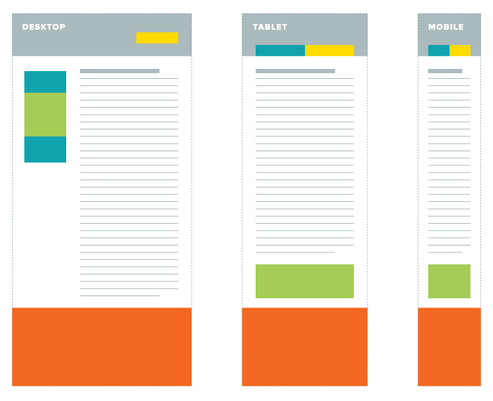
Navigation Layout
Scalable Navigation Patterns in Responsive Web Design
Navigation layout is the initial challenge faced in responsive web design because setting up the prompt layout or the most suitable one for the targeted devices comes in first place. Most of the times the appropriate layouts are selected using CSS media queries and jQuery. Primarily the navigation layout is coded and then the appropriate designs are added to it. While setting up a navigation layout you always need to have sample content with various sections. Ignoring this will end up in arriving at different sizes while changing the screen sizes be it small, medium, large etc. A difficult navigation layout will end up in consuming more time and irritate the user, forcing them to leave your website.
High Resolution Consideration
")
Designing for the Retina Display (326ppi)
High resolution is also a major consideration in responsive web design as you are focusing on a wide range of visitors using smartphones, tablets, desktop, laptop, netbooks and much more with a big high resolution screen. Most of the websites are designed to suit a typical desktop screen with a width of 1024 pixels whereas any other screens that are bigger than this size will end up in showing a lot of unused space on both the sides of the website. This is where the need of a responsive web design arises and it is used to match the needs of a larger monitor and shrink according to the resolution of a smaller screen size.
Adapting User Experience

Five responsive web design pitfalls to avoid
Taking up a responsive web design exhibits that your company is up to date and follows the latest trend without any lapse. The ultimate users of your website will be overjoyed and highly satisfied to use your website as they are not stopped to handle it with any kind of their favorite devices. Granting a better user experience will instill the trust of your users and will showcase the efforts you’ve taken to take care of your potential customers.
Content Delivery

Content Strategy for the Web, 2nd Edition
Delivering the responsive content is the most important challenge as your content speaks for you. A responsive web design assures that your website does not lose any kind of important content when it is opened on a tablet or smartphone. This happens with the help of content delivery networks and your website can be accessed from any device without forgoing its readability. A responsive design considers offering only the resources that are suitably sized for the gadget demanding the page and the images will differ based on the gadget. The problem arises here, specifically with the content delivery networks (CDNs). This is because the CDNs are habituated to being able to hoard a solitary asset for all devices or at the other extent caching a mobile and desktop version of the asset.
Responsive web design is a boon to all entities operating online. It encourages business owners to mark their inevitable presence without restricting the use of their website based on the nature of the mounting devices.


As web designers, I think we must change the way we think about web design. We’ve already learned that our print design skills are valuable, but not totally adequate, when it comes to web application. However, many of us design fixed width sites with a white knuckled hold on every graphic nuance. This is the control we were used to with print.
I think that to create responsively designed websites we need to loosen our grip and accept the fact that we no longer have pixel perfect control over every element of the design that we’ve so painstakingly created. This doesn’t mean we compromise design quality. When we adjust our approach and thoughtfully consider how our designs will adapt across a wide variety of devices, responsive design means we can craft sites that look beautiful and function well no matter what devices our audience may prefer.
We just posted an overview of 20 great responsive web designs http://bit.ly/OucwPE if you care to share!
-Devon
Great thoughts Devon, appreciate your comments & adding to the conversation! I agree about the print mentality compared to todays ‘fixed width’ mentality on everything. We (as always) must grow and adapt to our surroundings! Bring on the age of responsive web design! Nice article by the way 🙂