
Building a beautiful website that is also perfectly functional is not an easy task; especially, if you are not familiar with the industry.
Every niche is different and has its own set of rules and standards that have to be followed if you want to make the users happy. Luckily, once you get the hang of it, creating a perfect legal website should be no problem for you.
It all starts with good preparation and a solid plan. If you know what you want your website to look like even before you start building it, you will be able to avoid many mistakes that could occur down the road.
But what mistakes you should watch out for? Let’s take a look.
5 Mistakes to watch out for
Here are 5 things you should avoid by all means if you want to create a high-quality legal website:
1. Overwhelming and stuffy Content
It is one thing to make a website look professional but many designers confuse the huge blocks and stuffy content architecture for professionalism.
The truth is that if a website is arranged in that way, not only will it be really hard for the user to find the piece of information they were searching for, but many of them won’t even try.
It is easy to get intimidated by a sea of text so don’t let your users be overwhelmed by that the moment they hit the homepage.
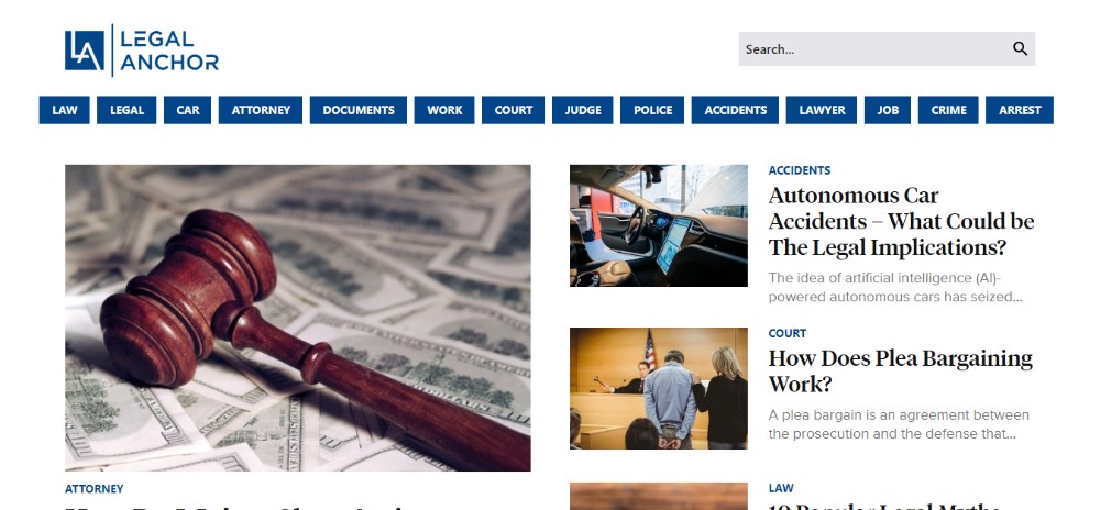
However, you don’t necessarily have to cut the content in order to make the website more welcoming. All you have to do is arranging it the right way with clear labels and categories.
A good example of well-arranged content is Legal Anchor.
2. Using a Lifeless Color Palette
Another thing that often gets confused with professionality is a dark and lifeless color palette. In the past, the majority of the legal websites used only navy, gray, and black and, as a result of that, all the websites looked pretty much the same.
Adding a touch of personality to a website is always a good thing. After all, you have to make it stand out from the crowd somehow.
If you add a dash of a warm color into the mix, you will be pleasantly surprised with the results.
Take a look at Keglerbrown website if you’re looking for inspiration.

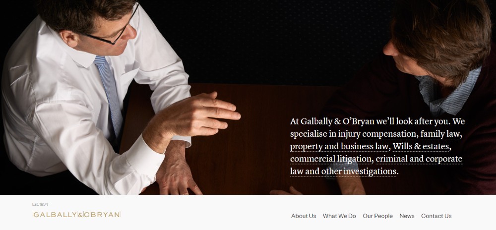
3. Using Stuck-up Stock Images
Let’s face it – the image of Lady Justice on the homepage simply isn’t going to cut it. Why? Because we’ve seen it too many times before and it adds zero personality to your website.
When choosing the right photos to use, always ask yourself whether or not the photo tells a story. You need to choose the images that show the human side of the business, preferably the actual photos of the company’s employees.
Lewisrice and Galballyobryan are great examples of incorporating the right photos into the website design.

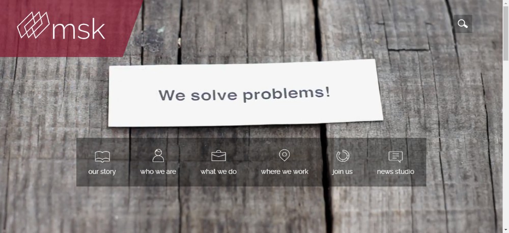
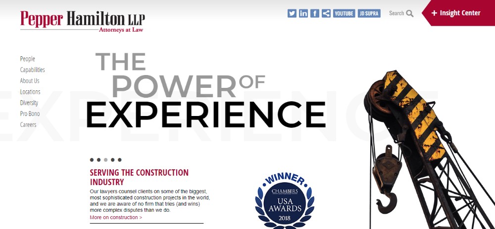
4. Creating a static Website
The legal websites are often completely lifeless and that is definitely not a good thing. However, you can easily change that by simply incorporating a few dynamic elements into the design.
Things like presentation videos on the homepage, 3D animated logo, animated taglines, and slider galleries will make the users want to stick around longer.
MSK and Pepperlaw are websites that incorporated the dynamic elements into the design just right.
5. No White Space
We mentioned before that legal websites are often packed with content so you really have to think about the content architecture if you want to avoid creating an overwhelming website.
There are 2 things you should pay a special attention to.
First, there has to be enough white space on every page if you don’t want the content to seem stuffy and intimidating.
Second, you should avoid having all kinds of elements competing for the user’s attention, such as the banners, team presentations, award icons, articles etc.
The focus has to be on the content and the content has to be arranged in a way that is easy to look at. Using blocks for creating an organized look, adding plenty of bullet points, and having sufficient white space will help you achieve that.
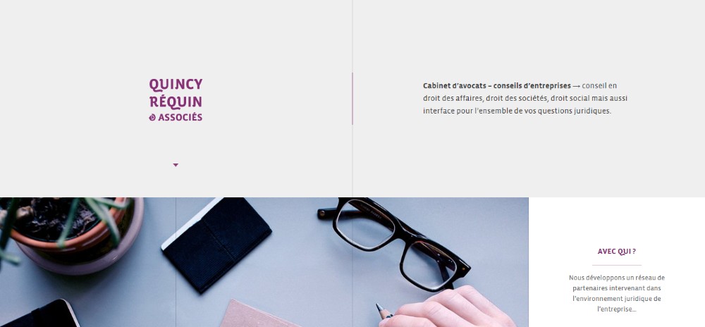
Jennyodegard and Quincy-requin-avocats are websites that are good examples of nicely arranged content.
Conclusion
If you are building a legal website, the first step is to get familiar with the industry as much as possible. And while there are some strict rules to follow, that doesn’t mean you have to give up your creativity altogether.
Adding a dose of personality is always a good thing to make the website stand out from the crowd.
Use crystal-clear content architecture, plenty of white space, photos that show the human side of the business, a few dynamic elements, and a touch of warm colors and your website should turn out exactly as the users expect it to be.