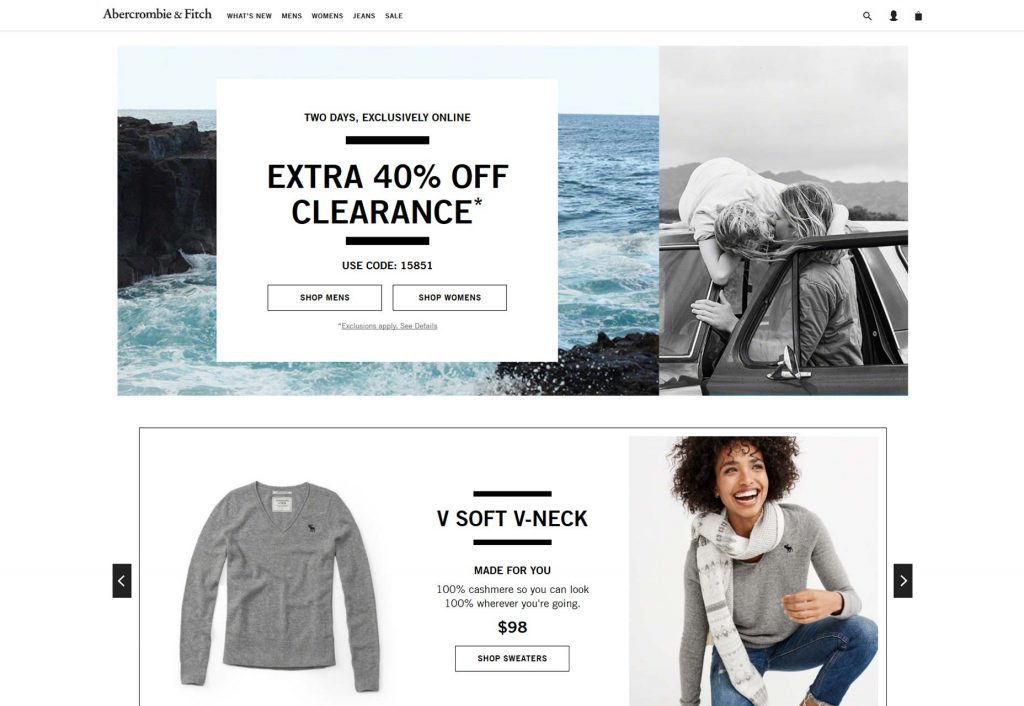
To optimize your E-commerce website, make the site easy to navigate, and add search bars, vivid images, accurate product information, social proofs, and visual cues.
One of the most important aspects of your e-commerce store is the website. How it operates, looks, and feels are essential to ensure a good user experience (UX) and a higher customer retention rate.
Your website is the key to generating sales. To do that, you need to make sure it offers a good UX. According to a UX survey report by econsultancy, 88% of users will not revisit a website if it has bad UX. To make sure this does not happen to you, you need to make your website fast, responsive, and organized.
Many people invest a lot of money in their website and still fail to enhance the UX. If you are also struggling, then do not worry because in this article we will be highlighting some tips to enhance the UX of your e-commerce website.
1. Minimize the Feature Area
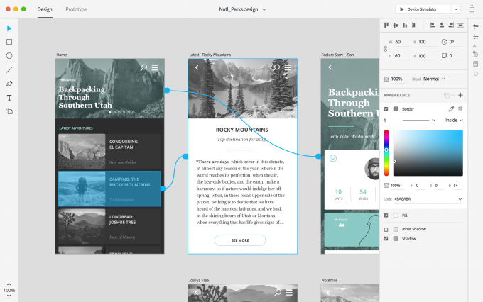
When users click on your website, the first visual element that pops up is the feature area, otherwise known as the hero area. The feature area has to be attractive and provide information in an appealing way.
Some people go overboard here by adding 3D animations, illustrations, and too many colours. This may make it look visually dynamic but it may not always work in your favor.
Instead, you should put on a minimal design with neat and clean fonts. Add a few images that indicate your products with a few words to describe them. Add one call-to-action (CTA) button that is very easy to notice.
If you are not experienced in designing websites, you can always hire a professional UX agency for the job. They have more relevant market statistics and know exactly what customers look for in a website.
2. Make an Impactful Homepage
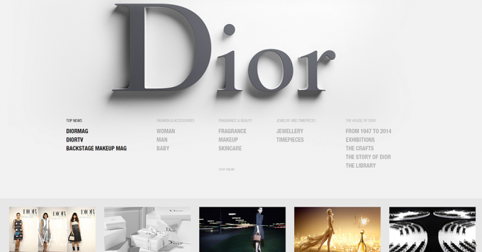
Your homepage is the identity of your website. On average, a user will spend a few seconds skimming through your homepage and decide whether he/she will stay or not. Bad homepages are the number one reason for increased user bounce rate – people coming and ‘bouncing’ away.
The homepage should be simple and attractive. Here are some tips to do it. Add an attractive and easy-to-remember logo. The logo is likely to be the thing your new customers will remember you by. Place the logo on the top left side of your website because that is the easiest location to spot.
Categorize and add an informative page footer with your contact information, FAQ links to other important pages. Also, include ‘call here’ buttons and chat boxes at the bottom of your website.
3. Use Visual Cues for Better Navigation

Effective use of visual cues makes navigation easier. You have to maintain a visual hierarchy that can lead customers to specific areas of your landing page. Use a combination of explicit cues and implicit cues to make your website user-friendly.
Explicit cues: This includes lines, pointing fingers, arrows, and human line of sight. You can use these cues to guide your visitors to specific places like the CTA button.
Implicit cues: These are not as direct as explicit cues and give the visitors the freedom to explore. Implicit cues include filtration systems or product categories with thumbnails.
4. Use Well-Positioned Search Bars

Add the primary search bar on the top right side of your website. Most visitors will have an impulse reaction to use the search bar. So you better make it easy to notice.
Add auto-complete options in the search bar for user convenience. Also, make sure the search bar is visible on every page.
5. Don’t Shy Away from Vivid Images & Illustration

Images make your website more alive. Provide vivid images and illustrations. For example, if your site is focused on selling outdoor gear, then add vivid images of mountains or forests as backgrounds.
Even if you have a minimalistic website design, add images. Otherwise, it will look bland and not retain customers.
6. Use UGC Content

UGC, or user-generated content, improves customer retention. It also allows high traffic flow to your website. A recent report by Crowdtrap claims that millennials trust user-generated content far more than other forms of media.
One of the prime examples of using UGC is Facebook. Their ads with UGC have a 300% higher CTR and 50% lower CPC & CPA.
To make UGC, search popular hashtags to find and create the most searched content. Create a content-sharing platform and always ask the creator’s permission before posting them.
7. Optimize Website For Mobiles

According to research by Bondgroup, 73% of online users use mobile phones to access websites and 57% of users claim that they would not recommend a website that is not optimized for mobile phones.
Your website design should automatically adjust when users enter it using mobile phones. Do not clutter the page since mobile screens are smaller. Display 5-10 products on a page and make sure the site does not lag laggy when scrolling or changing pages.
8. Allow Horizontal Display

Horizontal displays can add convenience to tab users. Add a horizontal filter option that will allow the users to flip the screen at their convenience. Make sure you do not leave too much white space when it is flipped horizontally, otherwise it will look ugly.
9. Add Social Proofs

Social proofs, like testimonials and customer reviews, help promote brand integrity and trust among visitors. You can add different things to customer product video reviews, video testimonials, customer ratings, and even celebrity reviews.
You should add user ratings and reviews on every product so visitors can have a better idea. Insert a 5-star rating method along with the product so users can evaluate the rating score.
10. Focus on Checkout Page
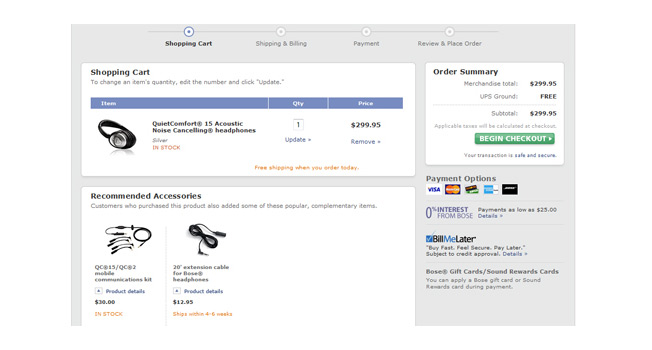
The UX should be optimized from beginning to end. So, ensure your checkout page looks and feels good. Add fewer form fields to make the purchase simple and insert an ‘add to’ cart option with clickable links to return to the home page.
Final Thoughts

Your e-commerce website needs to be optimized and user-friendly to give the best UX. This will generate more sales and ensure maximum customer retention. So, make sure to consider the tips mentioned above and try to combine them to see which methods work best for you.


